


When we design dashboard, our ultimate goal is to make it easier to use in order to deliver the information and insight to users. It is important to make sure that these visualizations are accessible to most of the people. However, not everyone can use the dashboard in a same way. In this blog, I document my experience and way of retrofitting a an original dashboard for the keyboard-only users.
The original dashboard is about a revenue breakdown in different sectors, with 4 line-chart to show the increase of the revenue over time; and a bar chart showing the most revenue-generated customers. The key challenges keyboard-only users might faced is that usage of the original dashboard heavily relies on the tooltip. The time-axis in all line-chart is different and the latest month revenue number was only included in the tooltips. There were also >10 filters in the original dashboard. Imagine when the keyboard-only users need to focus on a certain button, they need to smash the 'tab' button in order to run through all the options. As a result, I designed my retrofitting dashboard with the following principles:
- Keyboard centered designed: Keyboard-only users rely on keyboard navigation to interact with a dashboard. To make sure your dashboard is accessible, ensure that all interactive elements can be accessed and controlled via the keyboard. This includes the ability to move between different views, select filters, and navigate to different tabs. Use the Tab key to cycle through interactive elements, and make sure that the focus order follows a logical reading order. Remember that individual mark won't be focused when the use the Tab key. So don't expect that the user can select the mark to change views and parameters.
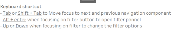
- Provide the instruction of Keyboard Shortcuts: Keyboard shortcuts can significantly improve the user experience for keyboard-only users. It would be much easier for the users to use the keyboard if you can provide the instruction for them so that they didn't need to experiment a lot or accidentally click for wrong things. Here is an example:
3. Use Descriptive Text: Because tooltips will not be shown. Keyboard-only users rely on text descriptions to understand the charts. Use clear and concise descriptive text for the insight. Of course, not every number can be described in text, so select the most interesting one or important one, like the max, and min, latest value. You can also describe the trend and changes.
4. Reduce the button option: When a user want to focus on a button, they need to keep pressing the Tab until the focus is on that button. Reduce the button options shorten the process. If you still want a list of filter, make a filter pannel and hide it with a 'show/hide button'. So that the user can use still them by opening the filter panel, meanwhile being easy to navigate to other element when the filter panel is closed.
5. Testing the view: Testing your dashboard is a necessary step. Make sure the dashboard is working before you finalize it. Even your dashboard is working on your computer, the way they interact with the dashboard can be different. Just make sure the dashboard is working as the same way that you design.
6. Contrasting color: Users know where they are focusing on by observing the blue frame surrounding the object. Make sure you have provided enough contrast for this blue frame to be clearly visible.