Hi, today I would like to share a trick I learned, which is to add a label above every horizontal bar in Tableau.
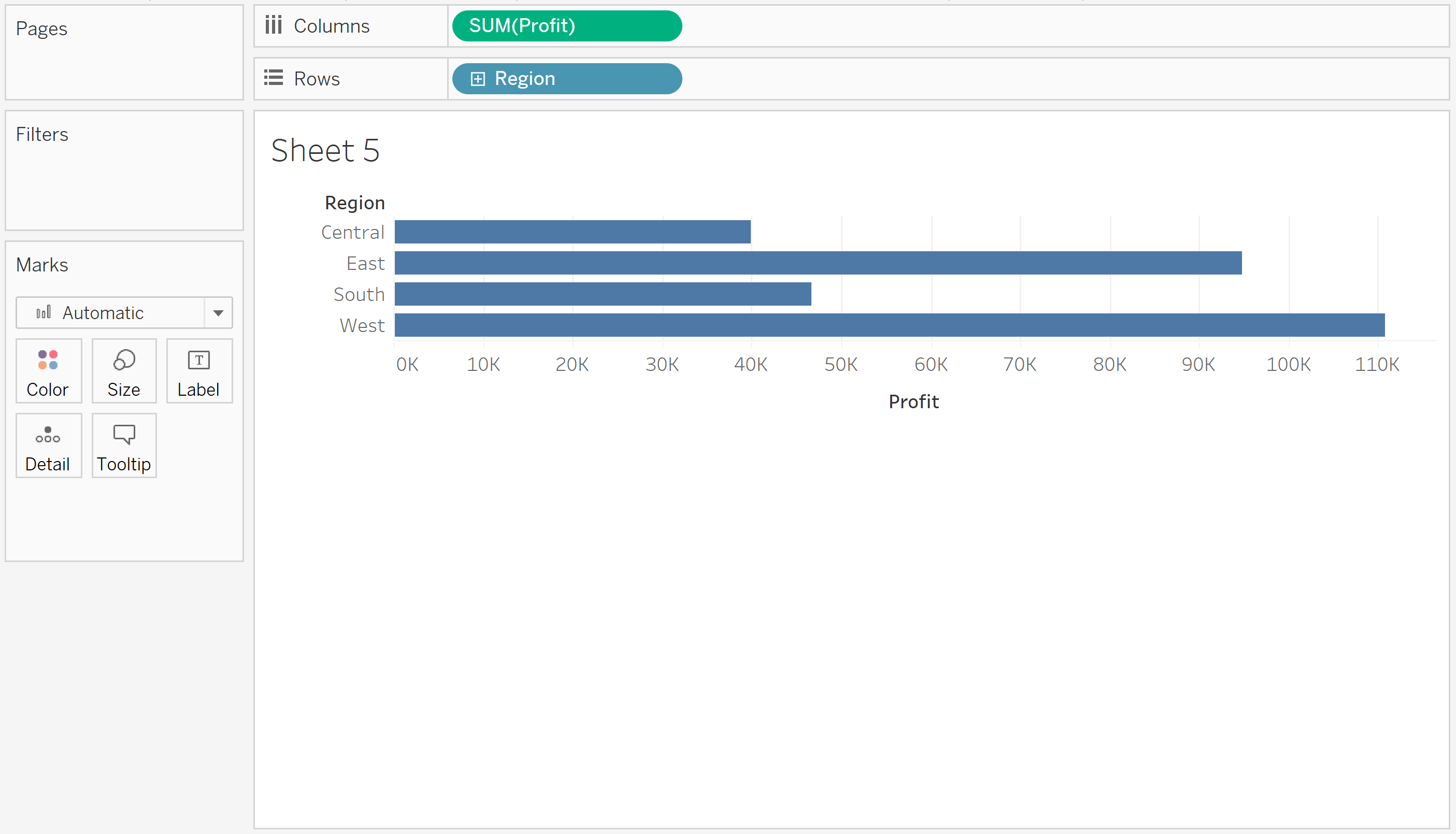
Let's use the superstore data to create a basic bar chart, with sum of profit on columns shelf and region in the rows shelf.

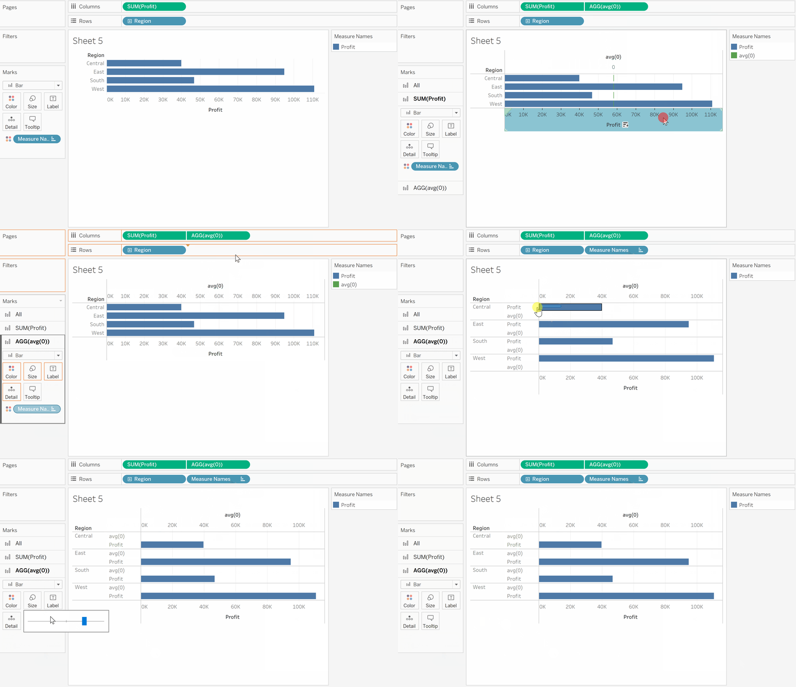
The next is to create a dummy row above each bar. This can be done by adding a dummy in-field calculation. The steps are as follows:
- double-click the columns shelf and type 'avg(0)'
- right-click the avg(0) and select 'Dual axis'
- right-click the x-axis in the bar chart and select 'Synchonzie Axis'
- Click the marks card of AGG(avg(0)) and drag the Measure Names pill to the rows shelf.
- The new dummy rows may appear below the bars. Just drag the bar label near the bars down below the dummy rows. This will solve the problem.
- Set the size and opacity of color of our dummy mark card as 0%.

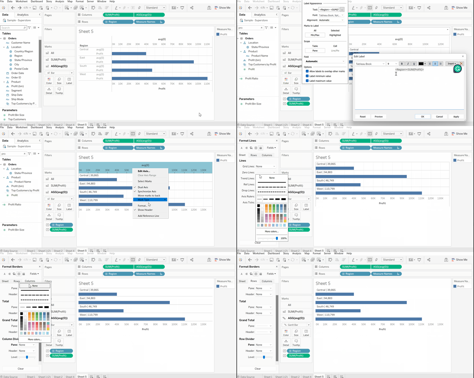
Now we need to add the labels and finish the chart.
- Drag the desired fields on the Text for the dummy mark card to show the label. Format the label a bit so that it appears in a single line.
- Remove the redundant headers for both x- and y-axis.
- Remove the redundant grid lines and dividers.
- Change of dummy mark card from 'Bar' to 'Gantt Bar' to remove the tiny dot next to the label.

This is how you add a label above every horizontal bar in Tableau
Feel free to check out my other posts and connect with me on Linkedin - learn and improve together!
https://www.thedataschool.co.uk/blog/stanley-chan
