


Hi, I am Stanley, a new guy getting into the Data School as a member of cohort 37. In a blink of time, I have gone through my first week in Data School. I feel Data School is a place where you can learn state-of-the-art data techniques. Although I can expect there would be a lot of challenges for both hard skills and soft skills (especially public speaking which I have been always afraid of), people here are helpful and friendly, and my teammate are supportive as well! :D
So this is my first blog post in Data School. Except for some feelings about being in the Data School, let’s talk about something that I learned. In the last couple of days, we learned about the basic theory of visualization and dashboard layout. When I looked back at my 1st application viz for Data School which is about the shark attack incidents in Australia (created when I had none of the visualization knowledge), I immediately recognized the failing points that make it not appealing at all.
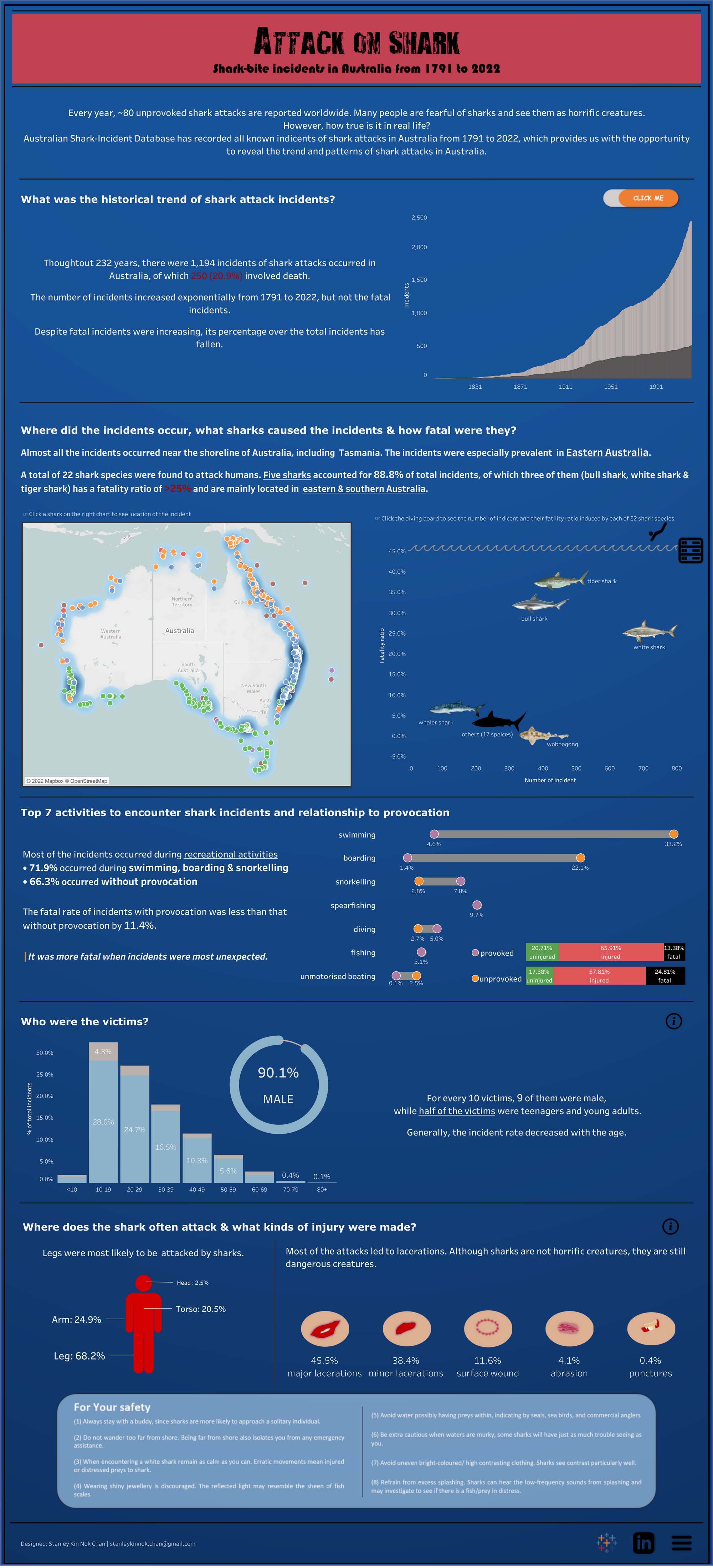
First is the color. Although my original thought is to make it like a warning board, where the red header showed in a dark-blue background representing the deep sea, this doesn’t work very well. The color themselves are in high contrast, and both colors were quite sharp, which hurts the reader's eyeballs when readers look at it for minutes. There were also lots of colors on the map without any labels, which makes it very confusing.
Second is the break. This includes the white space in each visual element and the layout. Obviously, the text and chart were pretty compacted. I also attempted to save up space by overlaying the stack bar chart on a dump-bell chart. This added another layer of complexity where readers have to change their cognition all of a sudden without any indication.
The third is the text work. According to the Gestalt principle, the object with similar color and size in close proximity would tend to be seen as the same group. The feature of the title in each part was just similar to the context text plus the axis and label text. The readers would find it very hard to quickly identify the element and follow along with the story. At the same time, it seems that I wrote the text repeating what the charts have shown. It would probably be better if I can put more focus on storytelling and create a more engaging reading experience.
Self-criticizing is not easy. You have to admit what you did wrong and only if you know and learn more can you did a fair judgment. Keep learning!