


Today, the second day of the dashboard week, we were provided with the dataset about high-paid athletes between 1990 and 2021, a dataset that was published on Kaggle. I found this dataset a really interesting one as I personally engage myself with sports during my free time and also watch some of them. Hence I was curious to know more about the payment the athletes receive in different forms apart from their regular salary. Unfortunately, from the dataset, it was not possible to find out the payment they received through endorsements since there was no classification provided for this purpose. Still, the dataset was interesting enough for me to analyse in detail and create a dashboard.
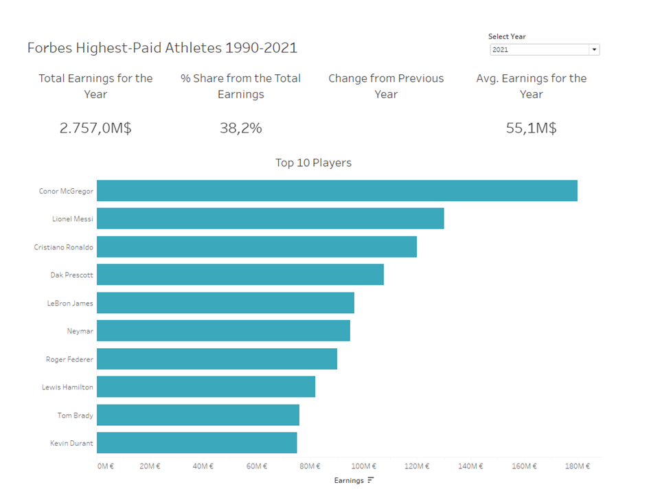
Since the dataset was from Kaggle, it was clean to a great extent apart from some datatype modifications. My idea was to focus only on the top 10 players for a selected year and analyse their pattern. To select the top ten, I created Set on the field Name. I then created a Parameter to identify the user-selected year which was then stored in a newly created calculated field. Then I created a bar chart and added the top ten set on the Filter area to show only the top ten. Since it needs to adapt for the selected year, I added the newly created year field into the Filter area and added it into context. This was the main chart in my dashboard. All other information that I provided were as BANs. One of the BANs that I created was the total earnings for the selected year. The second BAN would give the share of Total earnings for the selected player(s) in percent. To calculate this I used Fixed LOD. Since the focus was on the top 10, by default it would show the share of the top 10 players. The third BAN shows the average earning for the selected year. This enables the user to get an idea of how much more the player earns with respect to the average. The dashboard also shows whether the selected player got a pay change compared to the previous year which would be displayed by arrows.
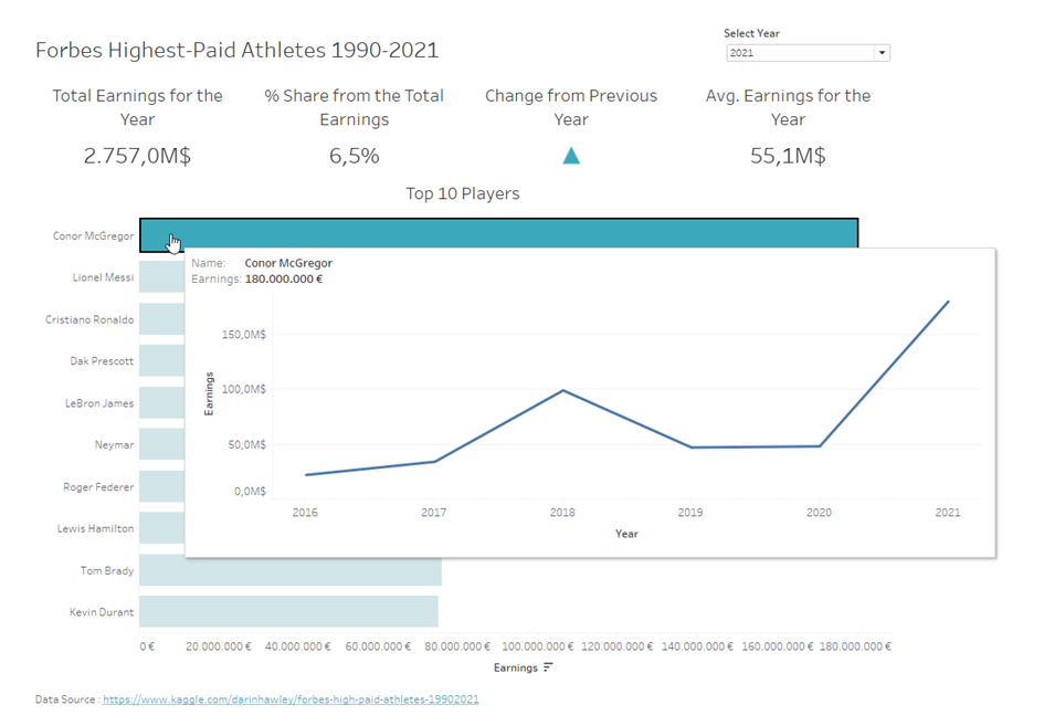
The pattern of the pay variation for the player since the beginning is provided as a tooltip. This information can be seen when we hover over the player on the bar chart. The year can be selected from the Year Parameter provided. Overall I enjoyed working with this dataset where I could apply some of the concepts I learned. Also, check out my tableau public for other dashboards. Hope you enjoyed reading this.
Thank you!