


In this blog I'll be walking through how I made a dendrogram using birth and death count data from the CDC.
What is a Dendrogram Chart?
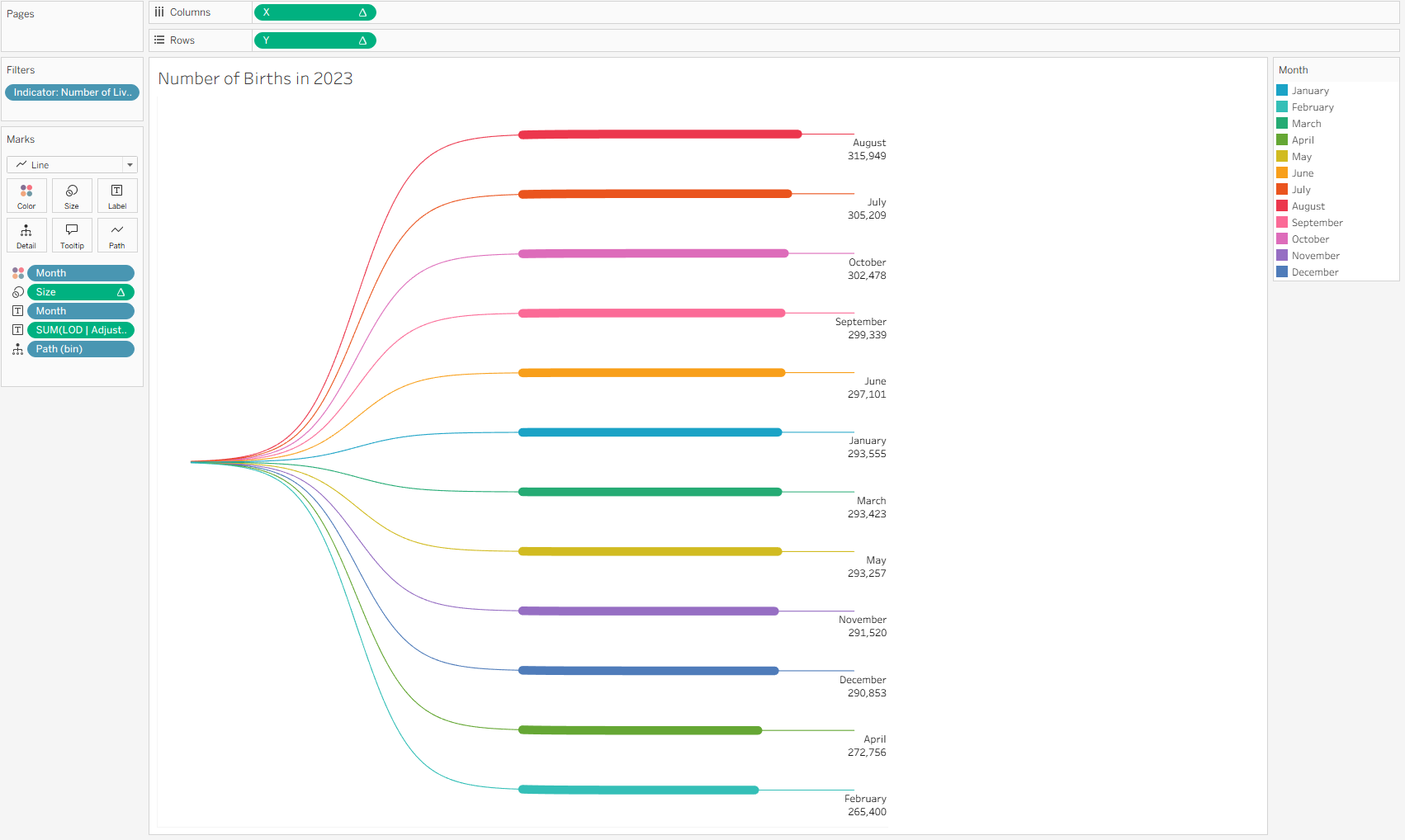
Also known as a tree chart, this graph is useful for representing hierarchical data and clustering results. As an example: I made three charts, one with total counts, one with death counts, and one with birth count. Below is one of the final charts where we can see the breakdown of the data by months, ordered by the highest birth count month to the lowest. Fun fact, more people are born in August!
Joining the data
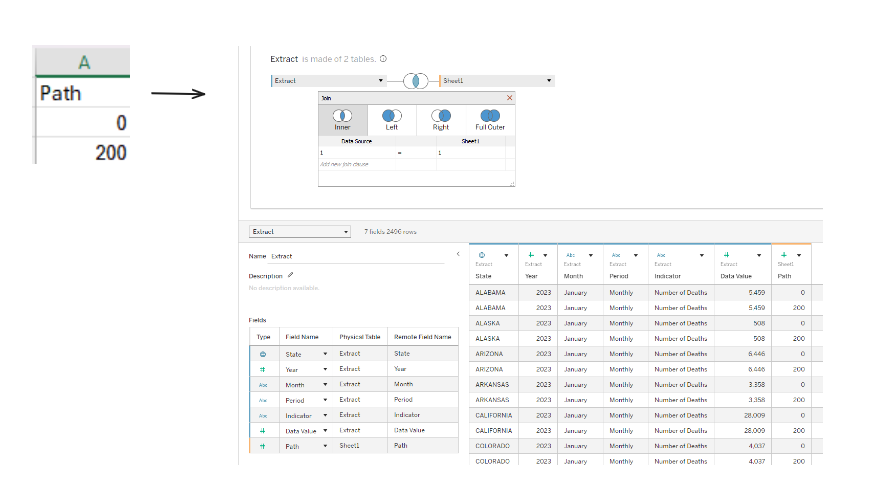
The first step is data densification, which is needed to eventually allow for the building of smooth curves. I created a 'Path' table on Excel, which I then copy and pasted into the physical layer of my table in order to cross join the two tables. For this, I made the join calculation 1 = 1. After, I created a bin with the 'Path' field with a siz1 of 1.
Calculations
The next step is making 'adjusted' values, which is necessary since the original value field got duplicated after the join.
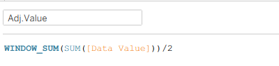
The calculation for Adj. Total Value is the same as Adj. Value and will be used in percentage calculations.
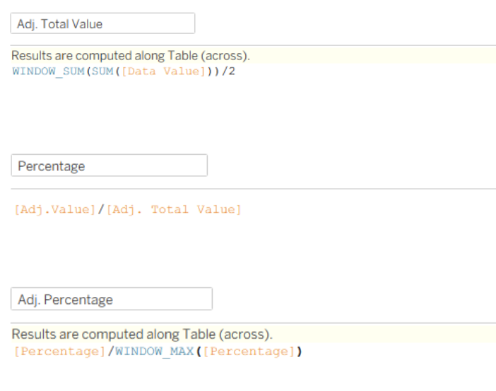
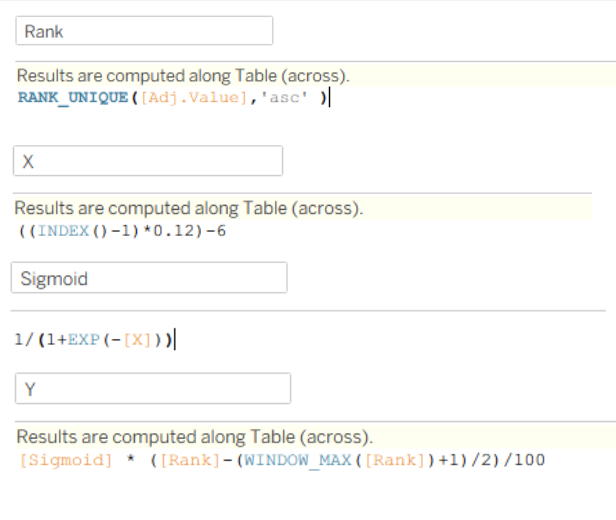
And then I calculated Rank, made a calculation for the X axis which creates equal spacing between the points, made a Sigmoid calculation which is necessary for the curve, and used that Sigmoid calculation in the calculation for the Y axis which will adjust the value of the curve based on rank and get the middle point to be zero by subtracting based on the max rank.
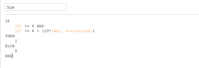
Then, the X axis calculation was used to create a 'Size' field.
Building the chart
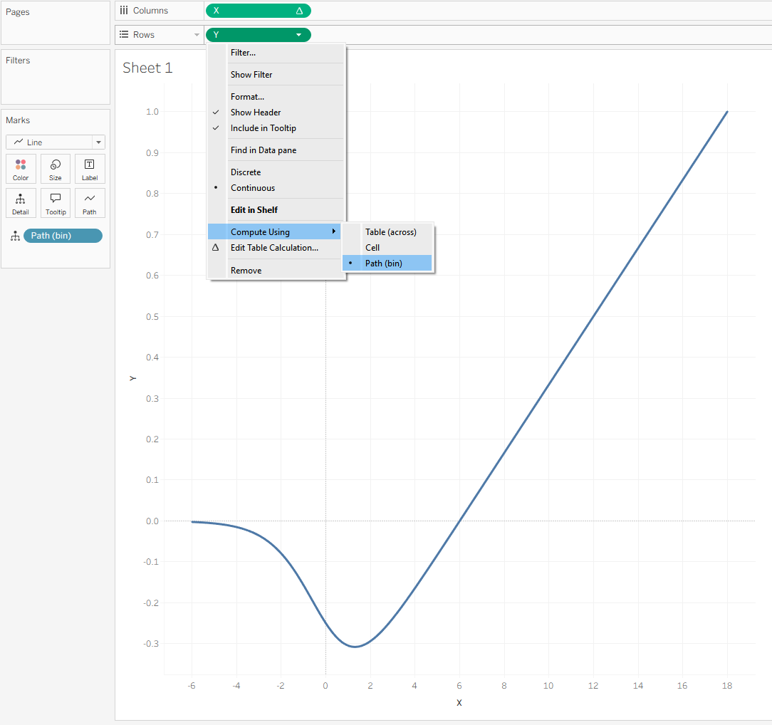
You should see a line after putting the Path bin on detail, X on columns, the Y on rows, and computing X and Y by the Path bin.
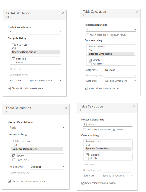
After, I added Size and changed the computations. This is important for ensuring the data on the view comes in as intended. The order of the values in the edit table calculations menu also matters (i.e., having month above path).
After, I added some labeling and started filtering to play along with the data. Here are the charts I made:
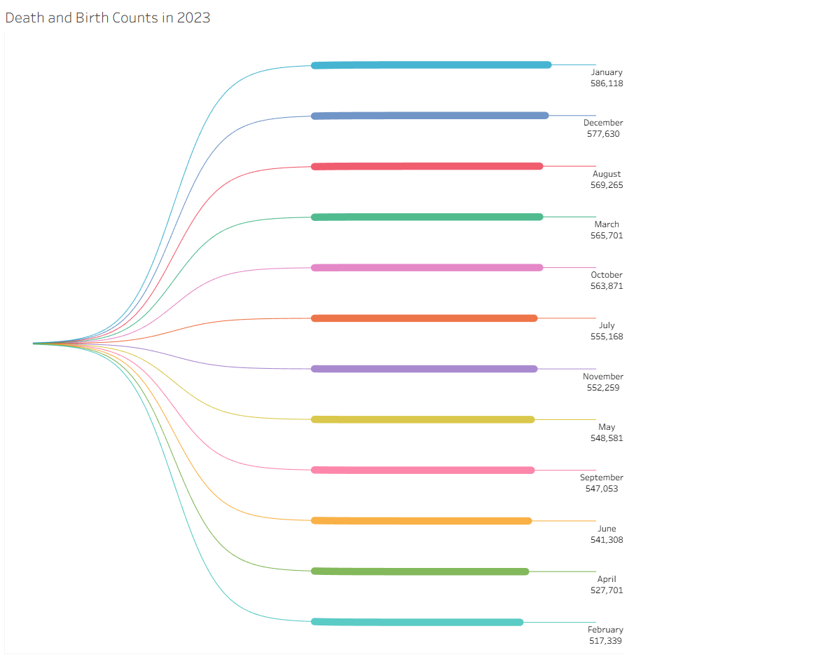
Overall, January has the most activity in terms of births and deaths, with February having the least.
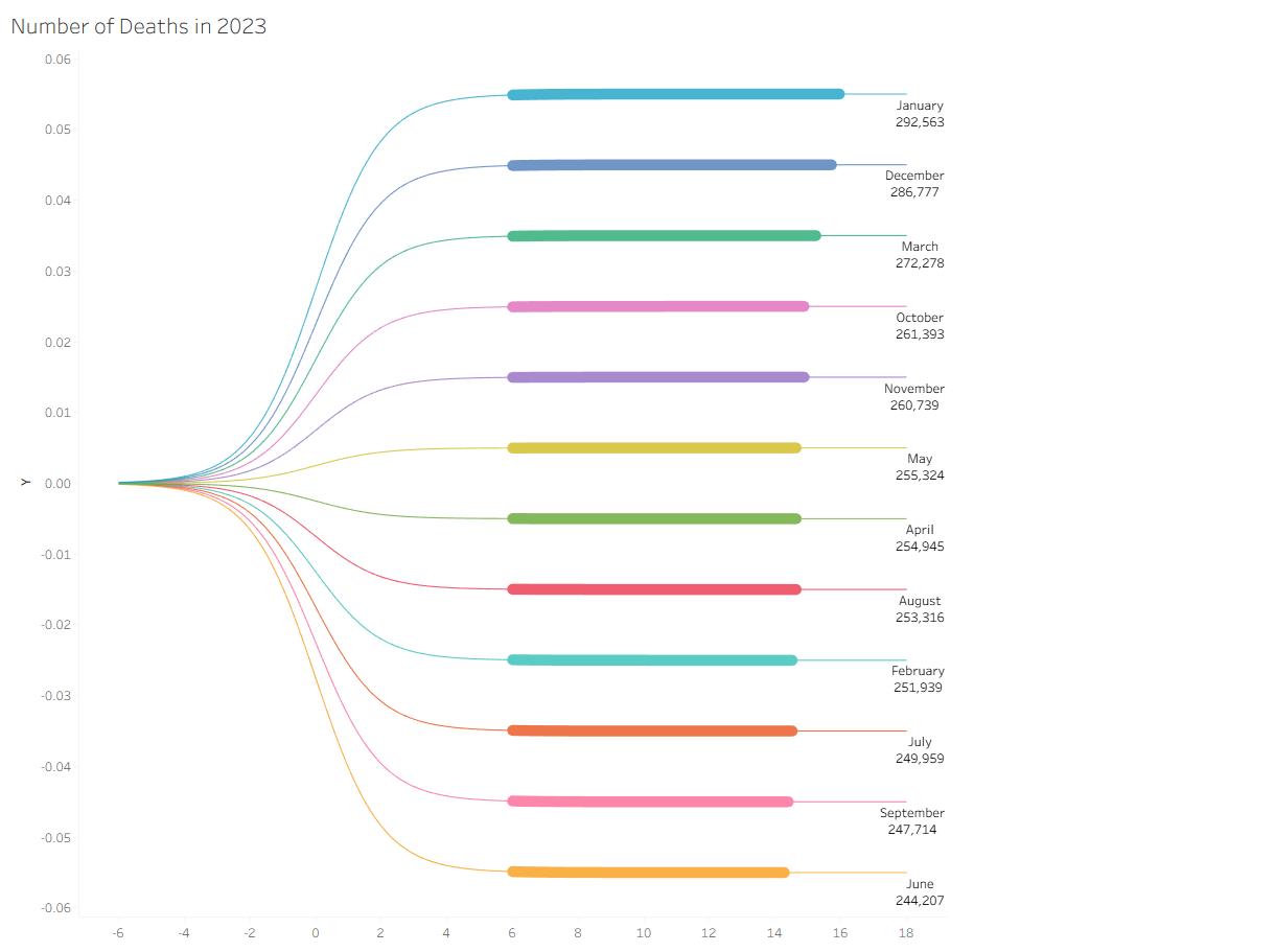
Most deaths are also in January, with the least in June.
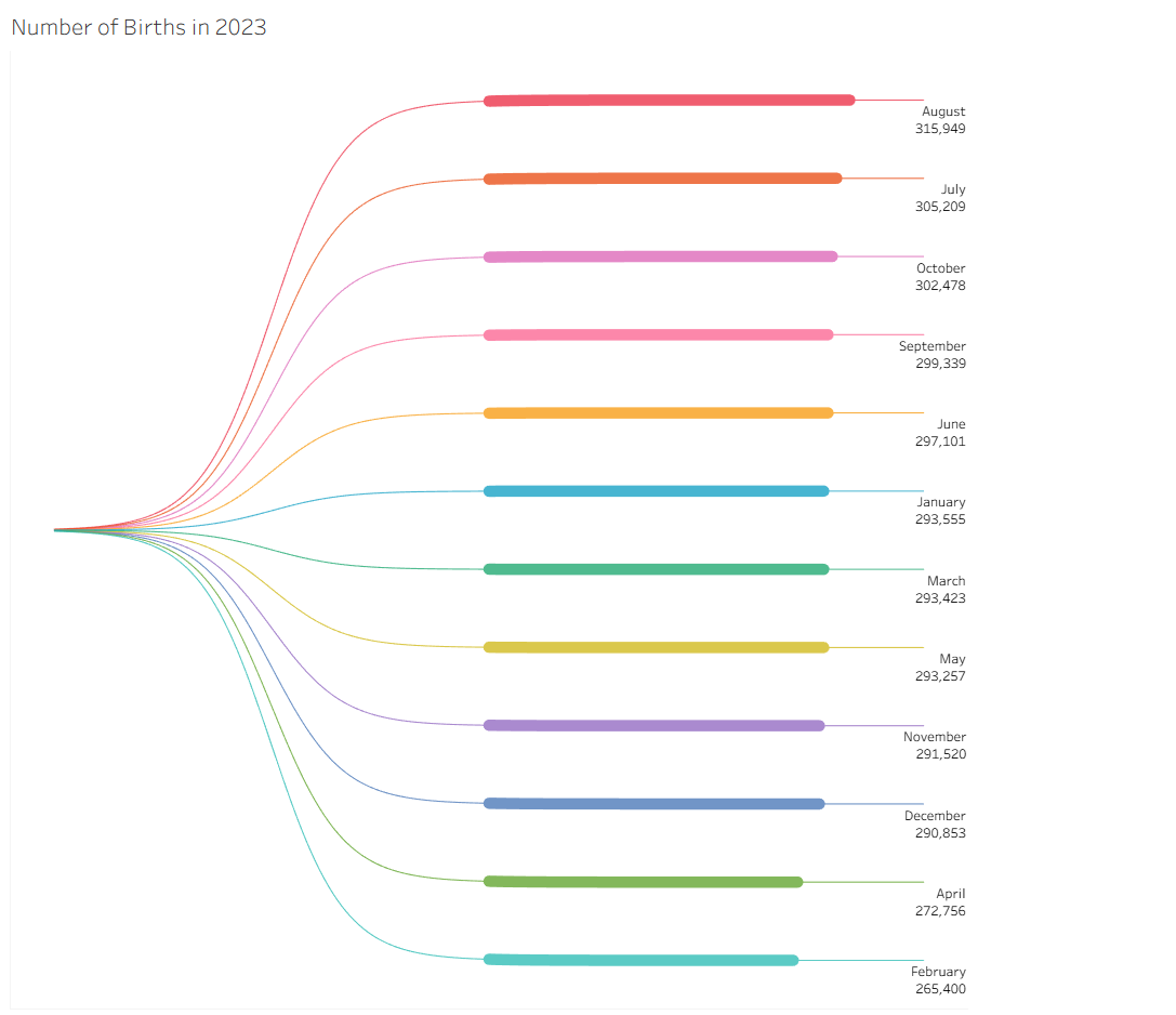
And most people are born in August with the least in February.
Thanks for joining me on this journey!