


In creating data visualizations, our main goals are to help the viewer see, understand, and make better decisions about the data presented. In doing so, we can take into consideration certain elements such as pre-attentive attributes, data ink ratio, and the gestalt principles. In this blog, we will take a look at the latter and see how we can utilize them in our data visualizations.
What are the Gestalt Principles?
The Gestalt Principles are principles that describe how we interpret or perceive complex stimuli around us. The principles that we will be talking about are proximity, similarity, closure, enclosure, and continuity.

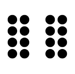
Principle of Proximity
This principle implies that elements closer together are perceived as belonging to a group or are more related to one another compared to elements farther apart.
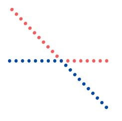
Principle of Similarity
This principle refers to grouping elements by a similar trait or characteristic. This can include color, size, shape, or orientation. Similar traits can be used to tie together elements that might not be close together within a design.


Principle of Enclosure
This principle states that elements enclosed, whether by a border or within a distinct region, are grouped together.

Principle of Closure
This principle refers to our minds natural tendency to fill in the blank when an object may have a gap or appears incomplete.
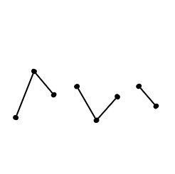
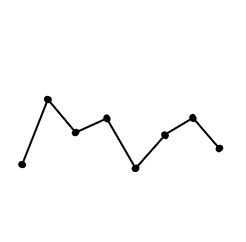
Principle of Continuity
This principle states that points perceived on a straight or curved line are closely related.
Considering these principles while designing your data visualization can greatly enhance its clarity, effectiveness, and impact, establishing a foundation for clear communication and effective storytelling.