


Back when I was applying to the Data School, one of the feedback notes I remember was to be cognizant of my data ink ratio. At the time, I didn’t know what that meant, but I was advised to use it for the next phase of my application. And let me tell you, that advice was very helpful. Fast forward 5 weeks, and data ink ratio is now the topic of this blog post. So let’s get to it!
What is data ink ratio?
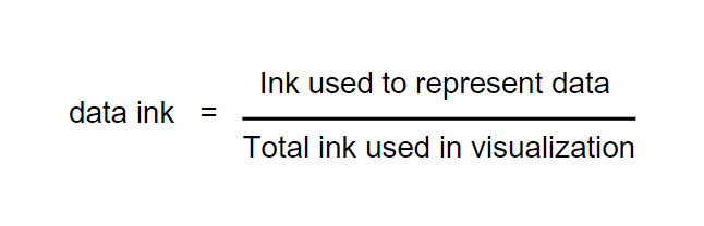
The data-ink ratio is a concept, first created by Edward Tufte, that refers to the amount of ink used in a visualization that represents meaningful information. In other words, we can get our data ink ratio by taking the essential ink representing our data divided by the total ink of our visualization.
Why do we want to consider it?
By removing irrelevant elements and decorations in our visualization, we can present our data more clearly, enhance the viewer’s understanding, and allow for a more efficient and impactful communication of insights.
How can we maximize our data ink ratio?
Remove the non-essential elements. This can be gridlines, tick marks, unnecessary labels, or excessive effects. This just becomes noise and distracts from what the data is trying to tell us. Get rid of it!
Keep it simple! Particularly when picking chart types, color palettes, and fonts. We want to be able to effectively portray the data, and by eliminating the complex charts, excessive color, and eccentric fonts we can manage to convey a more concise story.
Watch for redundancy. Consider things like labels, annotations, legends, and axes. Excessive repetition can clutter our visualizations and confuse our viewers.
Final Thoughts
Yes, having a high data ink ratio is important, however, we don't want to overdo it when applying this concept. We still want to give context for what we are presenting and trying to communicate. So before you go on and start removing every element, ask yourself if a certain element is essential in your visualization.