


Today is the last day of Dashboard Week (and also our last day of training!) Our final challange was to create a dashboard using the World Happiness Report Dataset.
You can see Jenny's full brief for us here.
The Plan
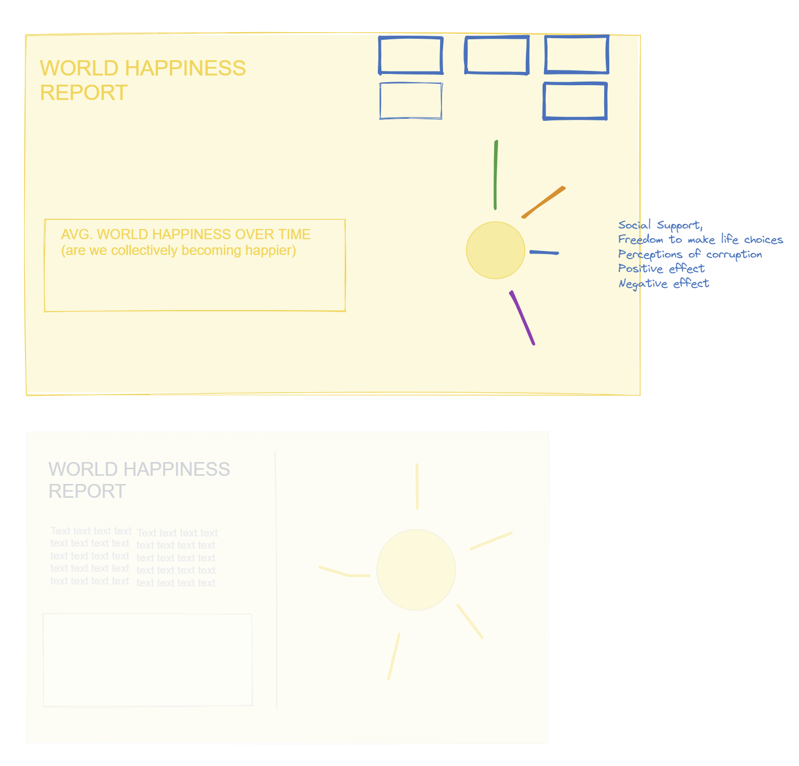
After exploring the dataset and understanding which fields were present, I jumped into Exalidraw to create a (very rough) plan.
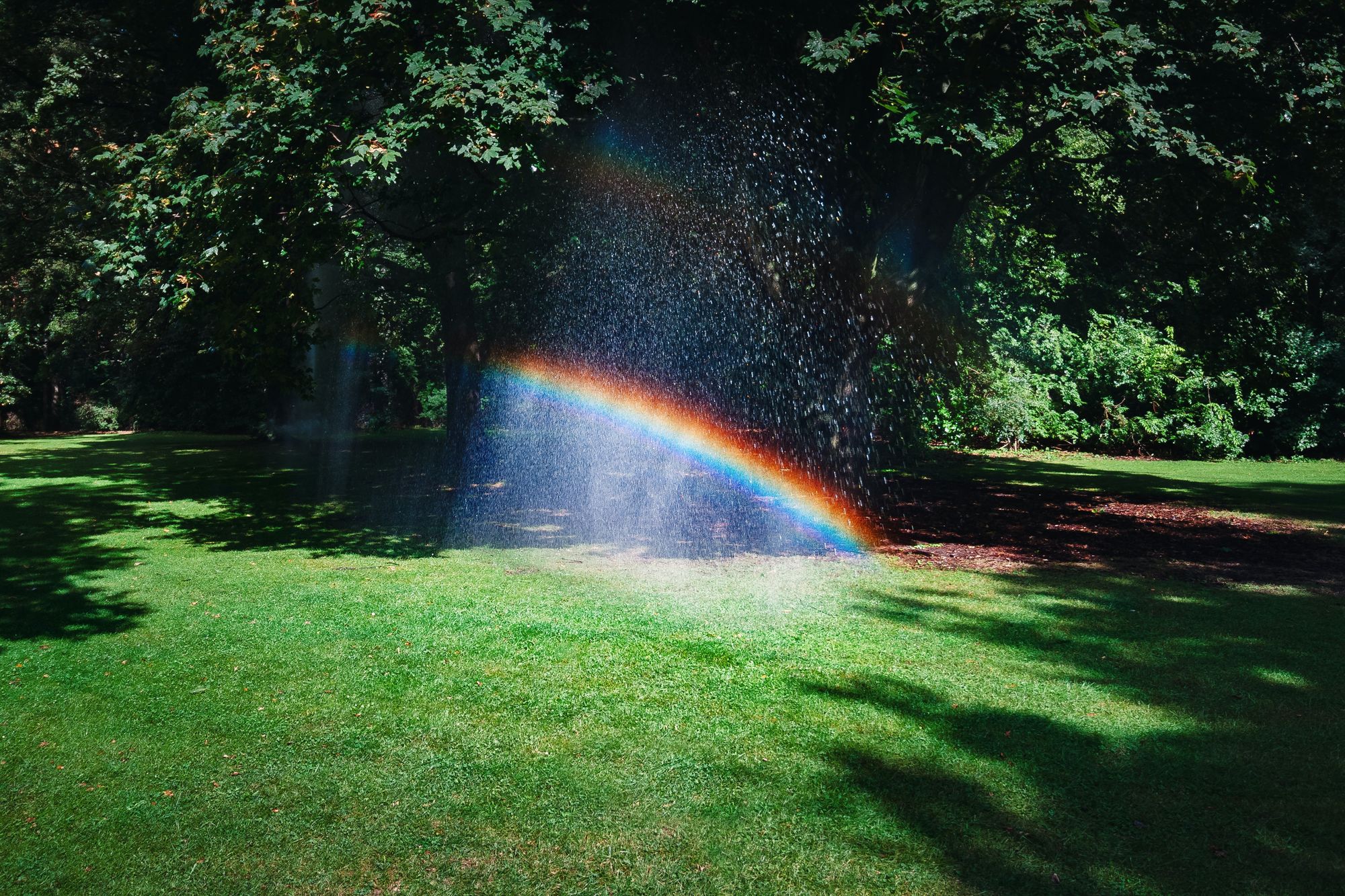
When I think of happiness, I think of rainbows and sunshine! So I already knew I wanted to create a radial bar chart and incorperate that "sunshine" happiness shape into my viz. At this stage, I planned out which fields I wanted as part of this radial bar chart.
The Outcome
Instead of sticking with the wide viz plan, I thought a long viz might work better so I switched it up last minute. This is what I presented at 3pm.
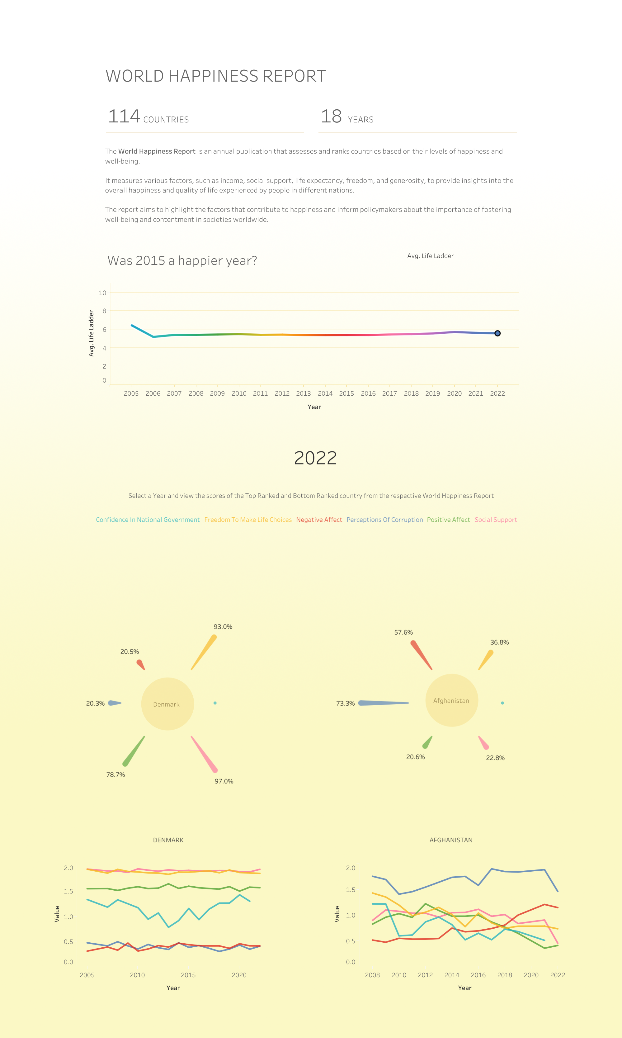
Overall, I wasn't very happy with my design. I found myself being very rushed for time, and I think the bottom part looks like a child just scribbled all over it! Also I ran out of time to format tooltips and I used red and green together which I'm really not happy about.
This has "re-design completely" written all over it! At least I tried to have fun with it and the "sunshines" came out okay :)
Final Thoughts
This may have been a miss, but I think it's symbolic of how much I'll miss training with DS39 and having Jenny as our coach! The final thing for today is to have our Hawaiian themed graduation party, so i'm excited for that. Aloha for now :)
(Also I'll update this blog with my re-designed version for comparision!)