


I’m someone who usually likes to slow down, relax and take small breaks when creating data visualisations. So when we were asked to complete a Makeover Monday challenge within just one hour, I was slightly nervous on how I would do, and if I would even finish…
That being said, I understand why we were asked to develop this skill.
As a consultant, you may encounter situations where the time you have available is very limited. In these situations, it is essential to best utilise your time, and prioritise your actions accordingly.


How did I find my first attempt of this challenge?
An hour flew by so quickly, while I was still deciding on which chart type(s) to use, colours, layout, how I wanted to incorporate interactivity into my viz…
It was a bit stressful, and admittedly, I wasn’t fully happy with my final design, but it was interesting to see what I could achieve within an hour. I'm also excited to see myself improve!


It’s not all about design…
Looking at this challenge from a client-perspective, let’s say you focused all your time on design, and your viz lacked on the analysis. Your visualisation might look impressive, but it won’t be useful to the client.
On the other hand, focusing purely on analysis, and putting little to no thought into your layout and presentation would also be ineffective – as the client may find your dashboard difficult to use and hard to derive analytics from.


...it’s about finding a healthy balance between the analytics and design.
The way I see it, you should prioritise your analytics, but still consider how you can present this in a clear and concise way.
Like everything, creating data visualisations within the space of an hour is a skill – will it be the fanciest visualisation? …Probably not, but practice makes perfect! And I hope to use this opportunity to explore more minimalistic designs for my vizzes – clear, concise and simple.


Feel free to join in and practice this skill along with us!
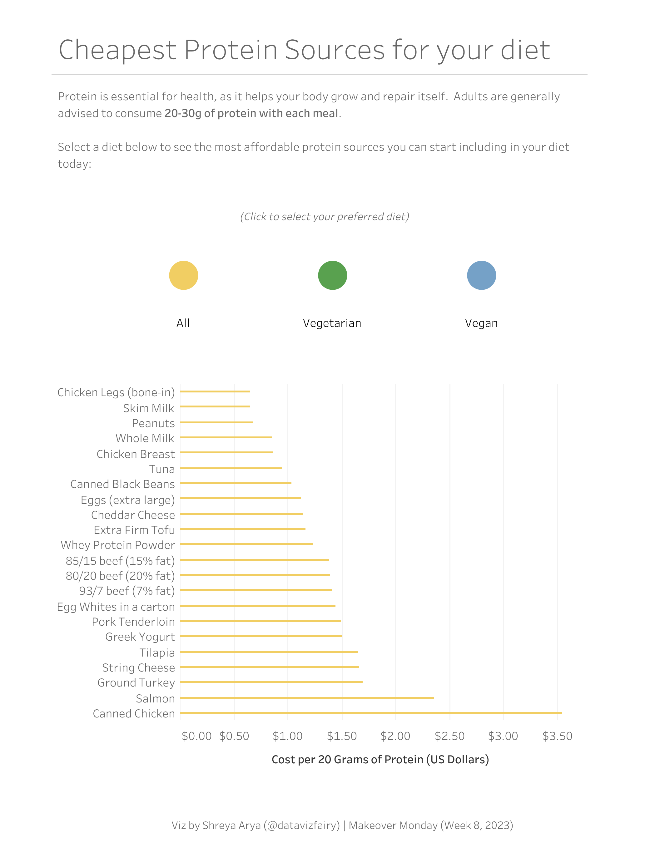
My cohort (DS39) and I recently completed the 1-hour Makeover Monday Challenge using the Week 8, 2023 “The Cheapest Ways to get your Protein” dataset.
If you don’t feel comfortable posting your 1 hour version on Tableau Public, that’s okay! If you’d like, you can try the 1 hour challenge just for yourself.
My cohort and I will be publishing our 1 hour versions on tableau public (no matter how they come out!), so you can follow our progress and see how we develop this important skill! Here’s my first attempt:


And who’s to say you can’t still practice making beautiful designs in your spare time? I plan to continue playing around with more creative designs through other #datafam community challenges also, so look out for those too! :)
Shreya Arya
Tableau Public Alteryx Community Twitter LinkedIn