


Today was Day 4 of Dashboard Week. Our challenge for today was to produce an explanatory dashboard about the Eurovision contest in Power BI, and we could only use PowerQuery for any data prep.
You can see Jenny's full brief for us here.
My experience with Power BI
Since we had only received one day of Power BI training (+ one self-study day!), I was curious how we would do. It seemed like a fun dataset though, so I was down for the challenge.
The Plan
There were a few datasets we could use for our explanatory story. The first thing I did was some data exploring! This involved checking out each dataset and understanding which fields they contained.
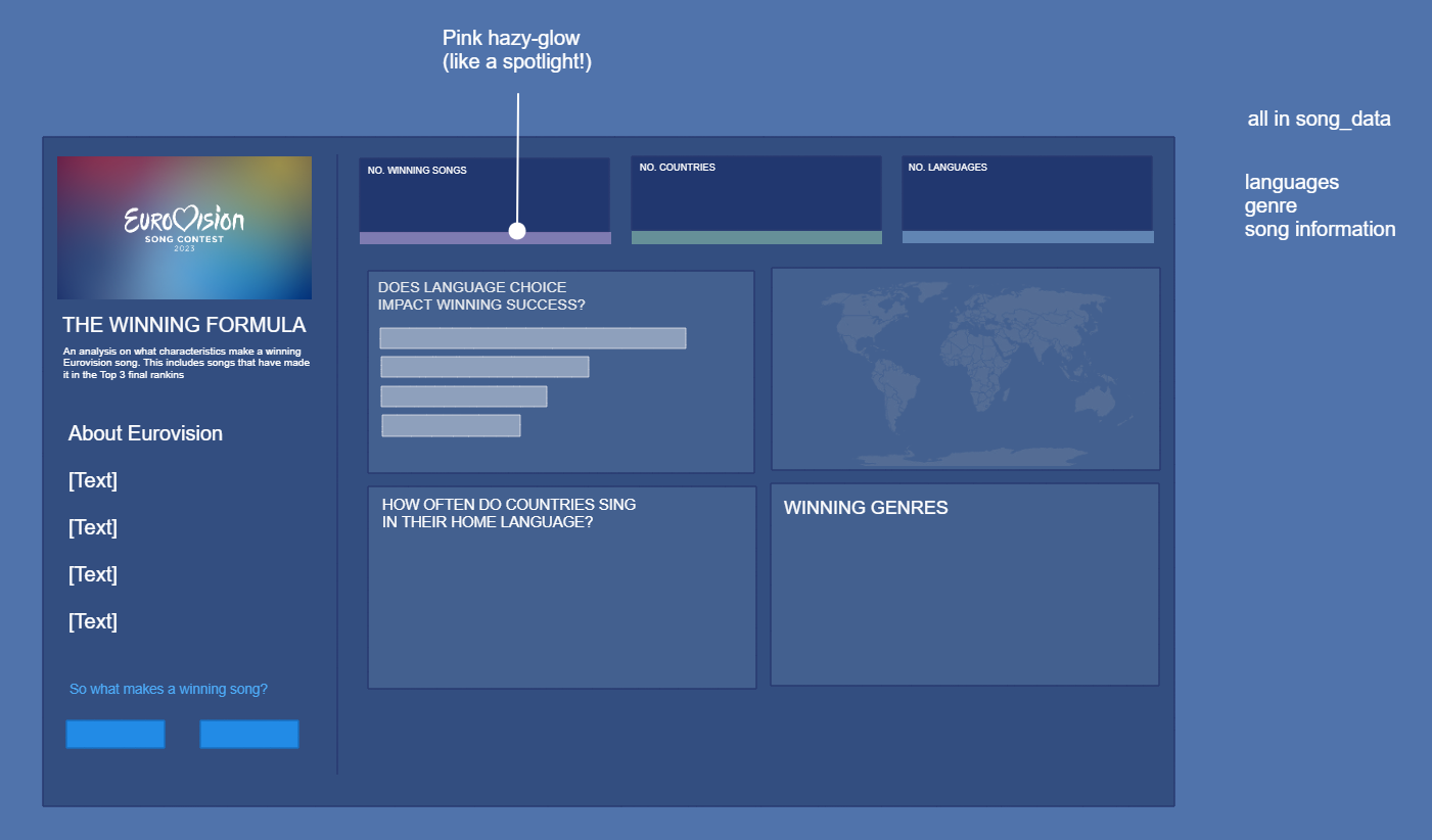
I then wanted to decide on where I wanted to go with my exploratory analysis, so I jumped into Exalidraw to build a plan. From this plan, I knew all the data I needed was in the song_data.csv.
Outcome
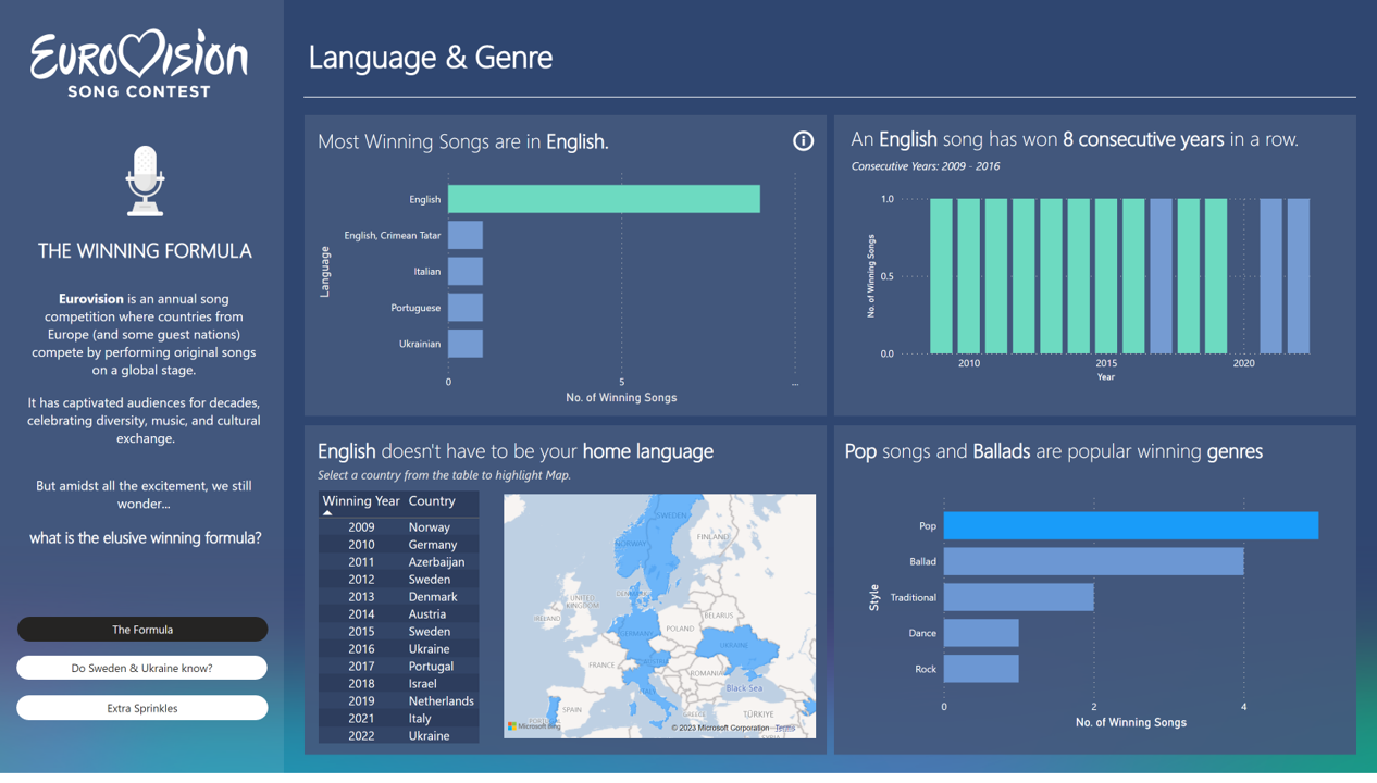
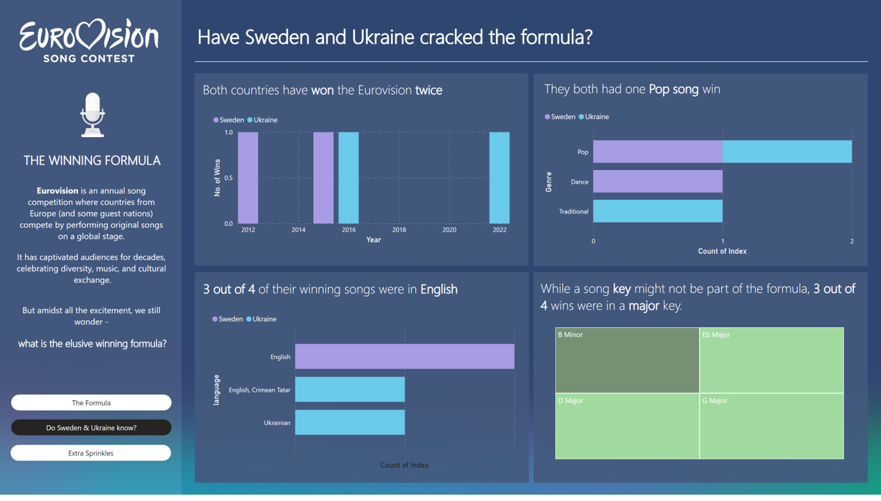
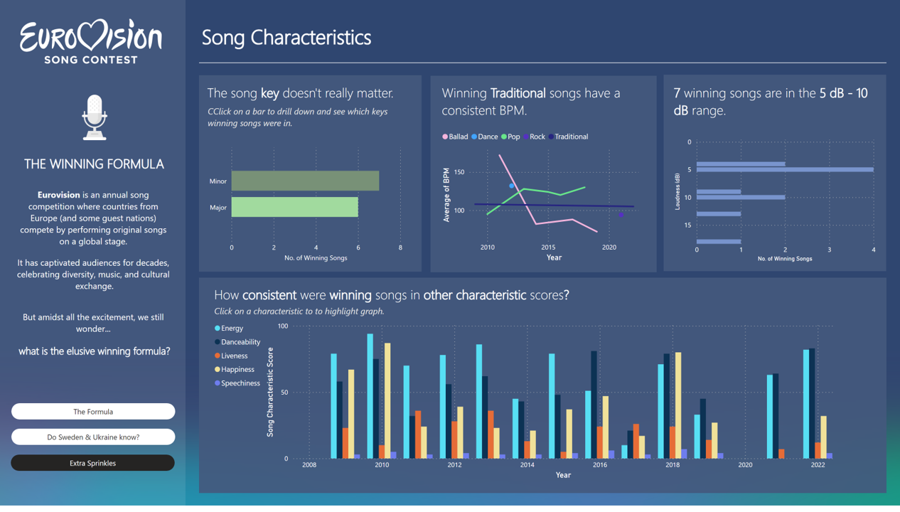
This is what my final dashboard / report looked like. I probably didn't need the "Extra sprinkles" page, as the story doesn't need all that extra stuff.
I finished early, and for some reason, wanted to try visualise everything, so that page was slightly rushed. Apart from that, I think it came out pretty cool!
Final Thoughts
I'm really happy with what I was able to create within the time! I think it's a nice design too. If I had just one piece of advice for myself in the future though, it would be:
"It's okay if you finish early. You don't have to keep adding more and more / visualise everything. Sometimes the story is already complete :)"