


Colour is a powerful and effective tool to use in data visualisations. However, not all colour combinations are considered best practice. I've listed two colour combinations I always try to avoid using together, along with my reasoning why.

#1: Red and Green
Reason: Accessibility
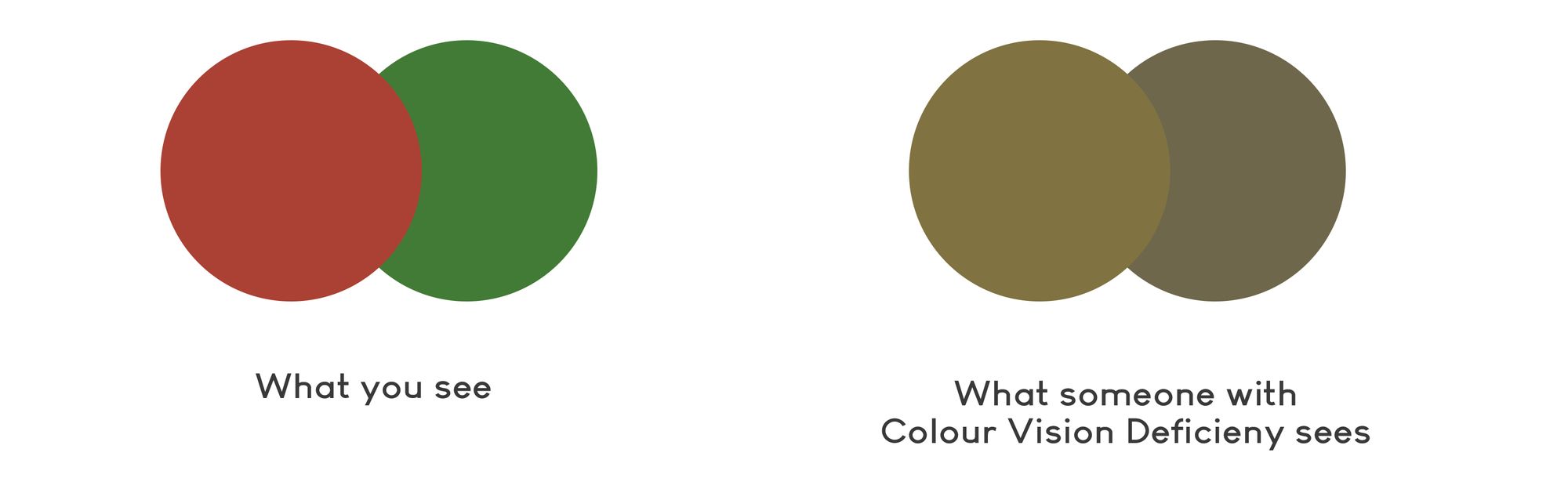
Using red and green together in a visual design isn't usually best practice... and here's why. These two colours may look strikingly different to people without colour blindness, but to someone with - these colours look very similar, and it can be very difficult for them to differentiate between the two.
When it comes to visual design and knowing your audience, it's always best to be inclusive and use colour palettes that everyone can easily view. After all, in data visualisation, our primary goal is to convey information in a visual and easy-to-digest way, so it's important that our visualisations remain accessible and clear to read by all.
There's a great Chrome extension called Spectrum that I use to test if my vizzes are accessible before posting. When activated, it changes the colours of my screen to stimulate what someone with colour blindess would likely see - it's been really helpful, so definitely worth checking out if you're interested!
But essentially, that's why red and green is a colour combination I try to avoid using together.


#2: Pure black and Pure white
Reason: Eye strain
On the topic of readibilty, pure black (#000000) and pure white (#ffffff) are also two colours you should avoid using together. The contrast created by these two colours together is very intense - imagine you're in a dark room, and someone shines a torch in your eyes - it feels uncomfortable, right?
The way around this is to deviate ever so slightly from pure black and pure white when selecting a colour. When you use these shades, it looks a lot more visually pleasing (and in my personal opinion - more elegant too). As you can see from the image below, it's a very subtle, yet powerful difference.
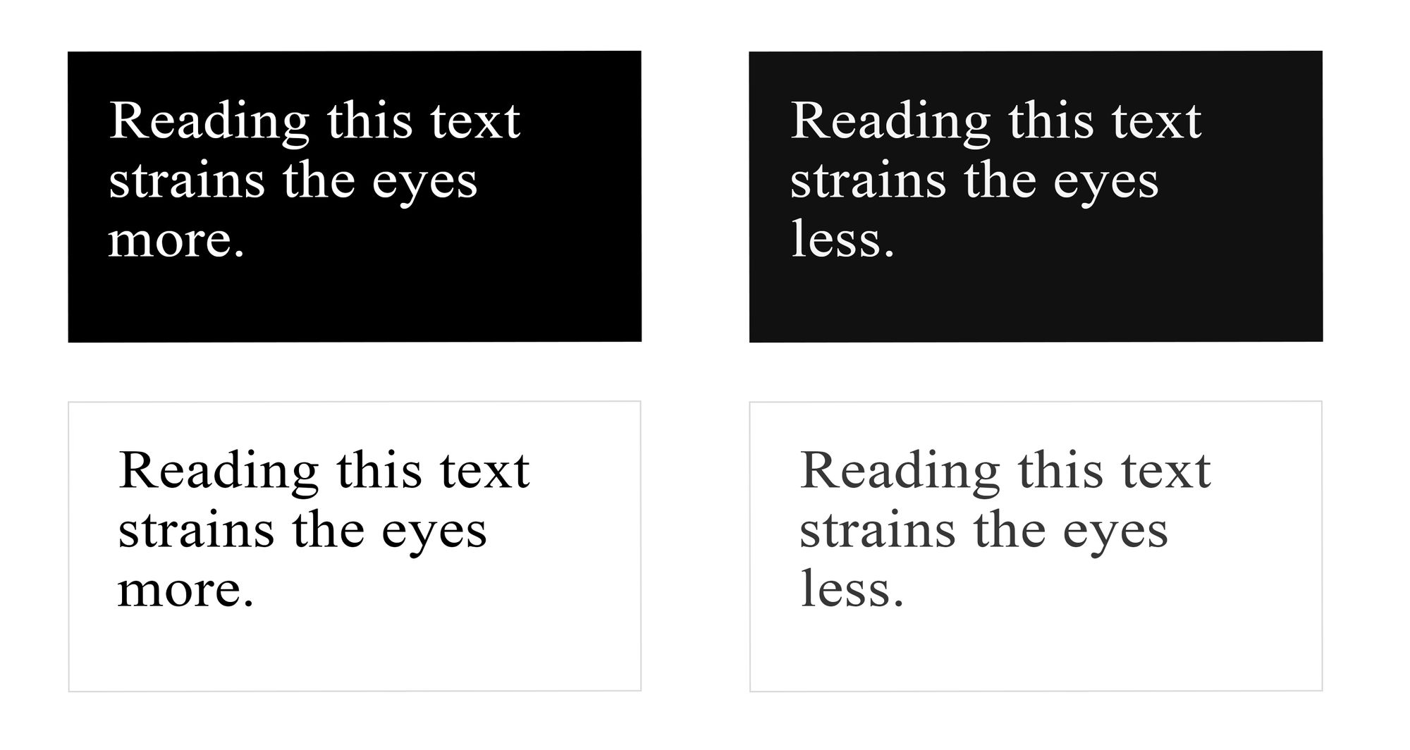

Top Left (Background: #000000, Text: #ffffff)
Top Right (Background: #111111, Text: #f6f6f6)
Bottom Left (Background: #ffffff, Text: #000000)
Bottom Right (Background: #ffffff, Text: #111111

I'm sure there are other colour combinations I have missed, but these are the main two that always come to mind. Just try to be a bit more careful when using these colours!
