


What is a Lollipop Chart?
A Lollipop chart is essentially a bar chart with a shape at the end of the line.
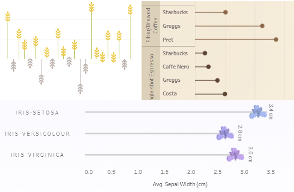
Here are a few examples of lollipop charts I have built on my Tableau Public. Since you can customise the shape at the end of the line, you can be really creative when it comes to building lollipop charts :)
This is a beginner-friendly guide to building Lollipop charts in Tableau, that will walk you through each stage of the process 🌸
Here's how to create one...
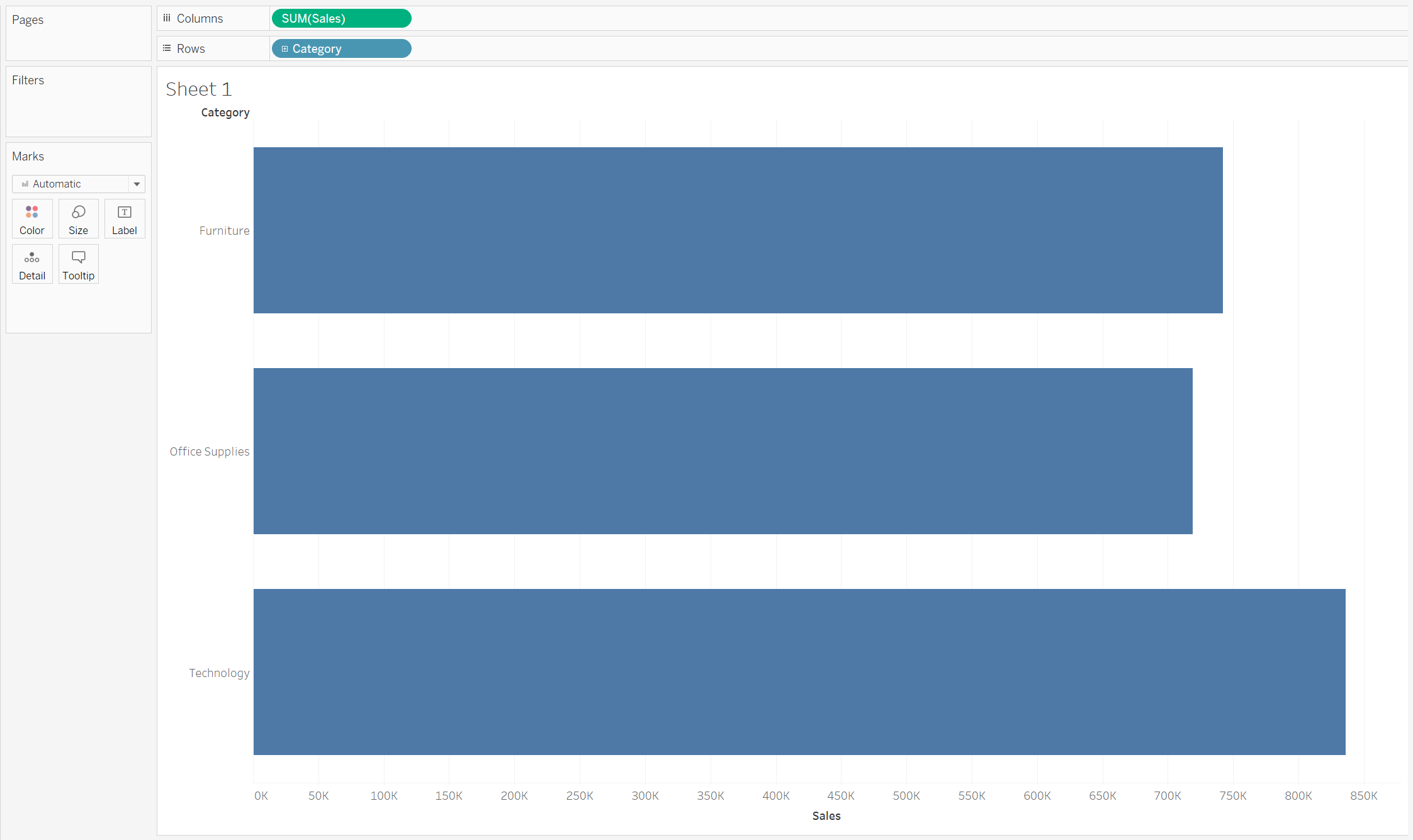
Step 1: Start with regular bar chart
To create a bar-chart, we'll need a discrete field (blue pill) and a continuous field (green pill) on your Rows/Columns shelf.
In this example, I'm using Sample - Superstore and I'm looking at Sales by Category.
I've put Sales onto Columns and Category onto Rows.
I have also changed the fit of my worksheet from "Standard" to "Entire View" so the bar chart fills up the entire space.
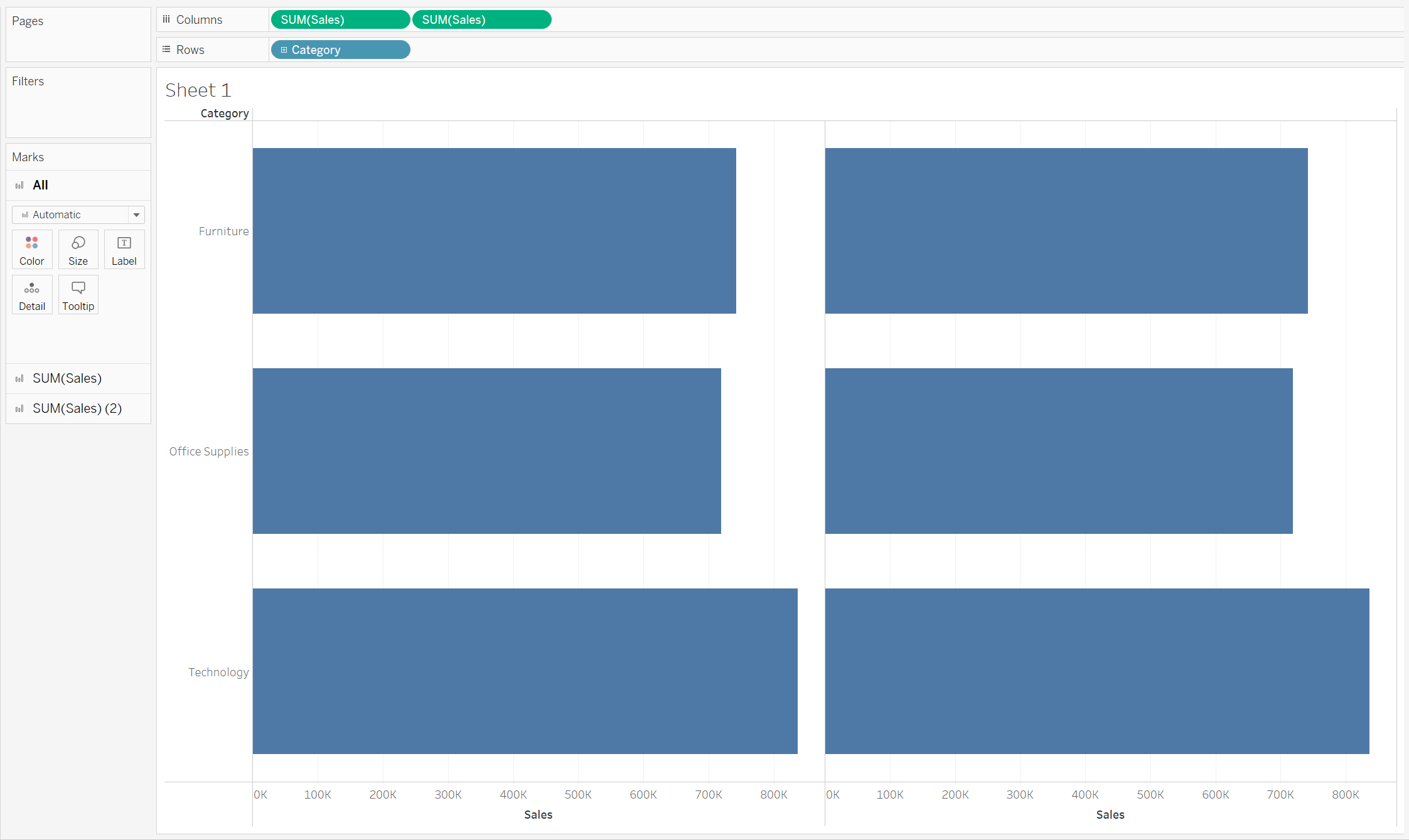
Step 2: Duplicate the bar chart
Now, we want to duplicate the bar chart.
To do this, drag the same continuous field (e.g. SUM(Sales)) from the Data Pane onto the Columns shelf, so you have two green pills next to each other.
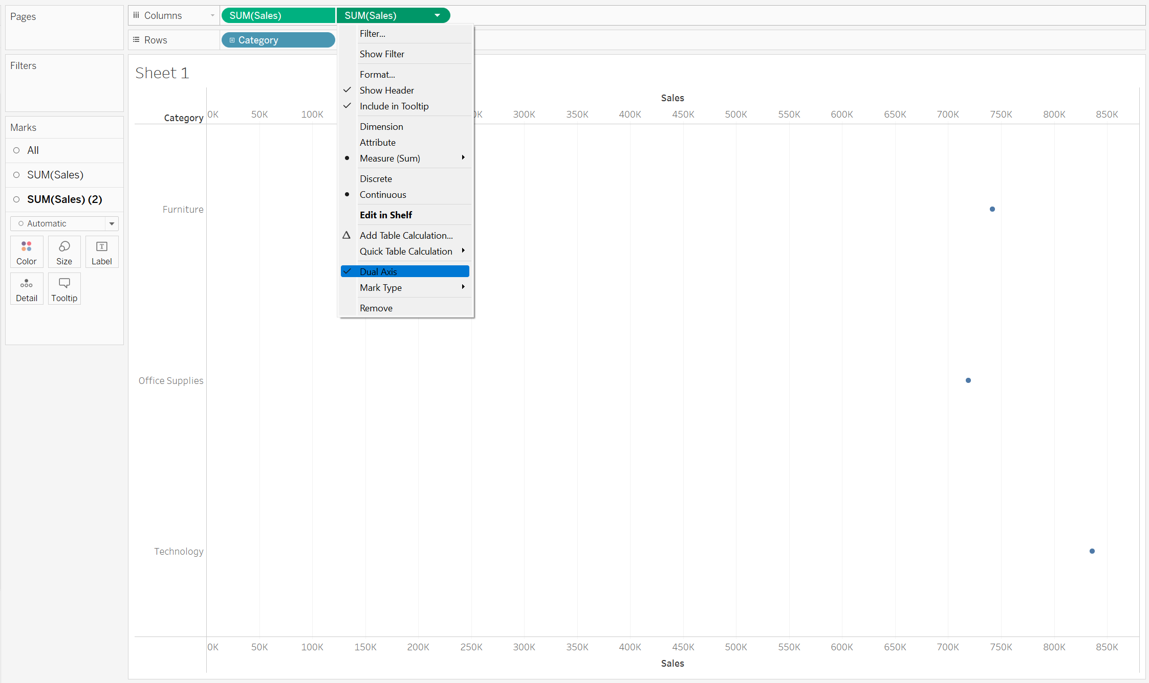
Step 3: Dual-axis
Dual-axis allows you to display two measures, with distinct axis, onto the same chart. This can be really helpful, when it comes to making comparisions.
Right-click on a green pill in your Columns shelf and select "Dual-axis". In this example, this would be any SUM(Sales) field.
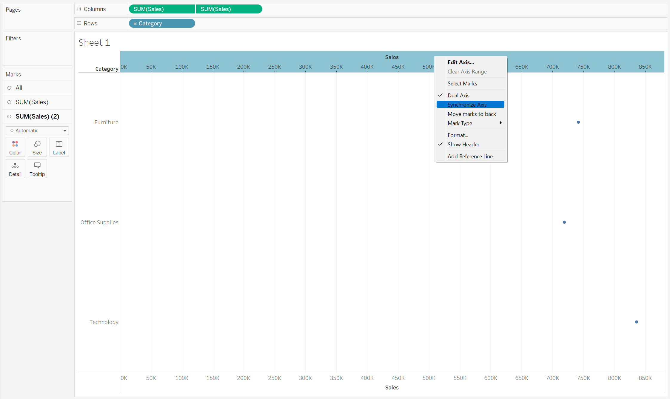
Step 4: Synchronise axis + remove header
We now have two Sales axis on our chart. One at the top and one at the bottom.
Right-click on the Sales axis at the top and from the menu select "Synchonize Axis".
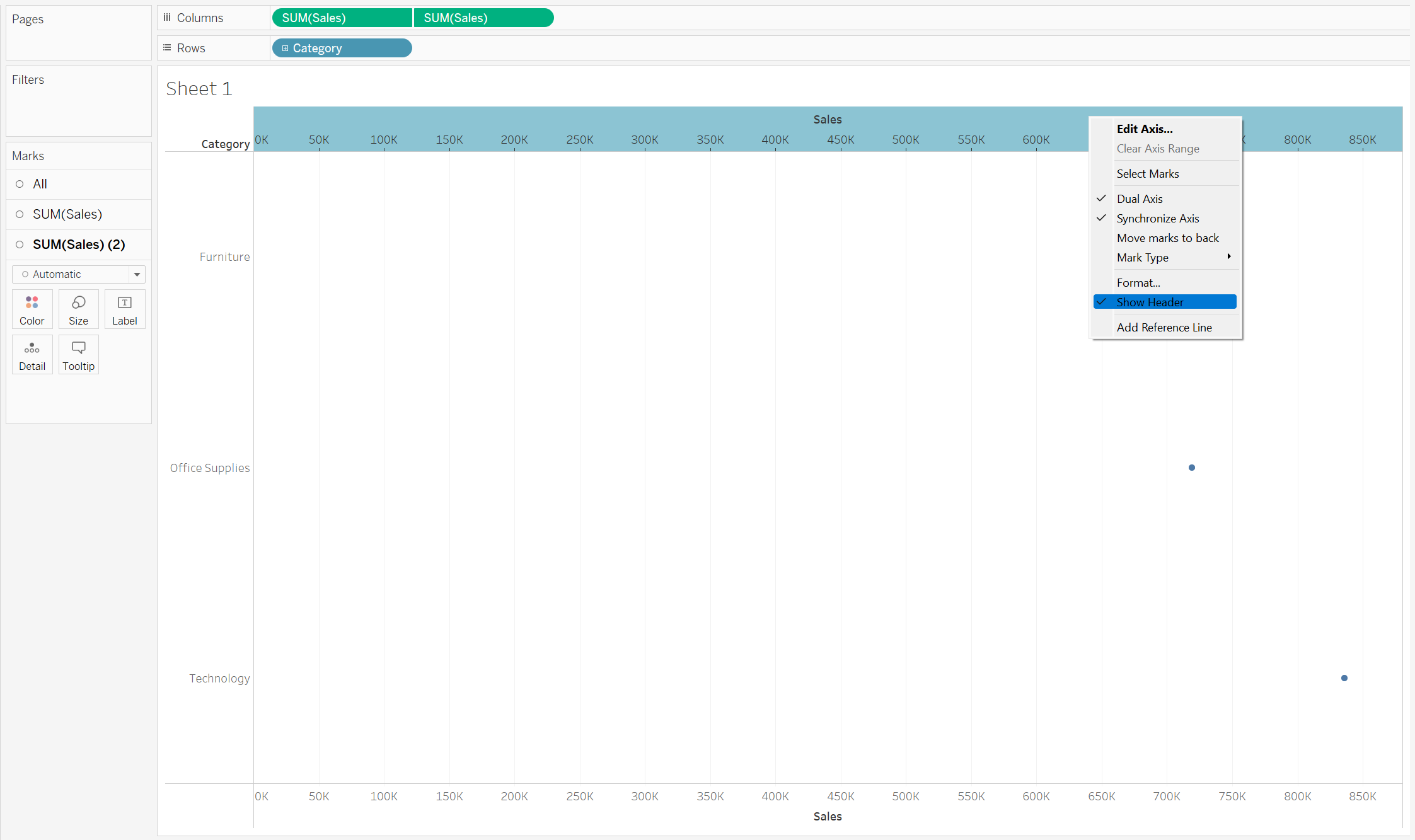
Now that our axis are synchronised, we can hide the upper axis to make our chart look neater.
To do this, once again right-click on the the Sales axis at the top and this time, de-select "Show Header".
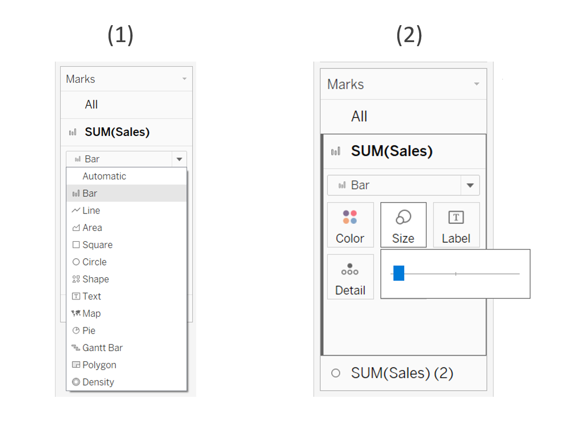
Step 4: Create your lollipop (Shape) and your stick (Bar Chart)
Awesome, now let's start fashioning our Lollipop chart. Our Lollipop chart is comprised of two separate Mark Types. One will be a Bar-chart, and the other will be a Shape.
Now, in your marks card, you should be able to see two separate sections. One for SUM(Sales) and one for the duplicate, SUM(Sales) (2).
(1) Start by clickling on SUM(Sales) in the Marks card, and change the Mark Type from Automatic to a Bar.
(2) Then to create the "stick" of our lollipop, click on the Size card and reduce the width of the Bar using the slider.
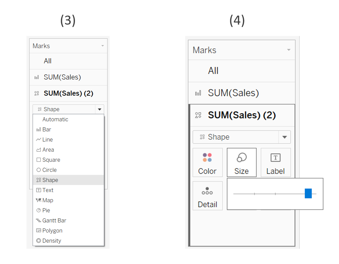
(3) Now open the SUM(Sales)(2) Marks card. Change the Mark Type from Automatic to Shape.
(4) To make our lollipop head bigger, click on the Size card and increase the size of the Shape using the slider.
🌸 Step 5: Customise your lollipop futher!
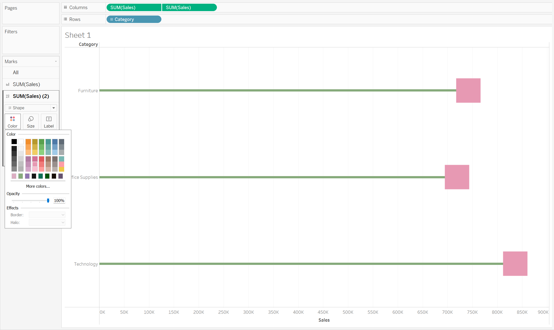
Colour
To customise your lollipop futher, you can play around with the colours of your Bar and Shapes by clicking on the Colour card in the Marks card.
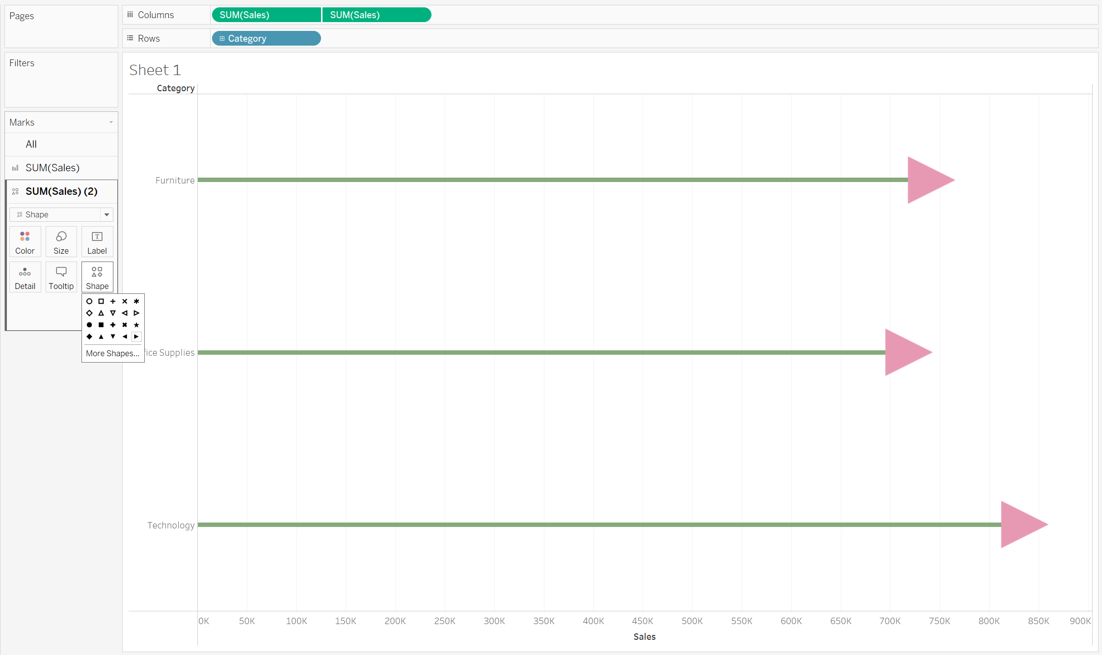
Shapes
You can choose between a variety of pre-existing shapes within Tableau to style your lollipop head. To do this, click on the Shape card in the Marks card.
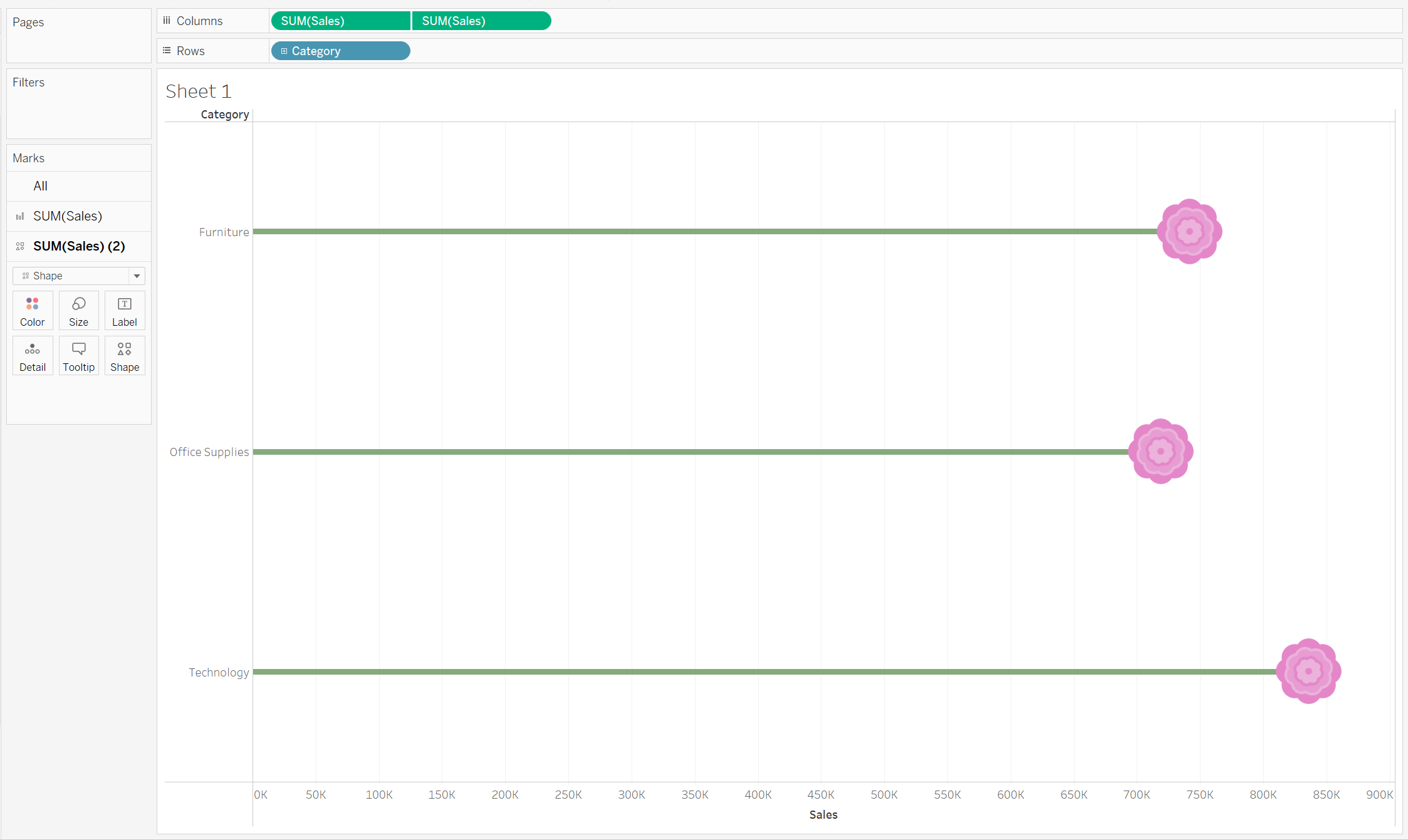
If you're looking for something more creative, why not import a custom shape into Tableau and use that instead? :)
How to add Custom Shapes into Tableau Desktop
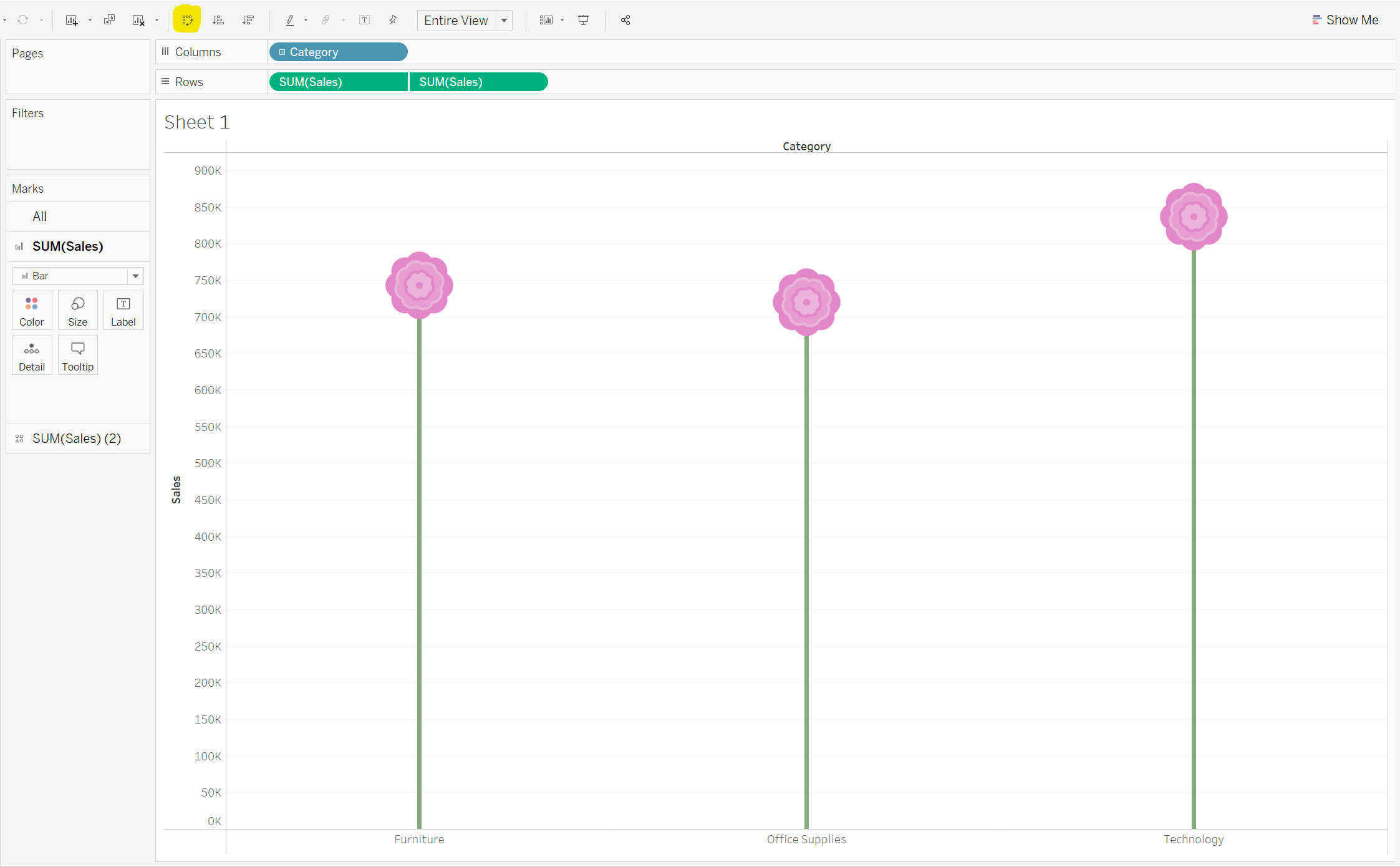
Orientation
You can even play around with the orientation of your lollipop chart by using the Swap Rows and Columns button on the top toolbar (highlighted in yellow).
Final thoughts on Lollipop charts
I love the creativity that Lollipop charts can bring to a visualisation.
They're a nice alternative to a simple bar chart, whether that be for creative, fun visualisations, or otherwise for use in professional settings. They're versitle. It all comes down to how you choose to style them :)
Feel free to connect with me on Tableau Public, LinkedIn or Twitter.