


After a full week of Tableau Time and learning about data visualization best practices, its made me view my initial application a lot differently. There are a lot of changes, whether big or small that I could implement in my dashboard which made a world of a difference in user efficiency and interactivity.
Lets start with the title – I made this on a third party website and inputted it as an image and I did really like the pop it gave so I decided to keep it.

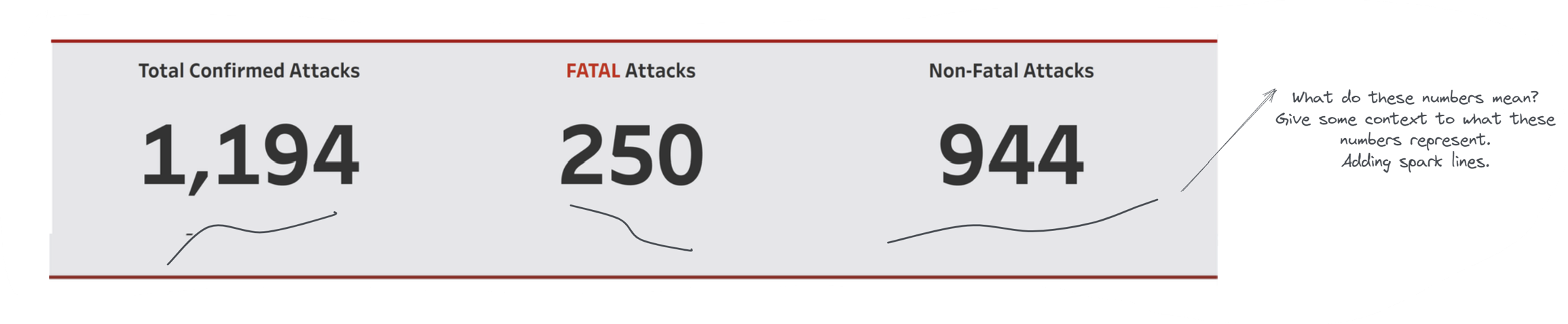
KPIs:
Moving onto the KPIs, these KPIs show the number total, fatal and nonfatal attacks over the years, however, they don’t show any context. What do these numbers really mean? Is 1,194 a low number or a high number?
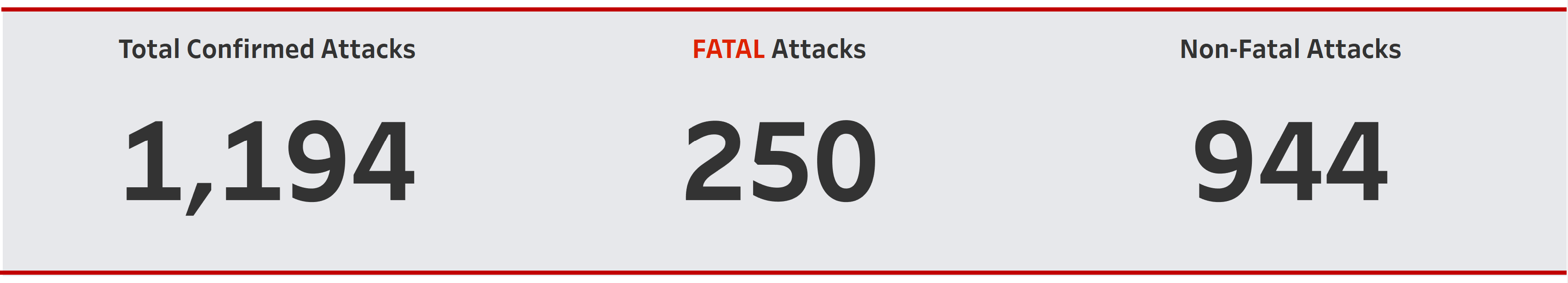
Initially I wanted to do a comparison to previous years for example a percentage increase, however, since this is an analysis of almost 500 years, we cant do that. That’s why I decided to go with spark lines to show the trend of that particular KPI over the years. And with that, we get some context – even though overall attacks have increased, there is a decrease in fatal attacks.
Titles:
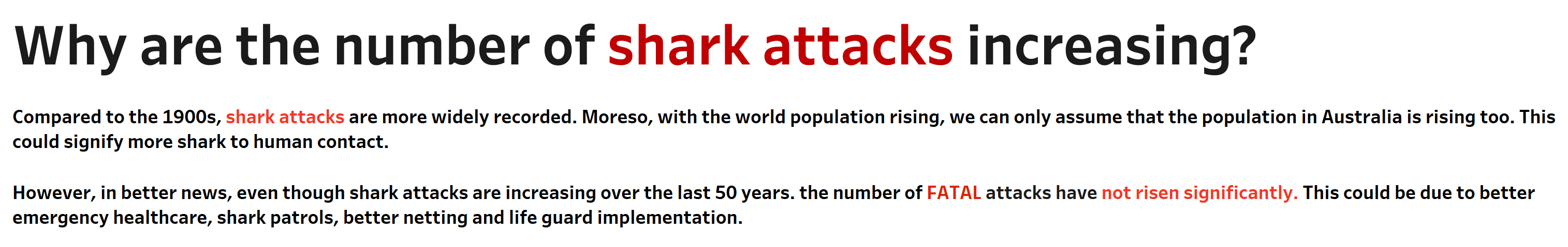
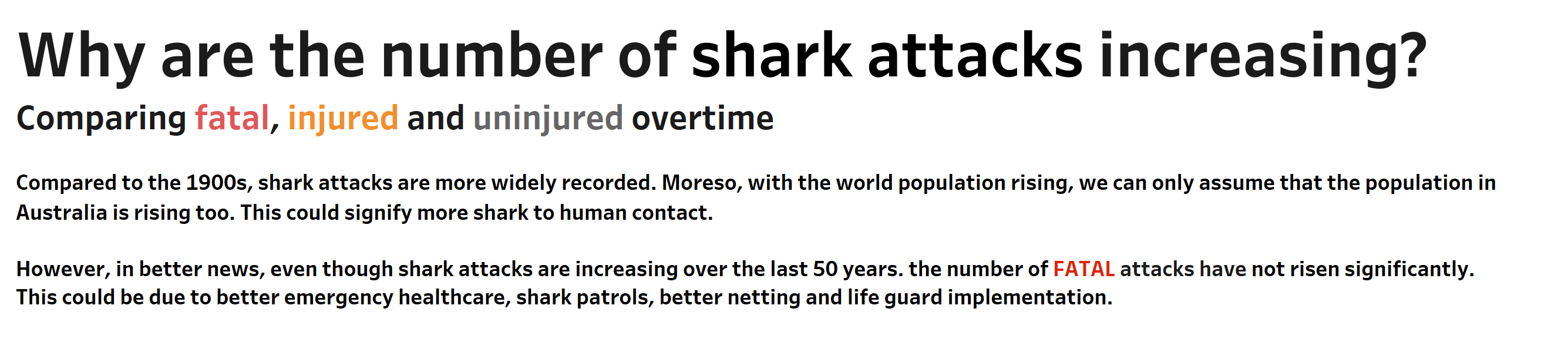
Moving on to the first graph of the viz – the first thing I'd like to point out is the misuse of colors in the title. Throughout my dashboard the color red has been associated with fatal attacks, therefore to highlight important aspects of the title and description in red was a misuse of color.
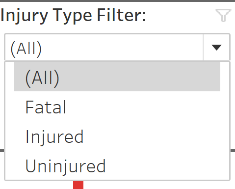
I have also taken out the legend of color and embedded it into a subtitle whilst removing all other color. However, I have kept the filter in and would like to have applied that filter to the entire worksheet so it could reflect the later part of my viz.
Timeline Graph (Bar Chart):
I have kept my timeline graph the same, the bar chart but I decided to give it more context. There are multiple reasons that the number of shark attacks could be increasing which are stated below. However, I wanted to add another two datasets which would help to those numbers and the trend more context. For example, I wanted to add a population dataset of Australia and input a trend line to show the viewpoint of population rising, which would mean by default, that shark attacks could be rising as well.
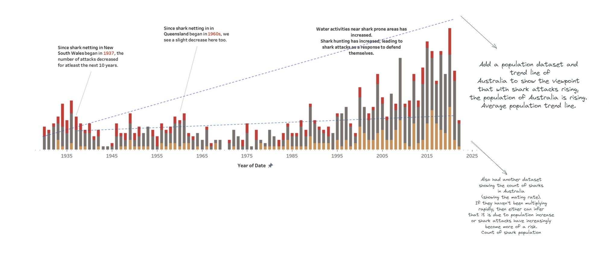
To give it another angle, I wanted to also input another dataset above of overall population of sharks in Australia. How fast have they been mating or multiplying? With the second trend line inputted, the graph could show that as population of people in Australia has increased and the amount of sharks has increased, the likelihood of an attack is much larger. However, if the trend line of number of sharks didn’t increased exponentially, there could be a problem there.
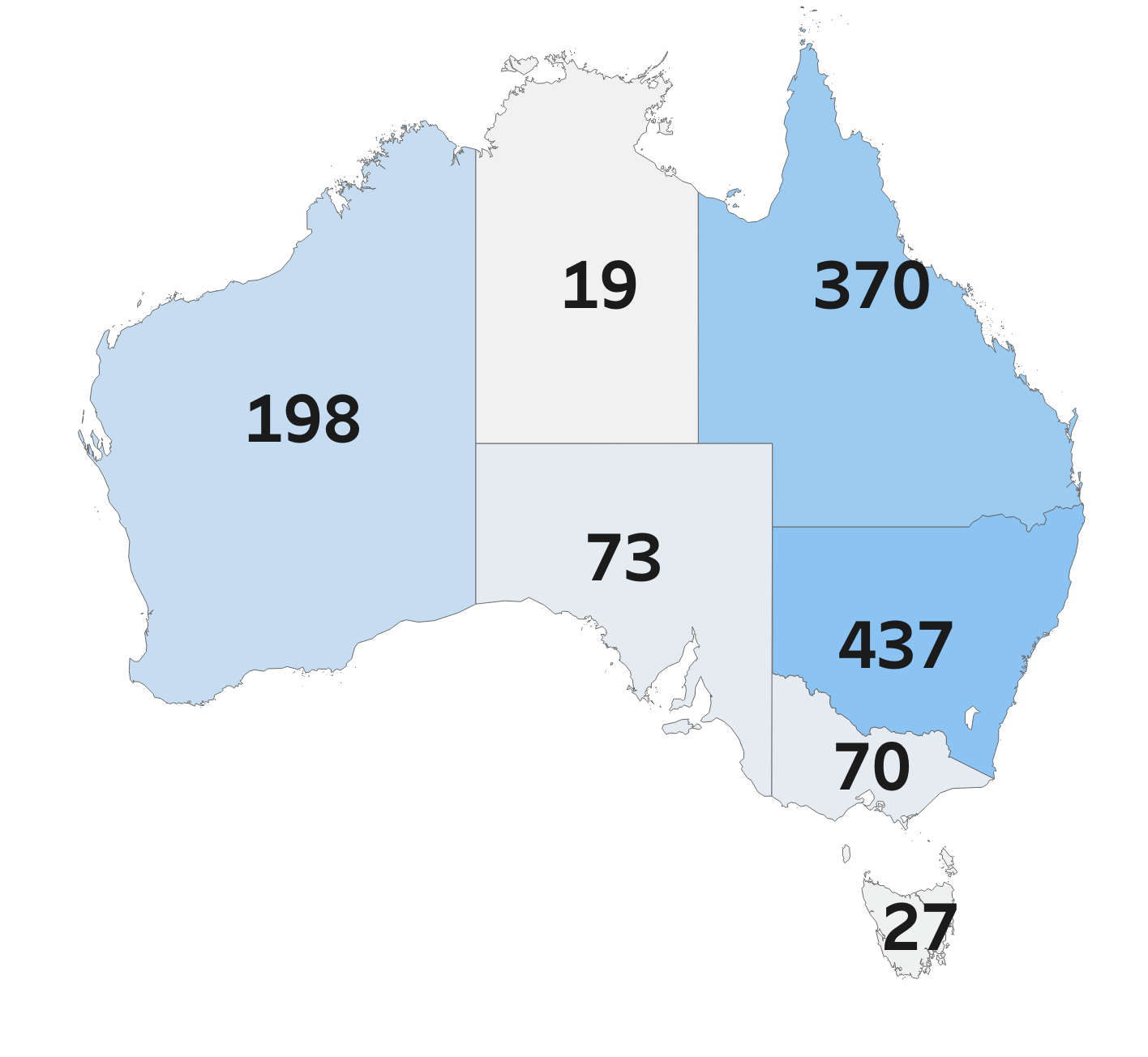
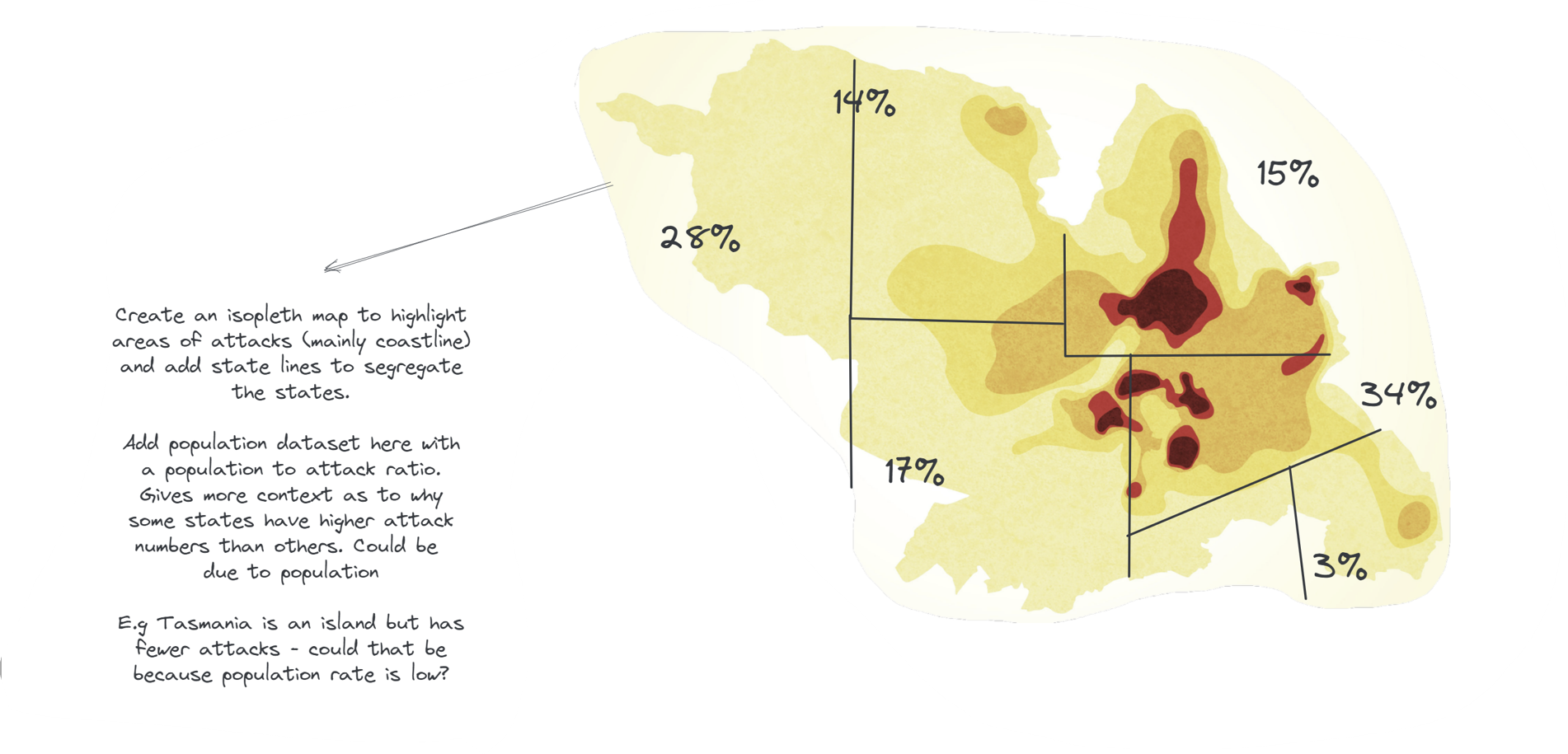
Map:
Now we move on to my map, which for me was just a basic graph using numbers and colors to denote the count. I would like to change this to an isopleth map showing heat where the count was high. Add state lines to segregate the states and input the population dataset here with a population to attack ratio in percentage. This gives a bit more information as to why some stats have high attacks numbers than others. For example, shark attacks only happen on the coastline and Tasmania is an island, so why are the numbers so low for Tasmania? Population could be a factor.
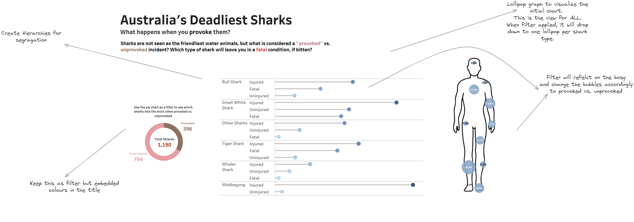
Pie Chart, Lollipop and Body Graph:
In my interview, I was told it is always better to visualize data rather than a chart so that's what I decided to create with the lollipop graph. I used hierarchies for user ease and sorted it for better understanding. The blue color reflects the filter 'All' but if fatal/non-fatal or provoked/non-provoked filter was applied, the circle color would reflect that.
I kept the pie chart the same as it was a nice touch to have a chart and a filter together as well as the body chart.
Moreover, I have also embedded the color legend into the description below so my dashboard doesn't look so cluttered.
To summarize:
- Context in dashboards are very important - whether it be KPIs (referencing what those numbers could mean) or adding more datasets to make the current dataset make more sense. It helps for the user to infer more analysis when comparing data with other data.
- Color is very important to deduce information or understand information and that is why I have decided to amend the positioning of colors in my viz.
- There is room for improvement even at this stage; over complicating the timeline bar graph is a problem that I can see in my revised viz. Perhaps can make two different graphs close to each other to see the trend lines in population of people and sharks instead of having it in one.