


Today we were given the task or analysing Real World Fake Data Season 2 where our cohort was divided into 4 categories analysing either the financial overview, citizen service requests, emergency calls or diversity score card. I chose to do diversity as I thought I could derive some interesting insights from the dataset.
It was a relatively small dataset with little to no data cleaning/prep at all, which was a nice break from the past couple of days. I wanted to dive into different categories of the business that diversity could play a part: job level/position, time at the company, performance and satisfaction with the company on their diversity policies. This was my initial sketch which only had one dashboard, however, I ended up doing 2 so the dashbord doesn't look to cluttered.
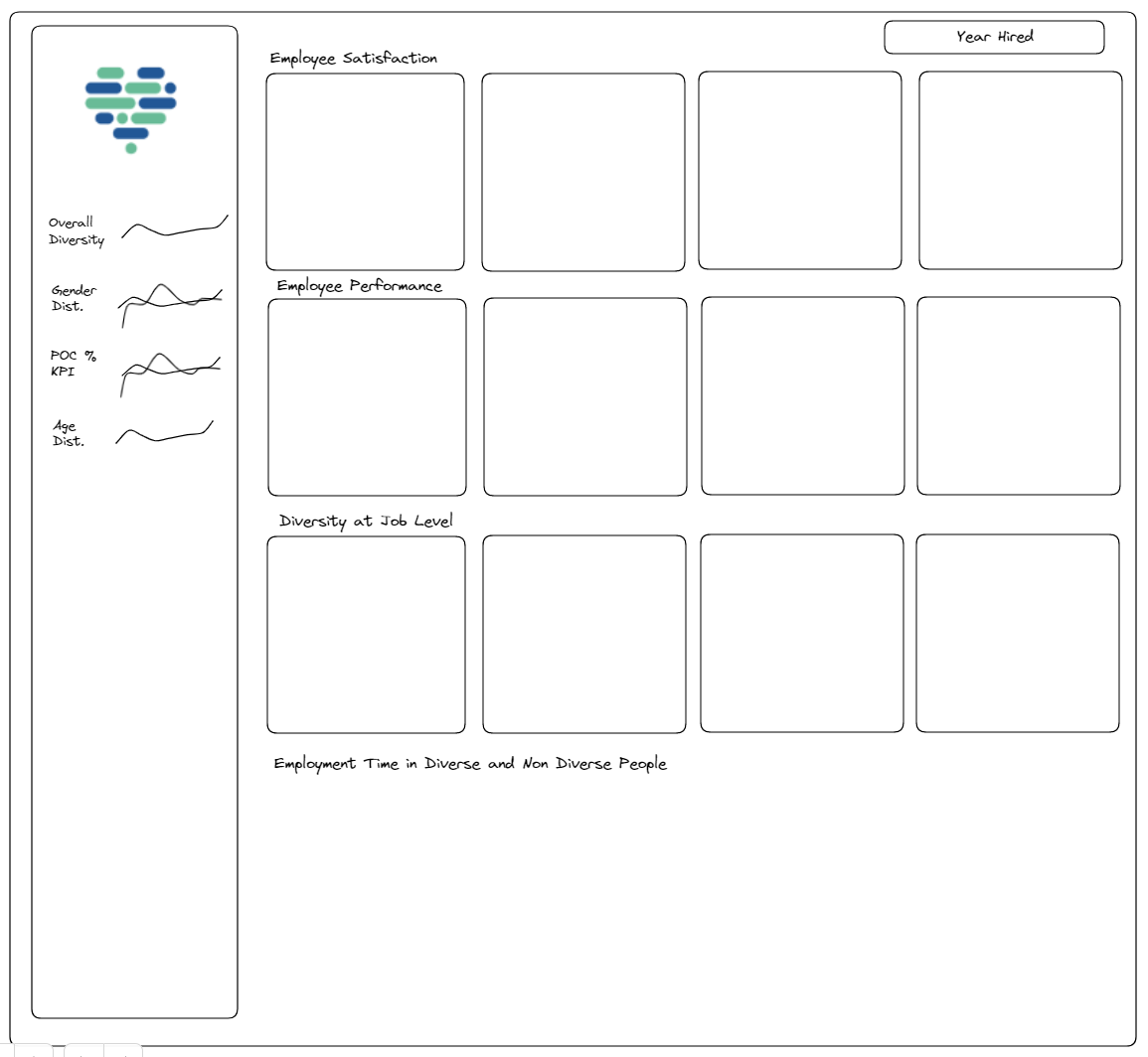
I decided to do many KPIs with this dashboard with sparklines to show trends overtime which was something I hadn't explored yet within Tableau. I do believe KPIs are the best way to grab someones attention regarding businesses - they instantly know whether or not something is good, bad or average.
I also wanted to explore futher but unforunately didnt have the extra data to do so. I wanted to explore Promotion Rates in females and in people of colour that would be broken down into different races. I also would have liked to check the affect of diversity projects - when are they implemented and are there any correlations between hiring and the implementation of diversity programs.
Other than that, I think I covered some good grounds and did some good analysis to cover a lot of information.
Check it out on my Tableau Public! Link: https://public.tableau.com/app/profile/sherina.mahtani/viz/DiversityScoreCard/SatisfactionvsPerformace?publish=yes