


It may have been a very straightforward and logical lesson, yet somehow it's the small details that slip the mind.
After my first lesson in data viz and essentially what is dashboard psychology, I learnt some neat tips and tricks to make a dashboard more efficient, user friendly and in need of less guidance when navigation through a viz.
- Eliminating the use of filter legends by embedding the colors in the title, subtitle or description.
In my final application dashboard, I had highlighted the word 'shark attacks' in red which was also the color I had chose for fatal attacks which could be misleading.
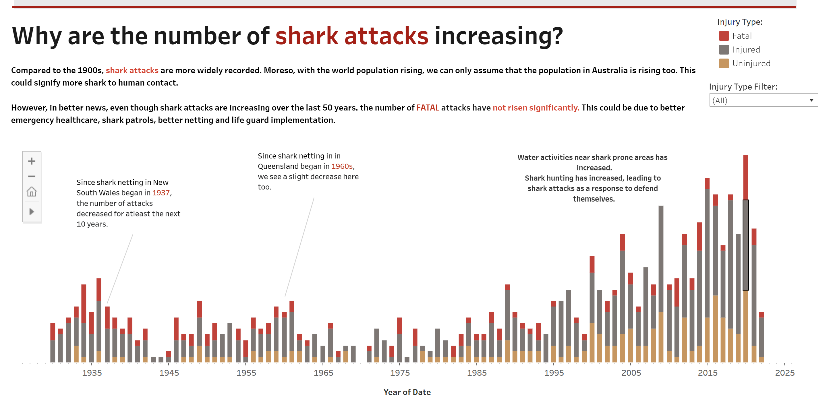
2. Furthermore, the above picture shows the general trend of shark attacks over the years, however, it doesn't give an accurate representation of whether or not fatal attacks have increased or not. Some navigation tools would help the user here to identify the trend.
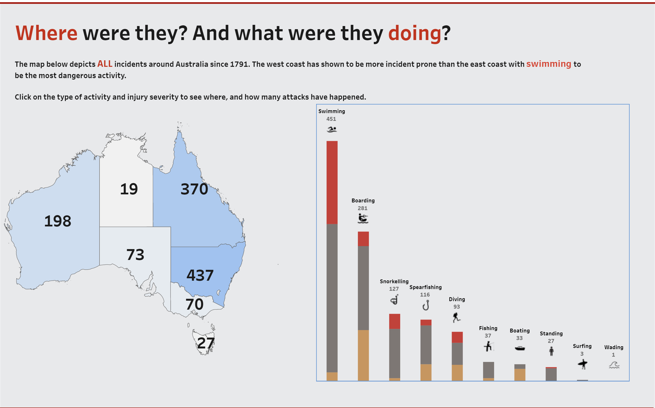
3. Lastly, I was reminded of the importance of additional data to support the existing dataset in the viz. For example, in the map below, the user could be misled to thinking that most of the shark attacks happen on the east coast - that may not necessarily be the case. It could be due to the higher population on the east coast than the west coast. An addition of the population of each state in Australia could be helpful to the user and perhaps a percentage of population vs. attacks to see the ratio clearer.
It is the small details that can make or break a viz and it good to go back to the basics and build a solid foundation before trying to learn more.
Sherina Mahtani
Ds37