So as week 9 comes to a close for DS35; a week we spent completing a client project as well as teaching the public some Tableau and Alteryx in an event called 'learn what the data school learns' I wanted to impart some of the tips and tricks I picked up while preparing to teach this very topic.
1) What are horizontal and vertical containers?
So in simple terms a horizontal container allows you to stack things side by side and a vertical container allows you to stack things on top of each other.
Ok this sounds simple at first but why do the icons for these containers not make any sense?
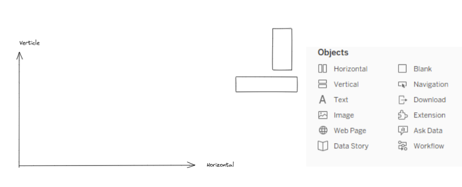
If your anything like me the icons used to denote the respective containers are extremely annoying. Why are there 2 vertical rectangles denoting a horizontal container and 2 horizontal rectangles denoting a vertical container, its maddening!
That is until you have that eureka moment and realize that the Icons show:

You can also imagine this as booked stacked on top of each other inside a container:

Ok so now we've established what the container do and why they have the icons they have lets get into some tips and tricks when dashboarding:
1) Make Your First Container the same dimensions as your dashboard
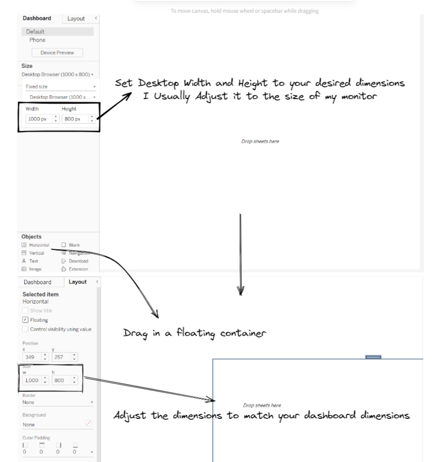
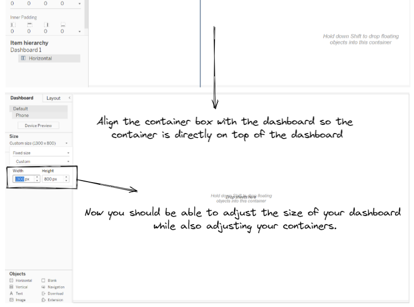
Doing the above will allow you to not have to worry about having to resizing your dashboard later on and having to go through the hassle of resizing everything else as the everything within your initial container should now automatically change with your dashboard size.
2) Fix your containers with blank sheets (this is probably the most important piece of advice I can give you!)
When you first drag in a container to the dashboard canvas whether it is a horizontal or vertical container does not matter until you start placing things inside it!
How you place your next few objects inside that container will determine its behavior e.g.
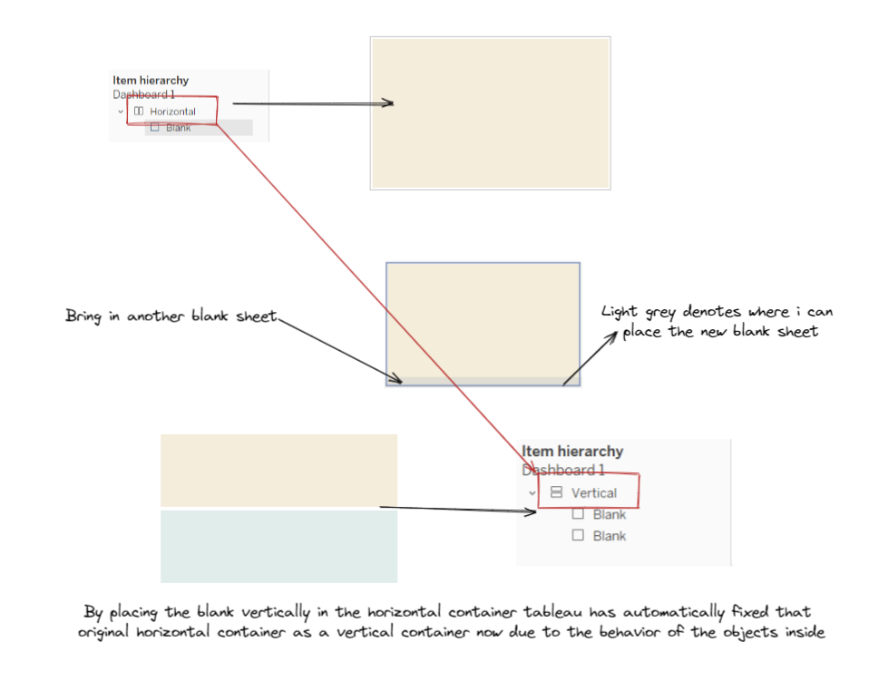
In the above example I had a horizontal container with a yellow blank sheet inside it - at this point as there is only one object inside the container the behavior of the container is still in 'limbo'.
Once I drag in the second blank sheet (the blue sheet) inside the container and place it inside below the yellow sheet as the objects are now stacked on top of each other the behavior is now locked in within tableau as a vertical container.
You can see the red arrow show tableau automatically change the container from a horizontal to a vertical within the item hierarchy. This container can no longer be changed now and will remain a vertical container.
Using blank sheets like this to fix the behavior of your containers not only is invaluable in making sure you have the correct containers in your hierarchy but is also extremely useful in acting as a guide as to where you place your sheets inside the container.
3) Padding - Use padding to put some space between your containers/ worksheets
I've seen a lot of people confuse themselves over the difference between inner and outer padding hopefully this diagram I've made below helps you understand the difference:
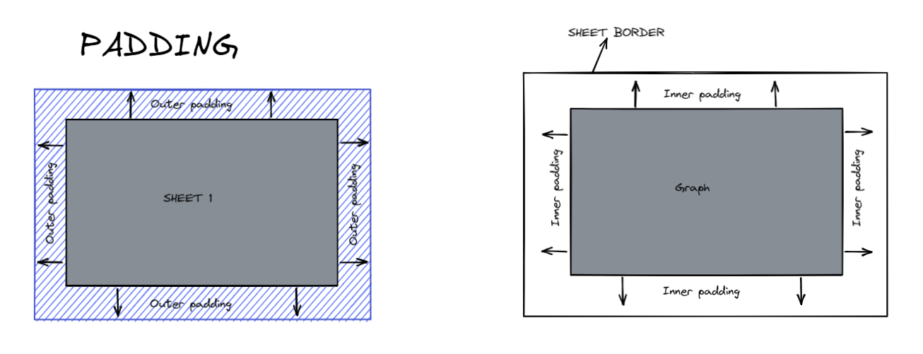
Outer padding: the distance between your sheet and everything outside the sheets border
Inner padding: the distance between the graph and the sheets border
4) Plan out how your going to divide up your dashboard
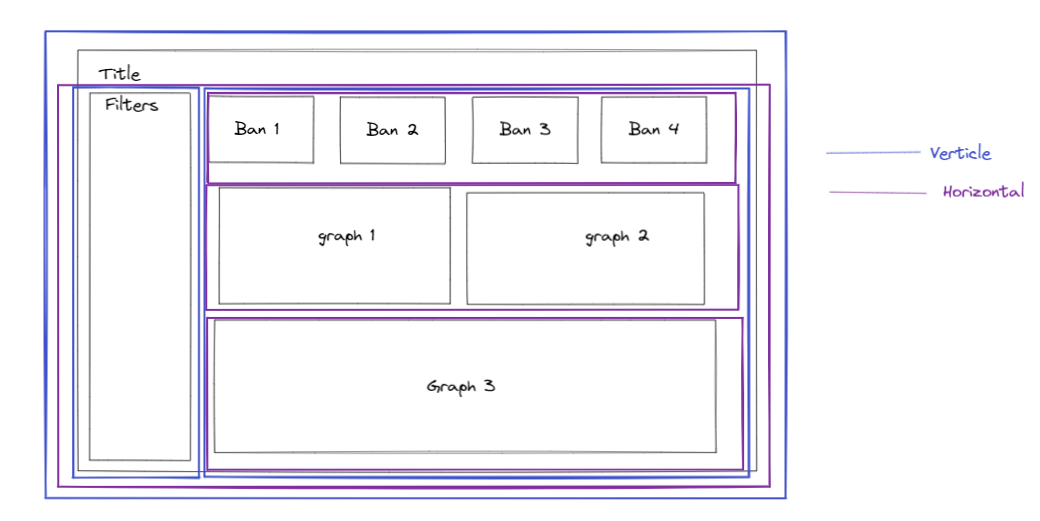
Planning out your dashboard is always helpful and I've found that knowing how your going to divide up your dashboard is really helpful before going into tableau so you know exactly what containers you need before you start dragging things into the canvas.
This lets you plan out your item hierarchy and avoid having to backtrack if you make a mistake by just diving into things.
Those are the key things I've learnt about containers over the past week hopefully some of these things are of use to you, I know they've definitely helped me in my dashboarding.
