


So the past week DS35 have had the pleasure of playing around with some other data visualization tools available for use. In order to get some practice in with these other tools we've spent some times recreating dashboards we have made previously in tableau.
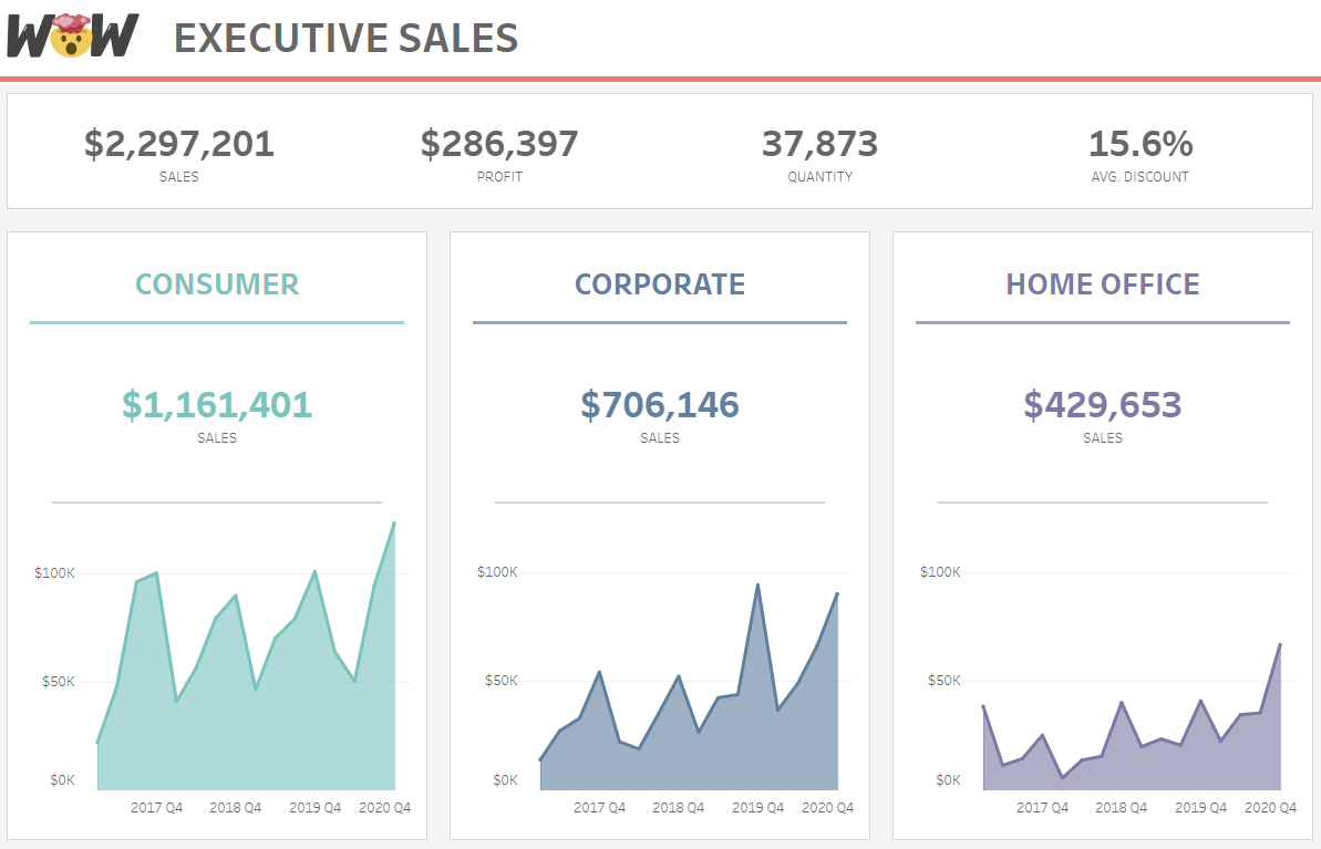
Here's an example of the original viz on tableau (workoutwednesday enthusiasts will recognize it):
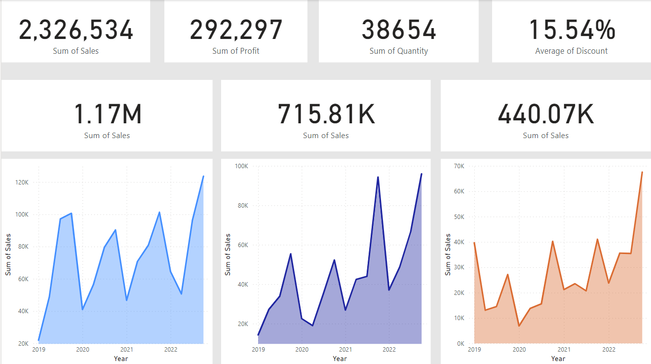
my attempt to recreate in Power BI:
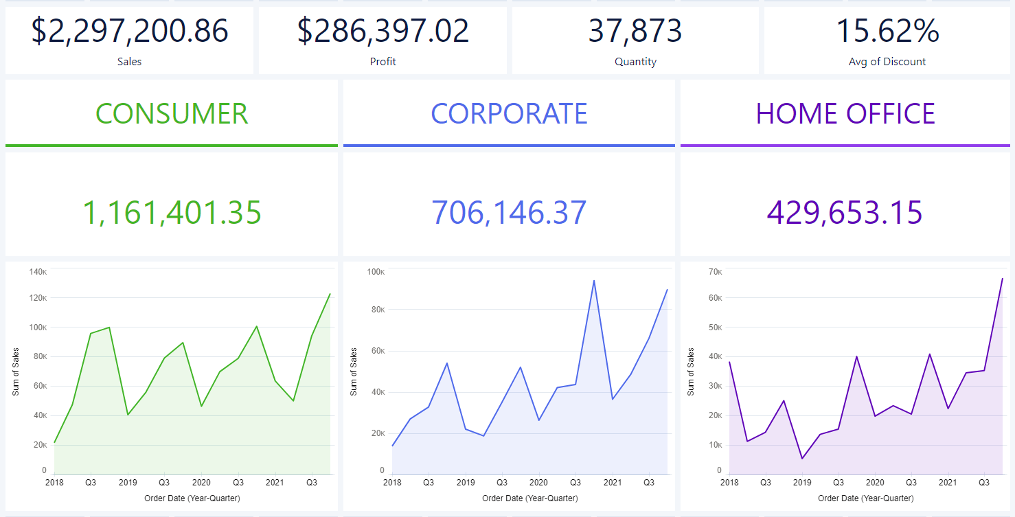
my attempt to recreate it in CRMA:
Here are some of my initial takeaways from both pieces of software having used them each for only a day so far:
Power BI:
pros:
- Available for use with microsoft office licenses' thus more available for companies which are already paying for these.
- pretty intuitive
- graphs are quite easy to make once you get used to the UI
- Really easy to web scrape data!
cons:
- messy UI in my opinion though i guess if your a fan of the office UI you may prefer this
- Not as robust as some other tools in terms of visualization options
CRMA:
pros:
- Incredibly easy to make graphs (built a Sankey diagram in 2 seconds something which took us an entire afternoon to build in tableau!)
- I really like the UI - seems pretty basic at first but is incredibly easy to navigate and get used to.
- wide range of graph types available for use
cons:
- Need to pay for a salesforce license
- less formatting options to tableau
Overall I quite enjoyed playing around with these other tools and hopefully can continue to advance my skills in them which then transfer over to my work in tableau. For now though I am sticking firmly with team tableau as my main data visualization resource.