


Having started the data school back at the start of October DS35 have now reached the last week of our training. Nearly 4 months of training all culminates in this last dashboard week.
When you first start the data school your told the time will go quicker then you think but its hard to believe that 4 months have gone in the blink of an eye. I will go through a proper summary of my time in the data school on Friday but today I'll take you through what we did on day 1 of dashboard week.
So Day 1 of dashboard week was all about accessibility - accessibility in a tableau context refers to the ability for users with disabilities/other impairments to access and utilize the dashboards we create. This is an important consideration for any business or organization that wants to ensure that their data is available to all employees, regardless of their abilities.
There are several ways to improve accessibility in Tableau, including:
- Keyboard shortcuts: Tableau offers a variety of keyboard shortcuts that can be used to navigate and interact with the software. These shortcuts can be especially helpful for users with mobility impairments, as they allow them to access the software without using a mouse.
- Alternative text: Tableau allows users to add alternative text to charts, images, and other visual elements. This text can be read by screen readers, which can help users who are visually impaired understand the information being presented.
- High contrast mode: Tableau offers a high contrast mode that can be enabled to make the software easier to use for users with visual impairments. This mode changes the color scheme of the software to make it easier to read.
- Audio descriptions: Tableau also offers an audio description feature that allows users to listen to an audio description of the data being presented. This can be particularly helpful for users who are visually impaired.
- Interoperability: Tableau also provides accessibility features that allows it to work with other assistive technology, such as screen readers, Braille displays, and more.
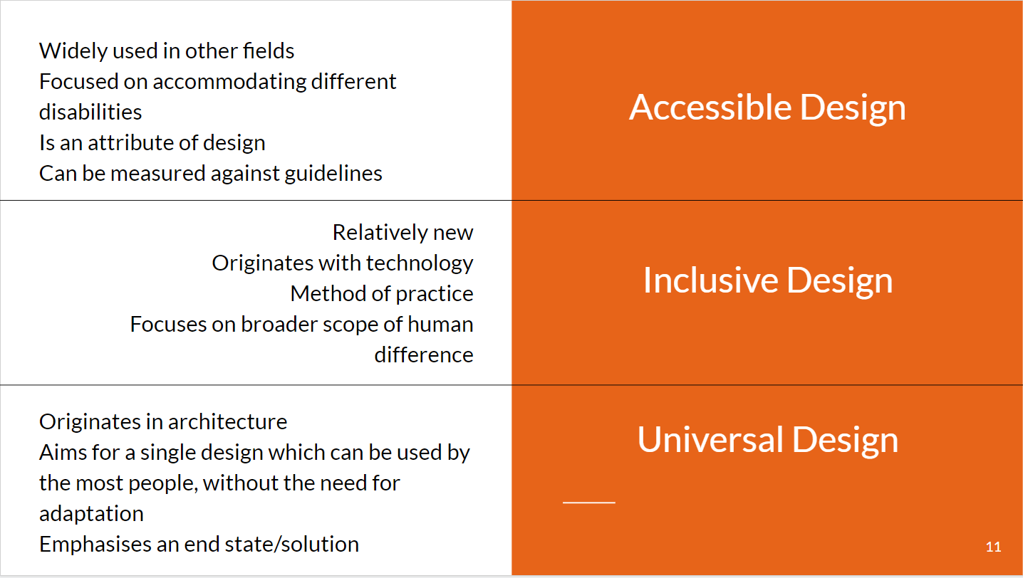
We also covered 3 different design principles which most people follow one of when designing something:
So my brief for the day after having learnt all about accessibility was to create a dashboard for a client where one of the stakeholders used a screen reader, and our final dashboard had to cater to her as well.
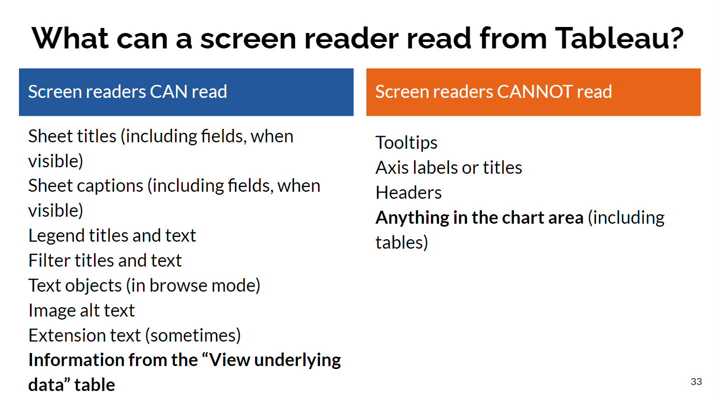
A screen reader is a software program that converts the text and images displayed on a computer screen into spoken words, allowing users who are visually impaired to access and interact with the computer.
My thoughts on the built in screen reader on our laptops was that it was infuriating to navigate -
some tips for other people in the future:
- caps lock + space bar turns off the scan function if your having issues with the reader scanning through your dash.
- try to have most of your writing on one sheet via the title plus the captions.
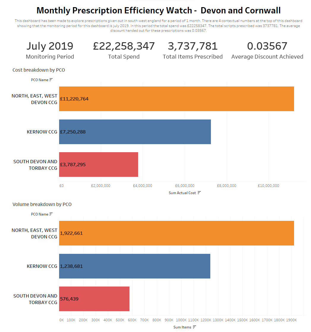
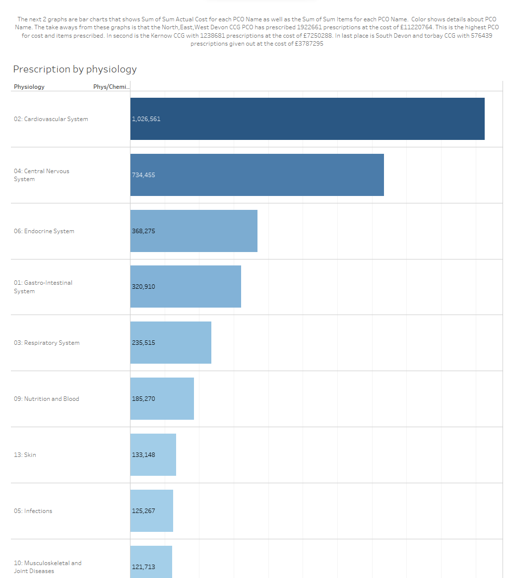
Here was my final dashboard:
Going forward I will definitely try to do accessibility minded dashboards starting completely from scratch as its harder to alter one already made.