


Chart choice is an important thing to think about, when creating a data visualization. Choosing the right chart to present your data can mean the difference between finding insights, and hiding them. There are rules for choosing how to present your data, which you can find here.
Inevitably, some charts always end up being the right choice for the job i.e. your bar chart, pie chart, or table. In this blog, I'm going to run through how to build three charts, that you can use in place of your regular charts, to make your viz look that bit more impressive.
All of these examples are done using the superstore dataset in Tableau Desktop.
Upgrade a Bar Chart, to a Bar in Bar Chart
Say you want to create a bar chart that compares the sales of two given years by category. You could do this by creating two bar charts and comparing them, or even creating one bar chart with the bars side by side. I'm going to show you how to take this to the next level, by making a bar in bar chart.
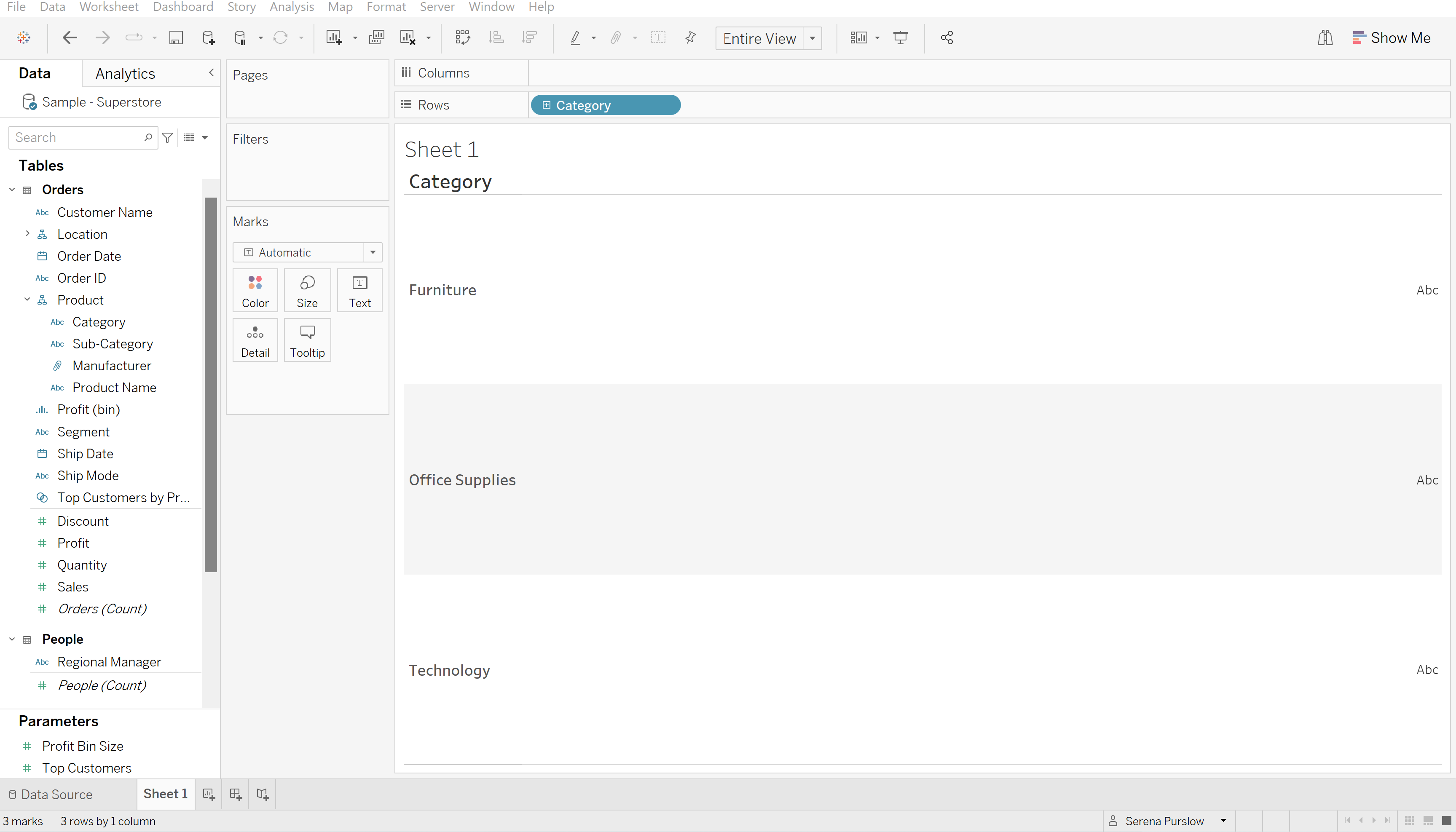
To start, drag your category field into the rows bar:
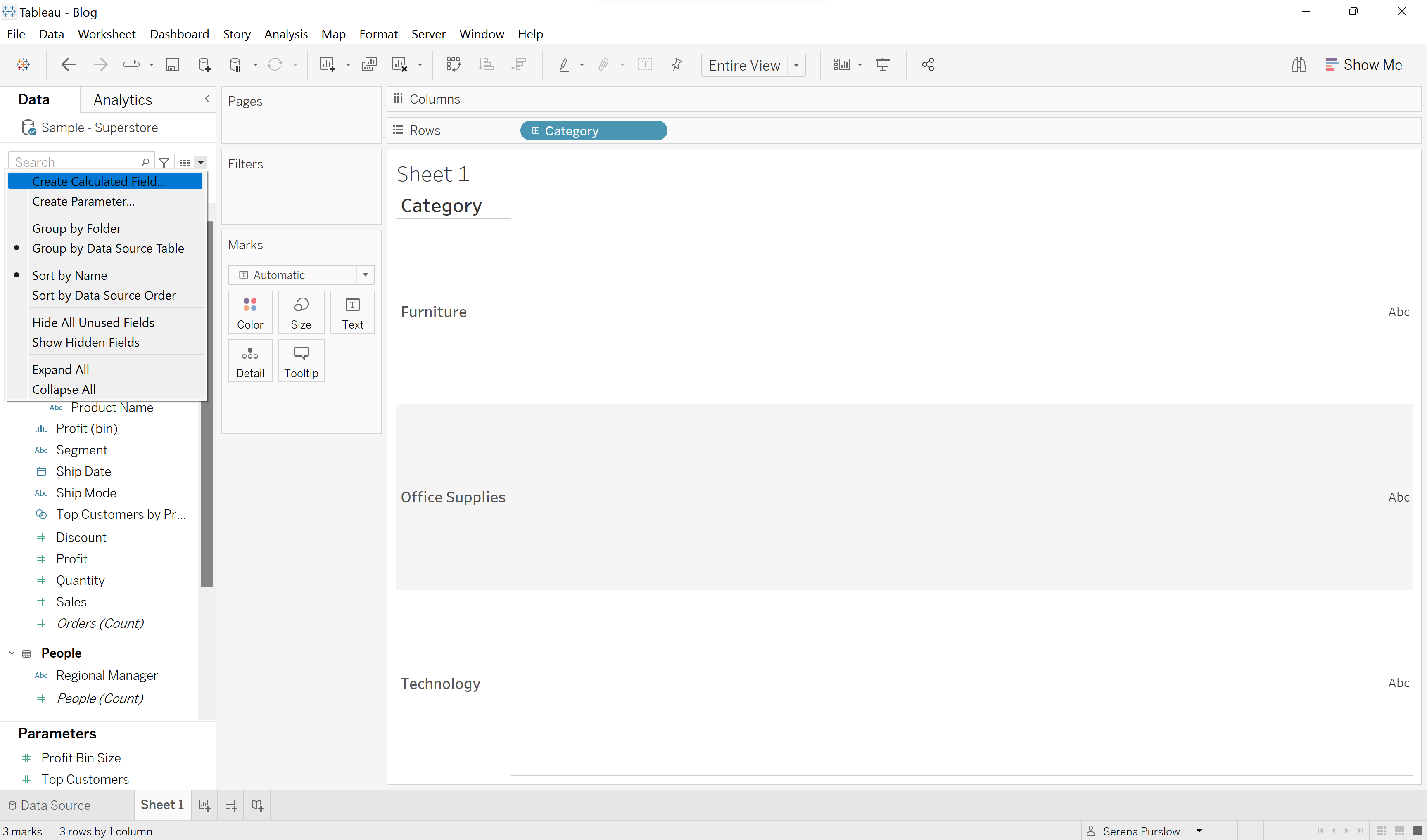
Next we want to create two calculated fields, which will be our sales for different years. Using the dropdown menu in the data pane, select 'Create Calculated Field':
In the calculated field we are going to write the following:
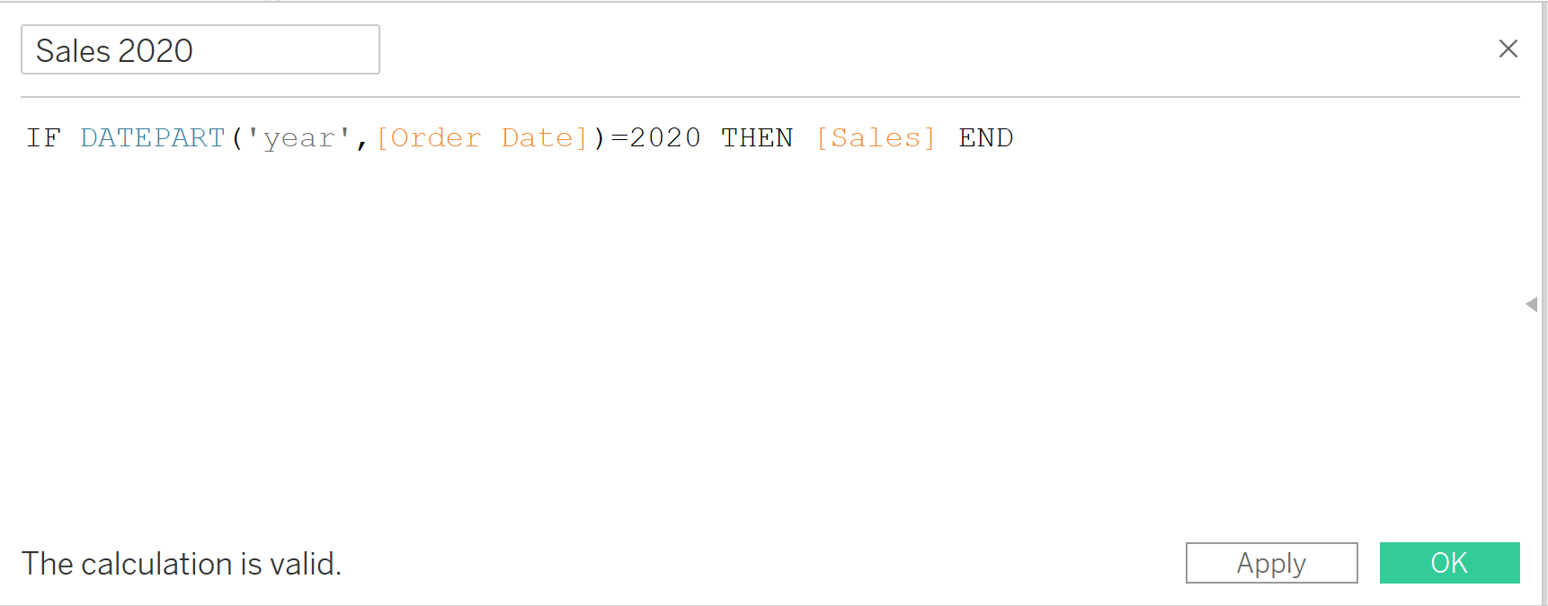
What this calculation basically does, is say when the year is 2020, then return all the sales for that year.
We then need to repeat this step for Sales 2021. Once you have created these two calculated field, drag both of them into the columns bar.
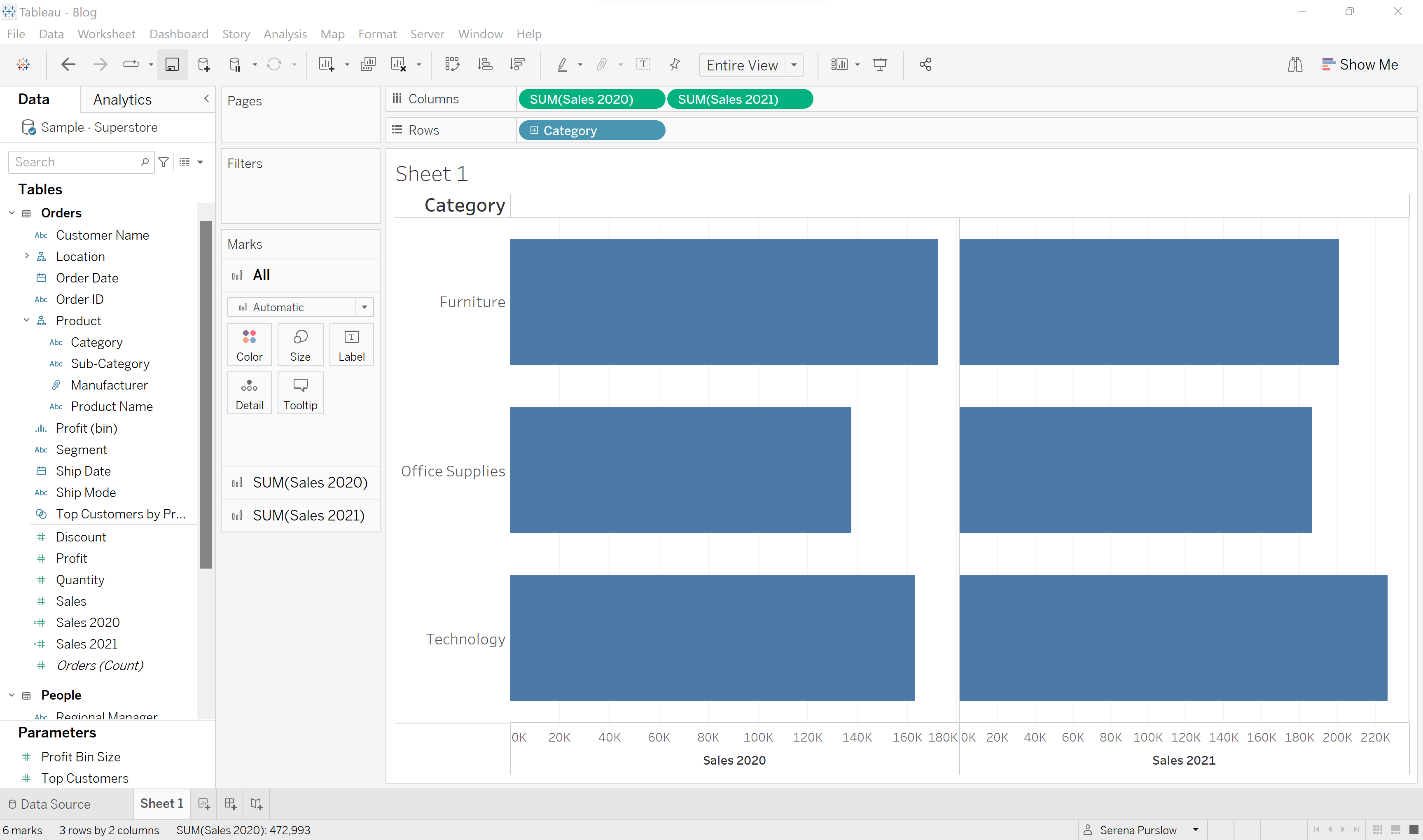
Next we want to put both of these charts on the same axis, so that they overlap. We do this by clicking the dropdown menu on one of the sales fields, and clicking 'Dual Axis'.
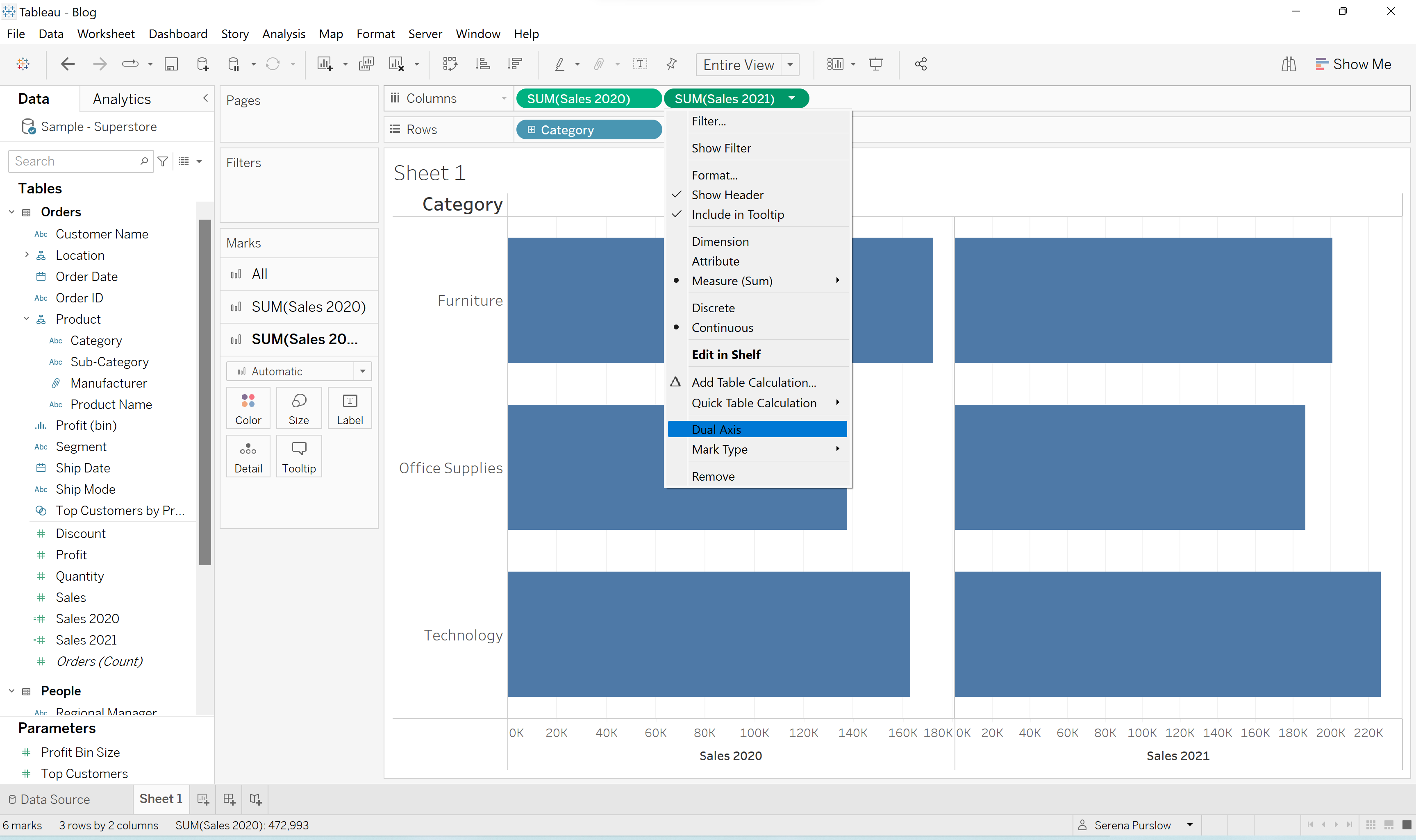
Next we need to synchronize our axis, so that the bars are compared by the same scale. This is done by right clicking on the x-axis, and selecting 'Synchronize Axis'.
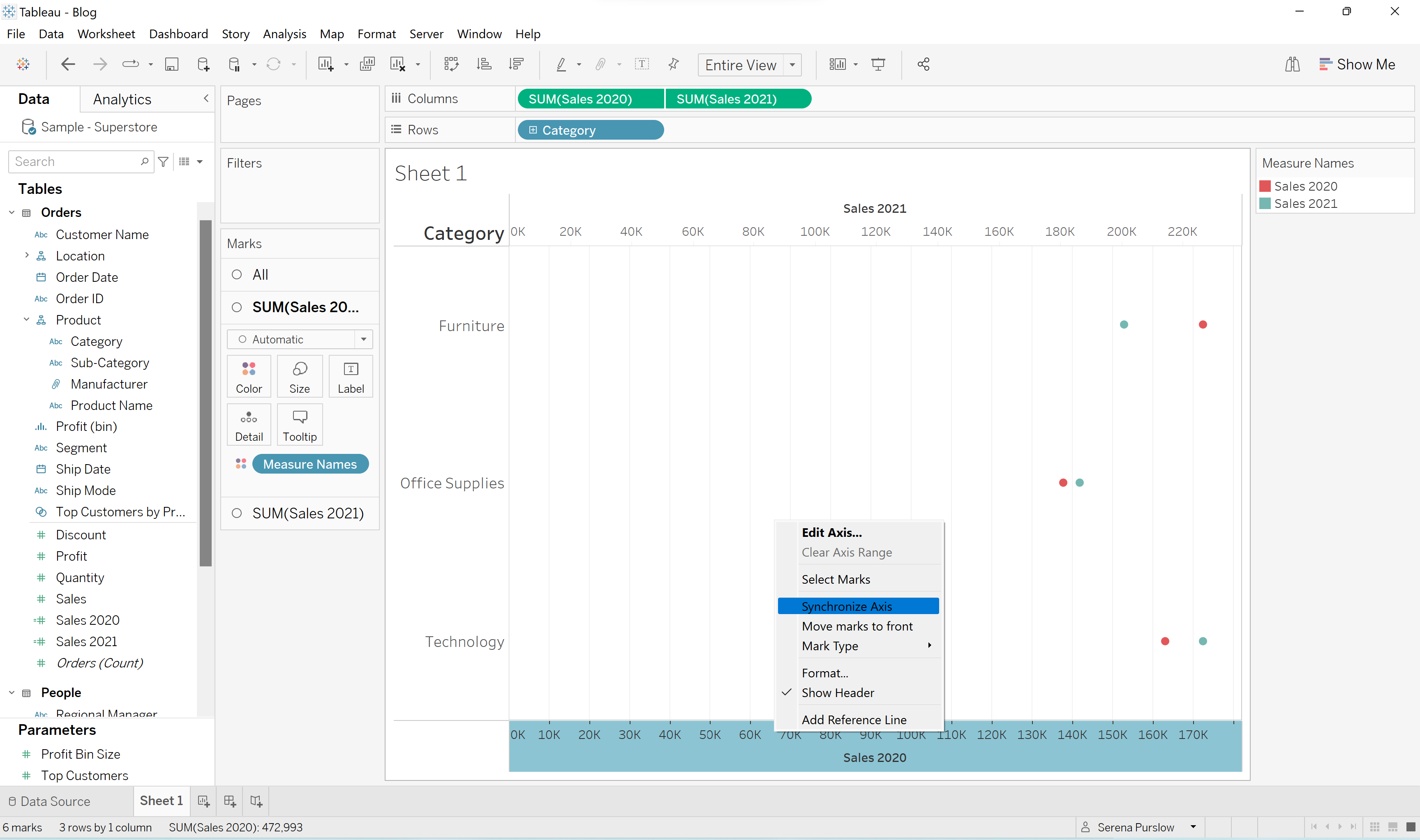
Remove the top header by right clicking on the top axis and clicking 'Show Header'.
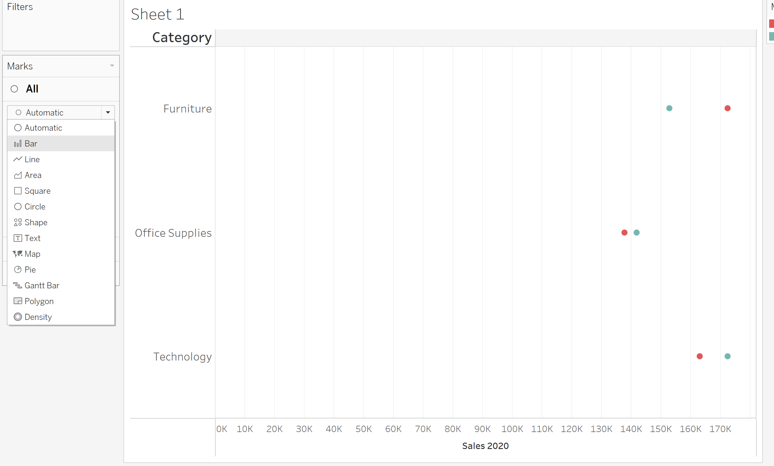
Now we want to create our bars. You can see in the Marks card that we have three different cards. Selecting the card for 'All', we're going to change the graph from 'Automatic' to 'Bar'.
Next, we want to play around with the sizes and colors, so that we get that classic bar-in-bar chart look. We do this by first selecting the marks card for Sales 2020, and changing the size so that it is bigger than our other bar.
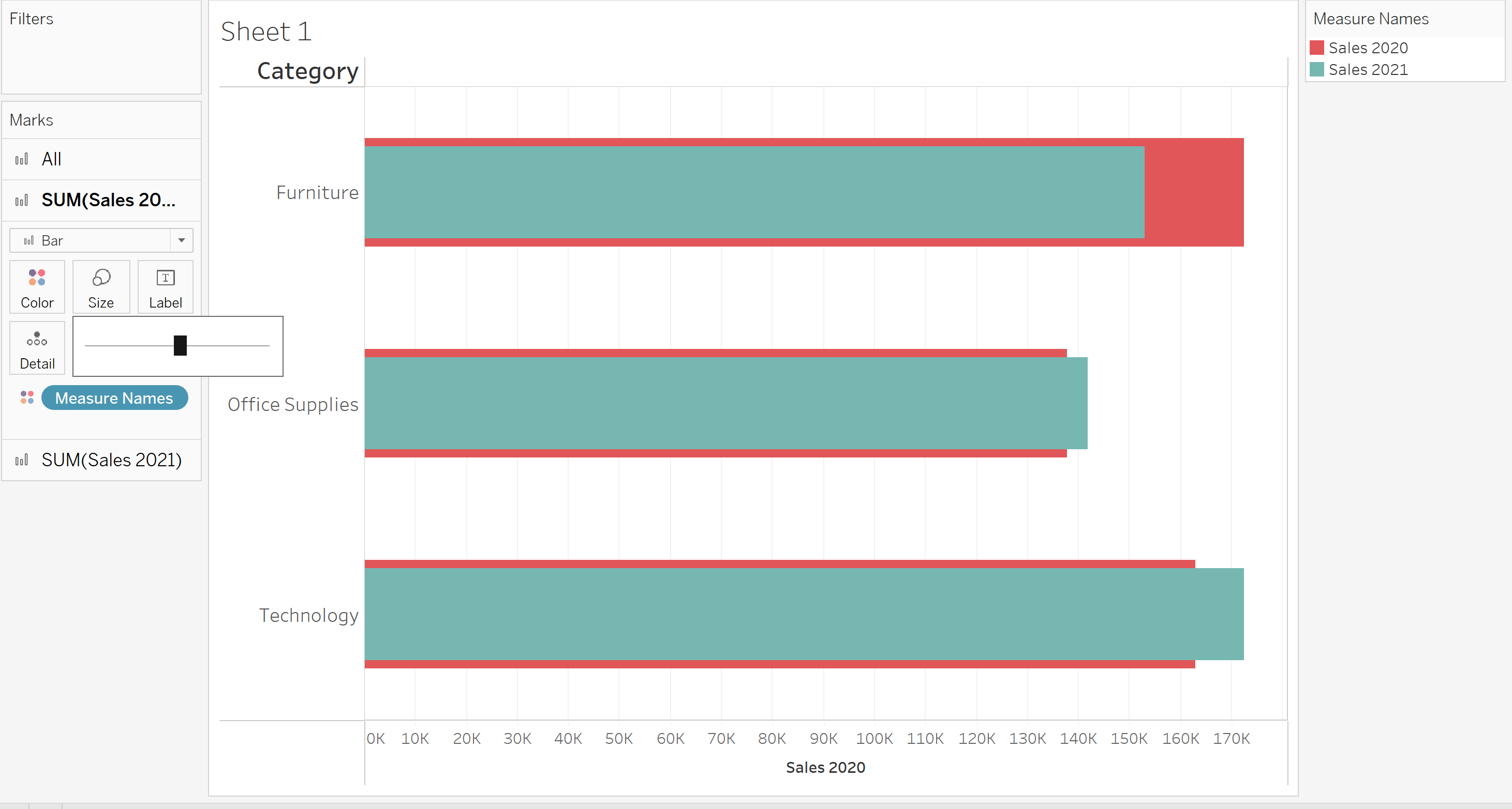
We then repeat this step using the marks card for Sales 2021 so that the bar for Sales 2021 is much smaller.
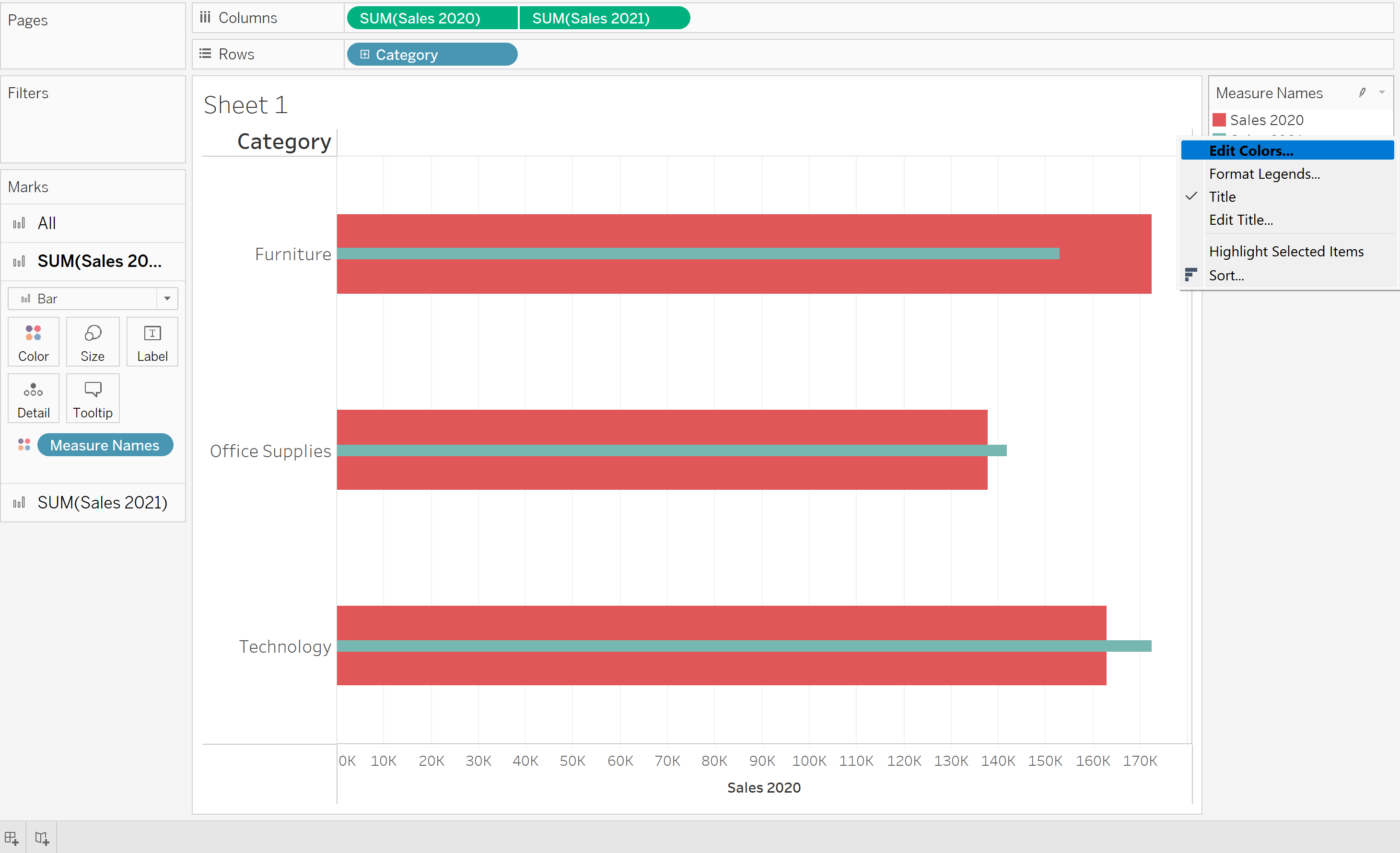
Finally, we want to right click on our 'Measure Names' tab on the right, and select 'Edit Colors', changing the colors as you please.
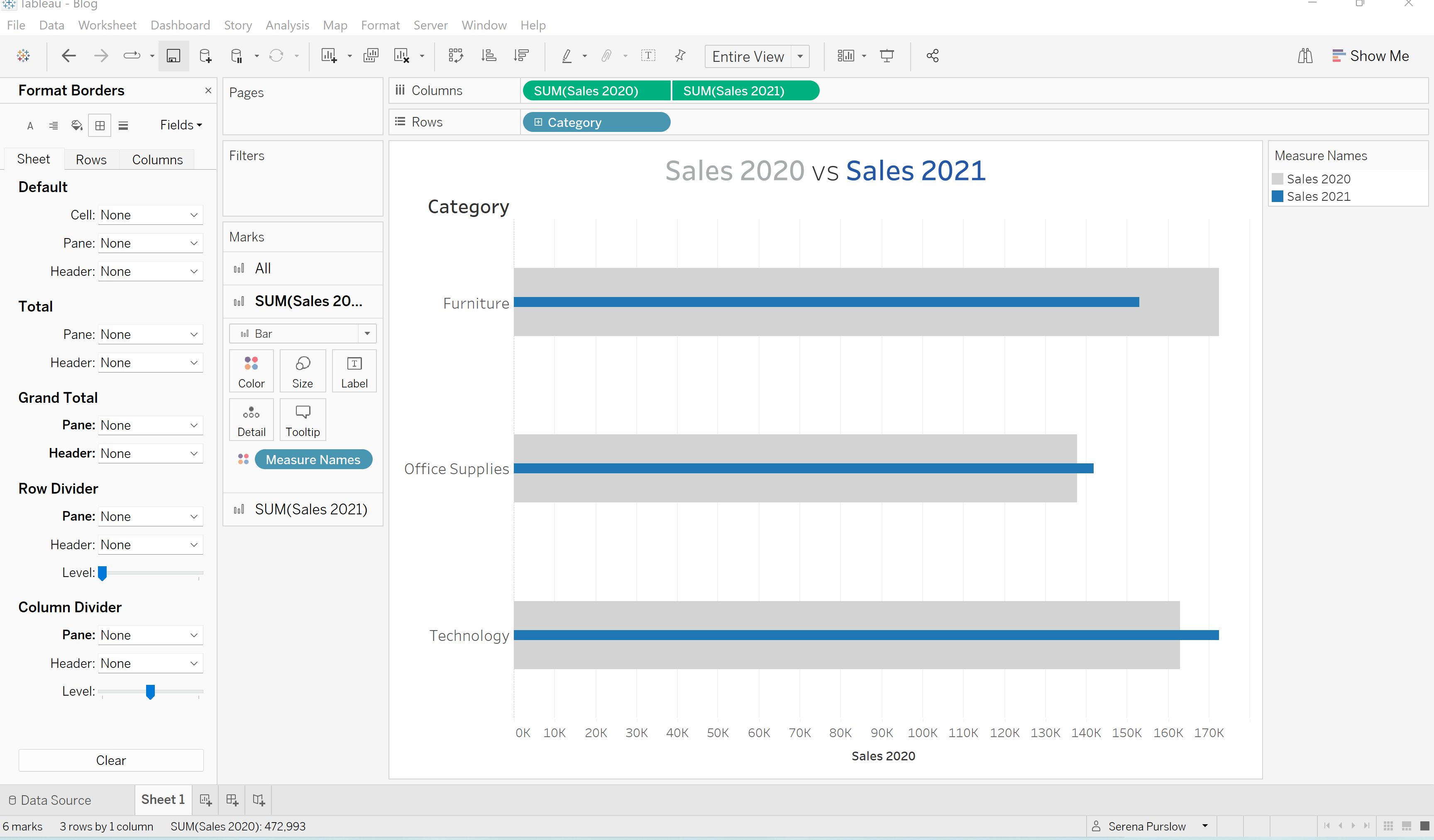
Final steps - format your chart by dropping some of the lines, and adding a Title. Top tip - if you're including your field names i.e. Sales 2020 and Sales 2021 in your Title, change the colors in your title to match the colors in your chart. And then voila! You have created a beautiful bar-in-bar chart, much more snazzy than your regular bar chart.
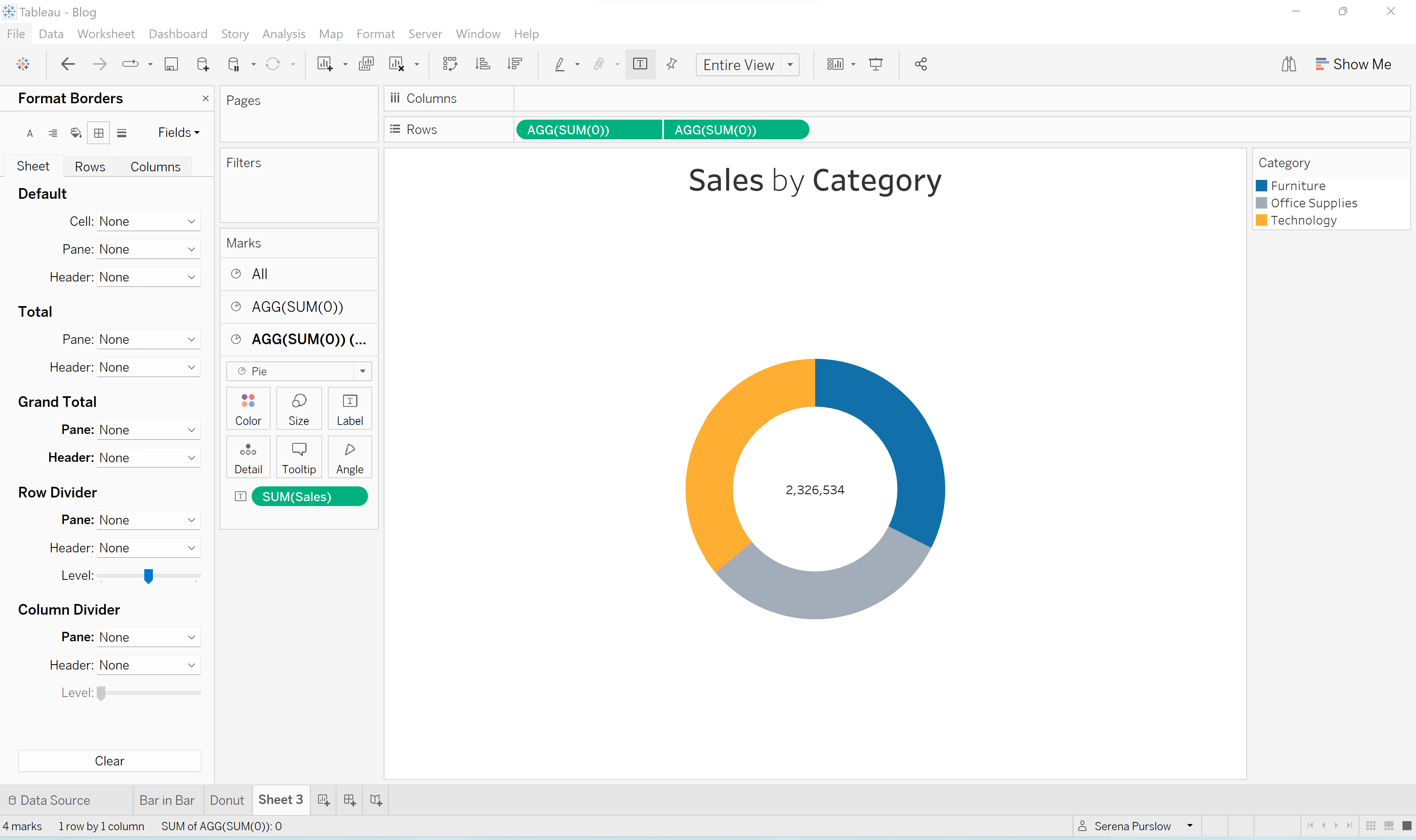
Transform a Pie Chart to a Donut Chart
Pie charts are useful if you want to compare a MAXIMUM of 5 fields, ideally where one field is much larger than the others. However, pie charts are generally over used, and a little bit boring. I'm going to show you how to spruce this up by creating a Donut Chart (basically a pie chart with a hole in the middle!).
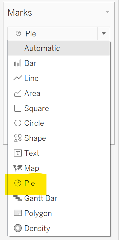
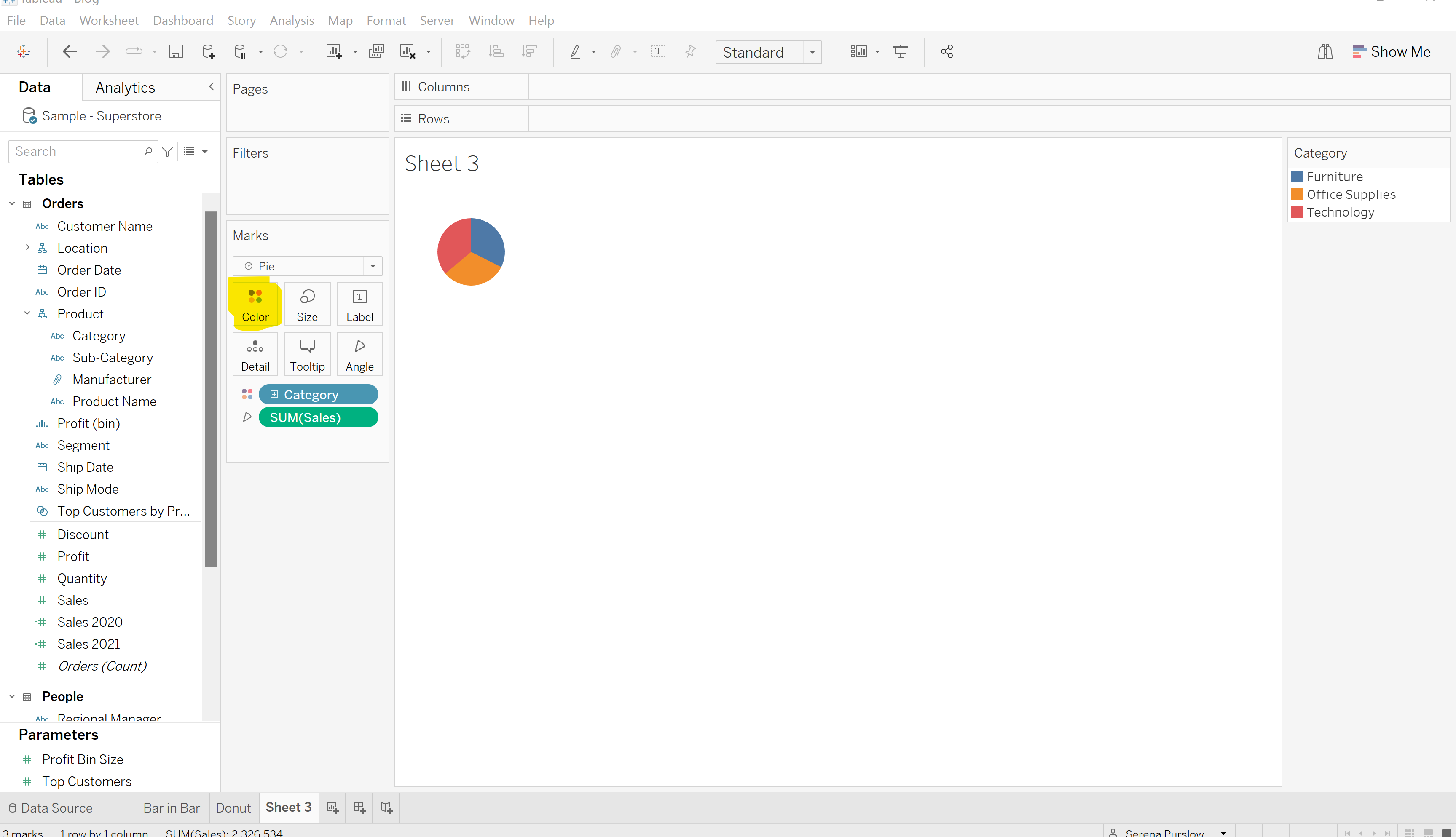
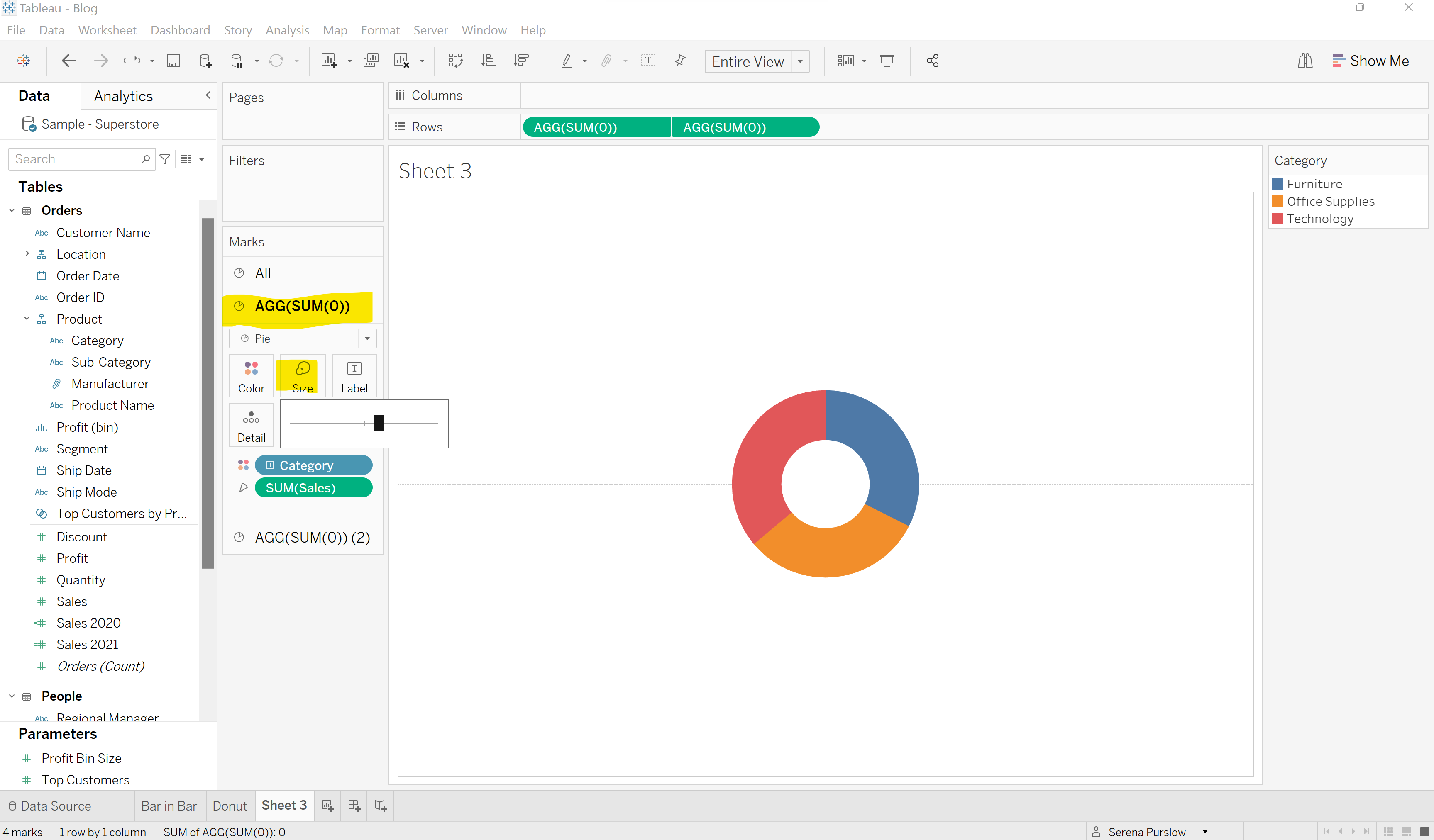
Say you want to compare sales by category. Start by selecting 'Pie' in the marks card.
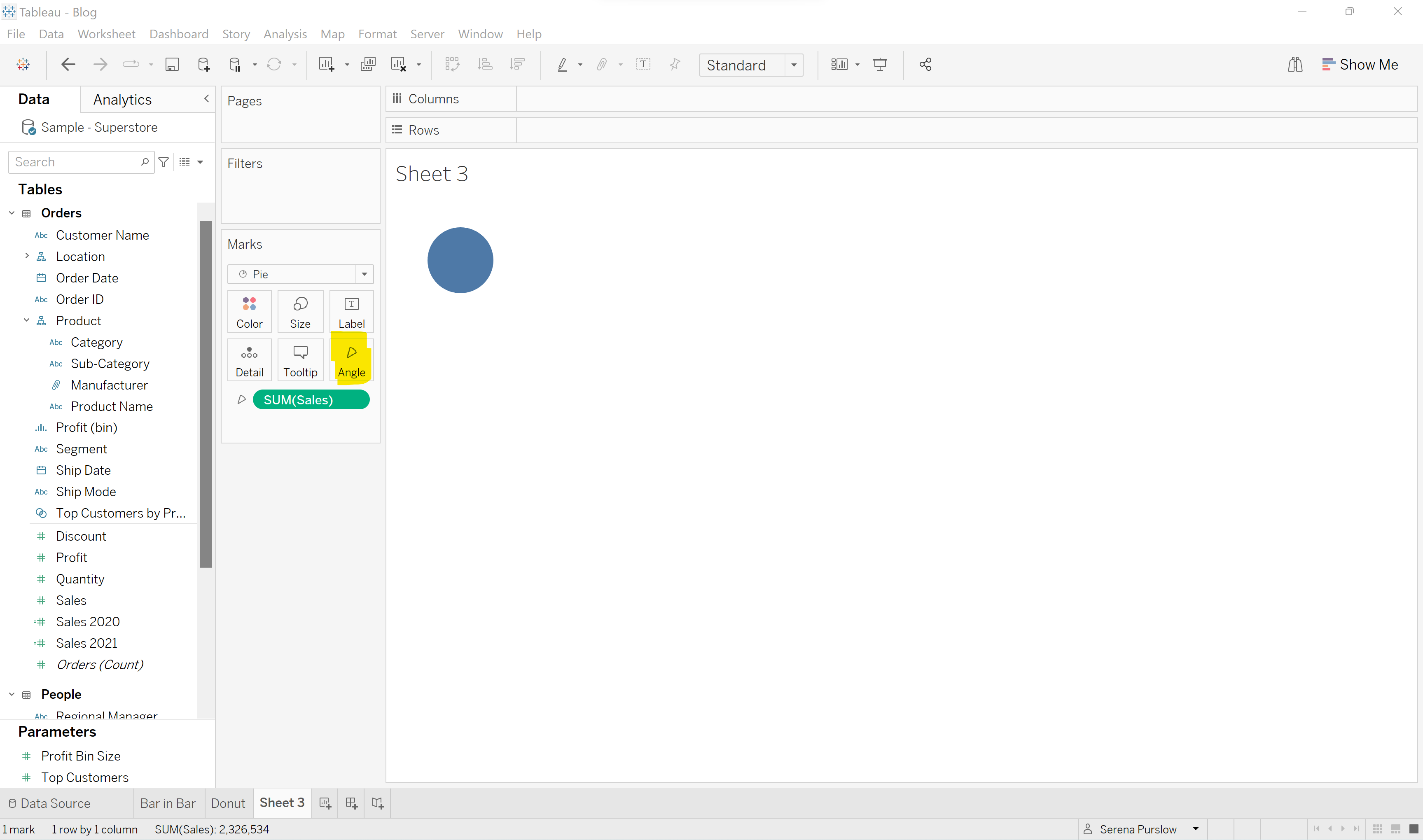
Next we want to drag Sales into the 'Angles' option in the marks card.
After this, drag Category into the 'Color' field.
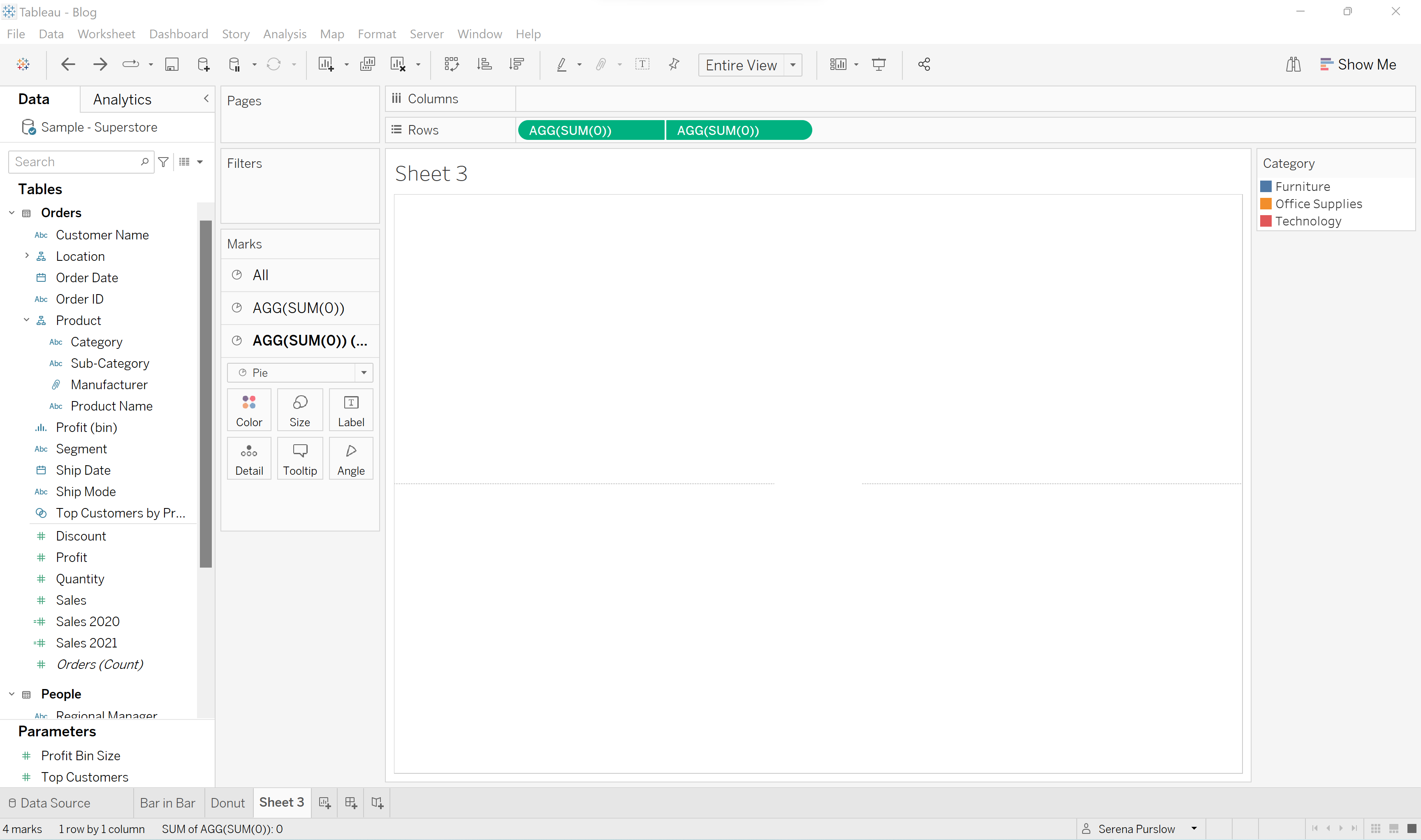
The next step is to create a dummy field, so that we can duplicate our pie chart. We do this by typing into the rows bar SUM(0):
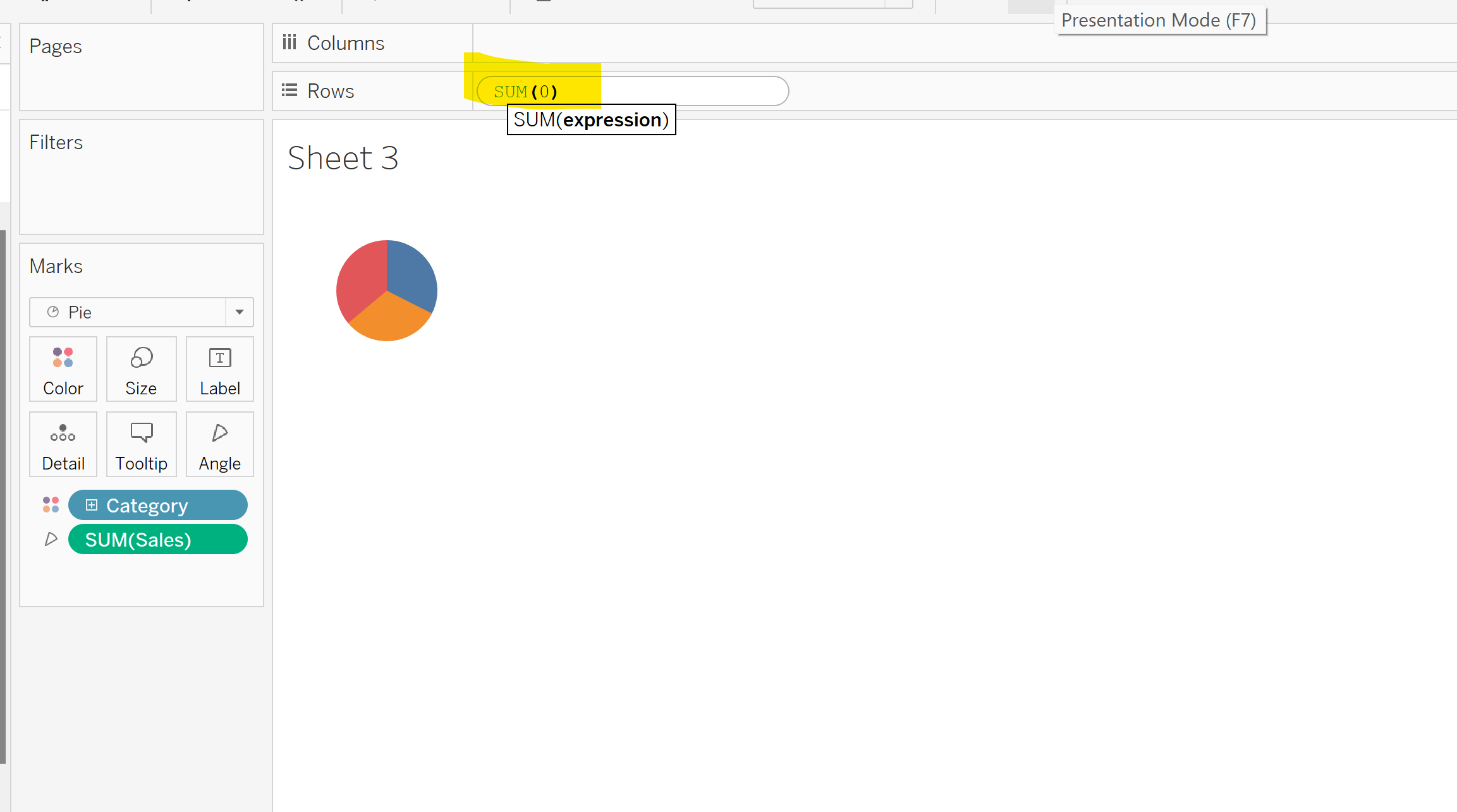
Do this twice so that your worksheet should be looking like this:
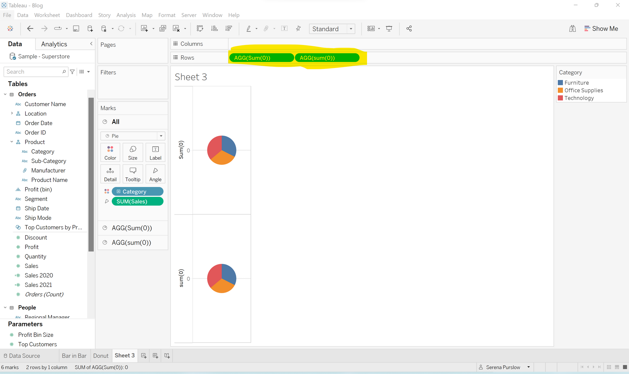
Next, as we did in our bar-in-bar chart, we want to create a 'Dual Axis' by clicking the drop down menu on one of our dummy fields, and selecting 'Dual Axis'. As before, synchronize our axis by right clicking on the axis. Finally, right click on the axis again, and click 'Show Header' to hide the headers. I also changed my view from Standard, to Entire View.
Your worksheet should now be looking like this:
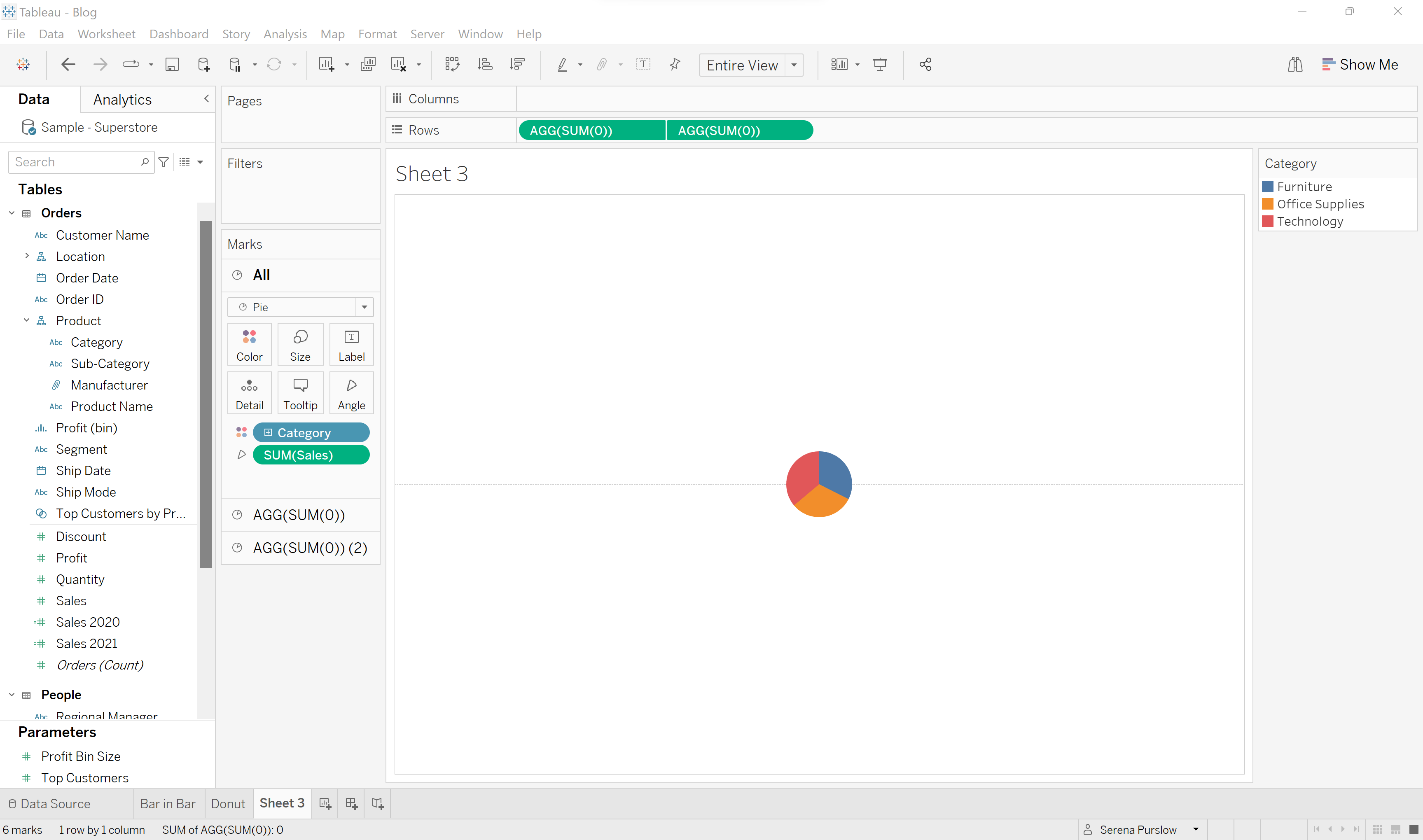
We want to select our bottom marks card (AGG(SUM(0)) (2), and remove the category and sum sales by dragging them out. You should be left with a grey circle. Next we are change the color to white. Don't worry when your pie chart disappears, the good stuff is just hidden!
Your worksheet should now be looking like this:
Next, we want to go to our second marks card, and increase the size, so that our donut chart starts to appear.
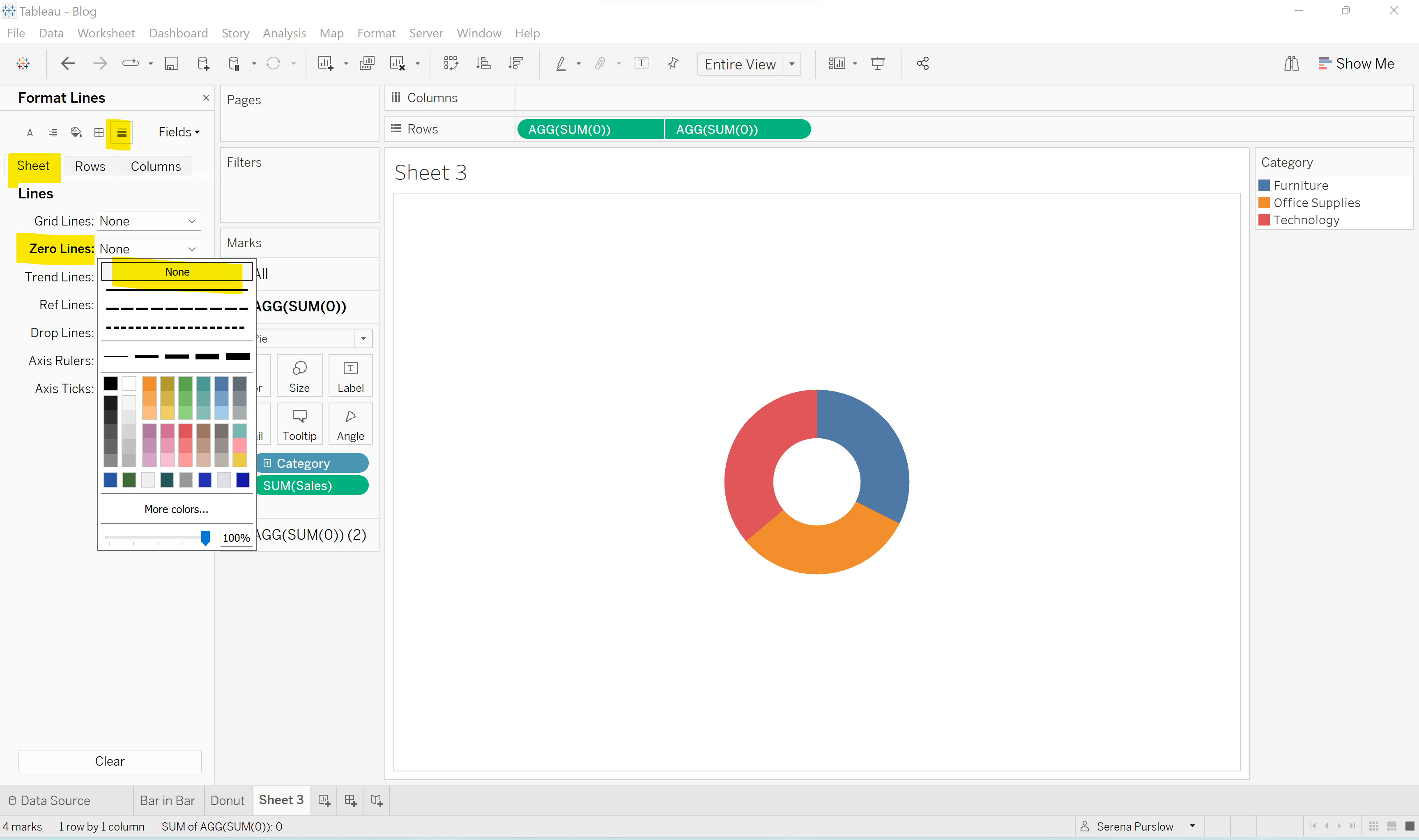
Now all that's left to do is a little formatting. Remove the line in the middle by right clicking on the sheet and clicking 'Format'. Change the 'Zero Line' to 'None' so that the line is removed.
As a finishing touch, we can put the total sales for all categories in the center of our donut chart, by changing the marks card to the bottom card (the one we colored white), and drag and dropping sales into the 'Label' field:
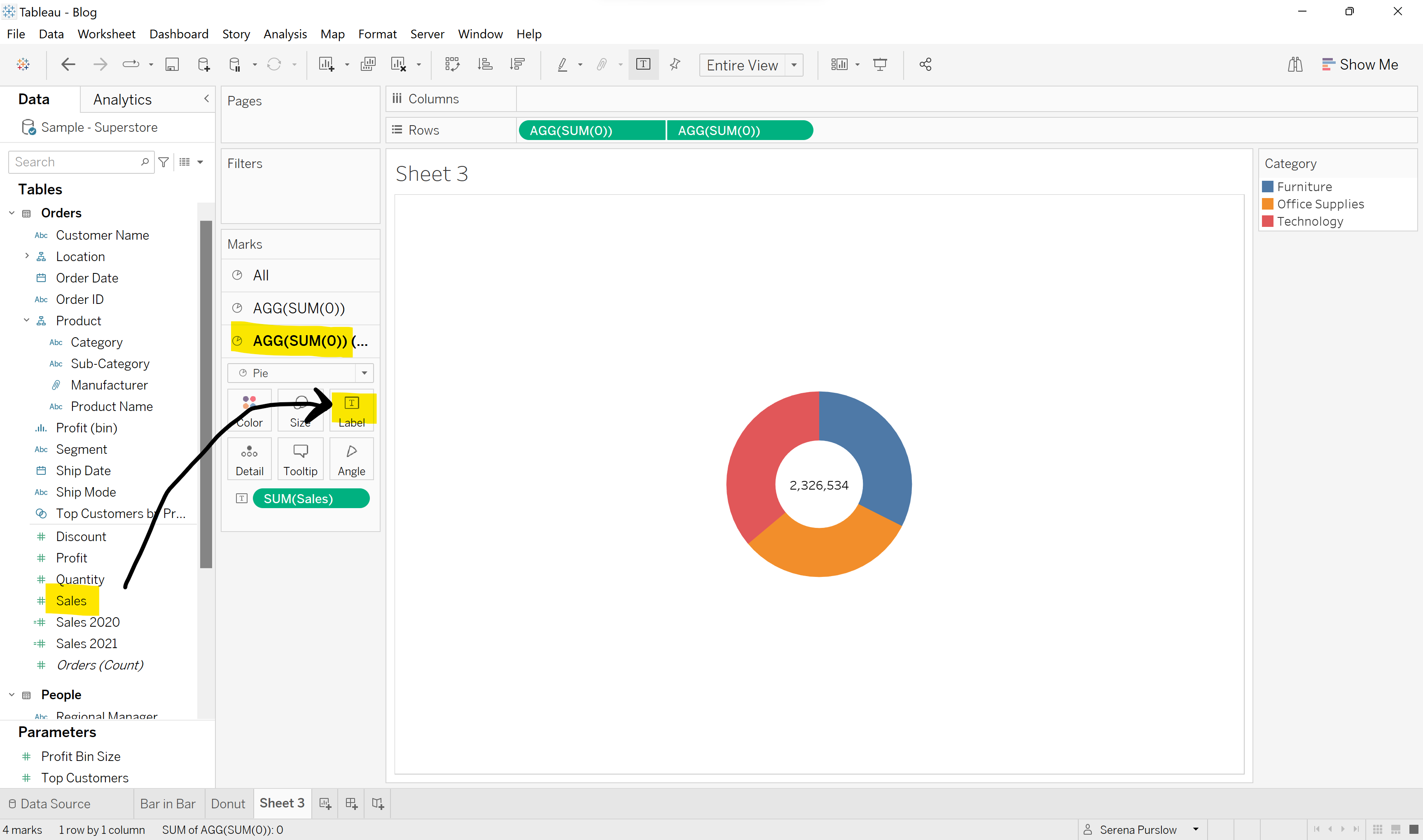
Add a title, format the colors as you like, and voila, you have transformed your over-used pie chart into a modern donut chart!
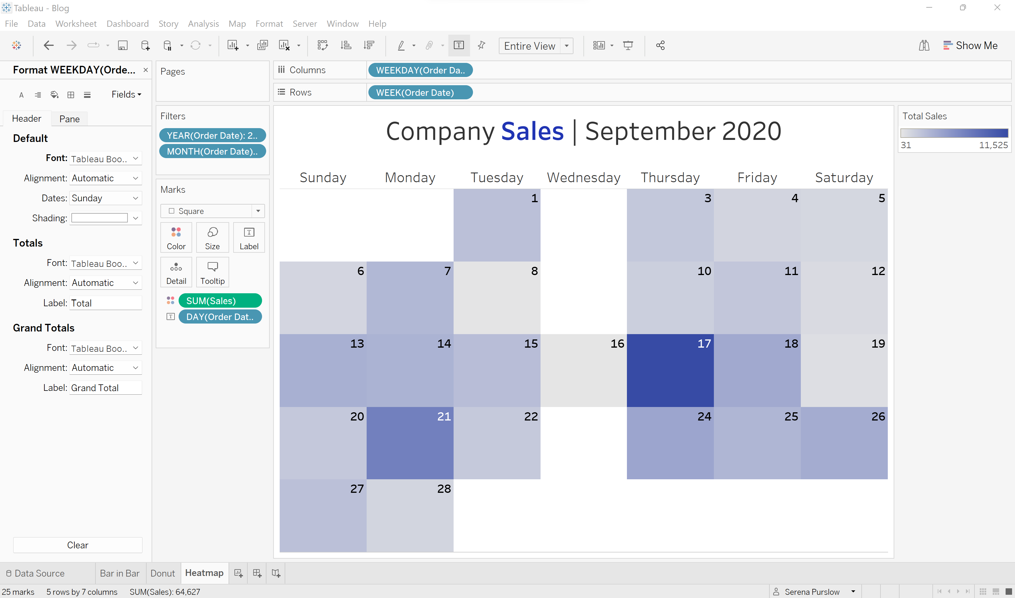
Convert a Table into a Heatmap - Calendar Style
Let's say you have your sales figures for each day of the month of September 2020, and you could present these in a Table, but you don't think that's going to blow anyone away. Well, let's turn that into a Heatmap, calendar style.
For this chart we will be using Order Date and Sales.
We will start by making our calendar table, by dragging Order Date into the columns bar, and again for the rows bar.
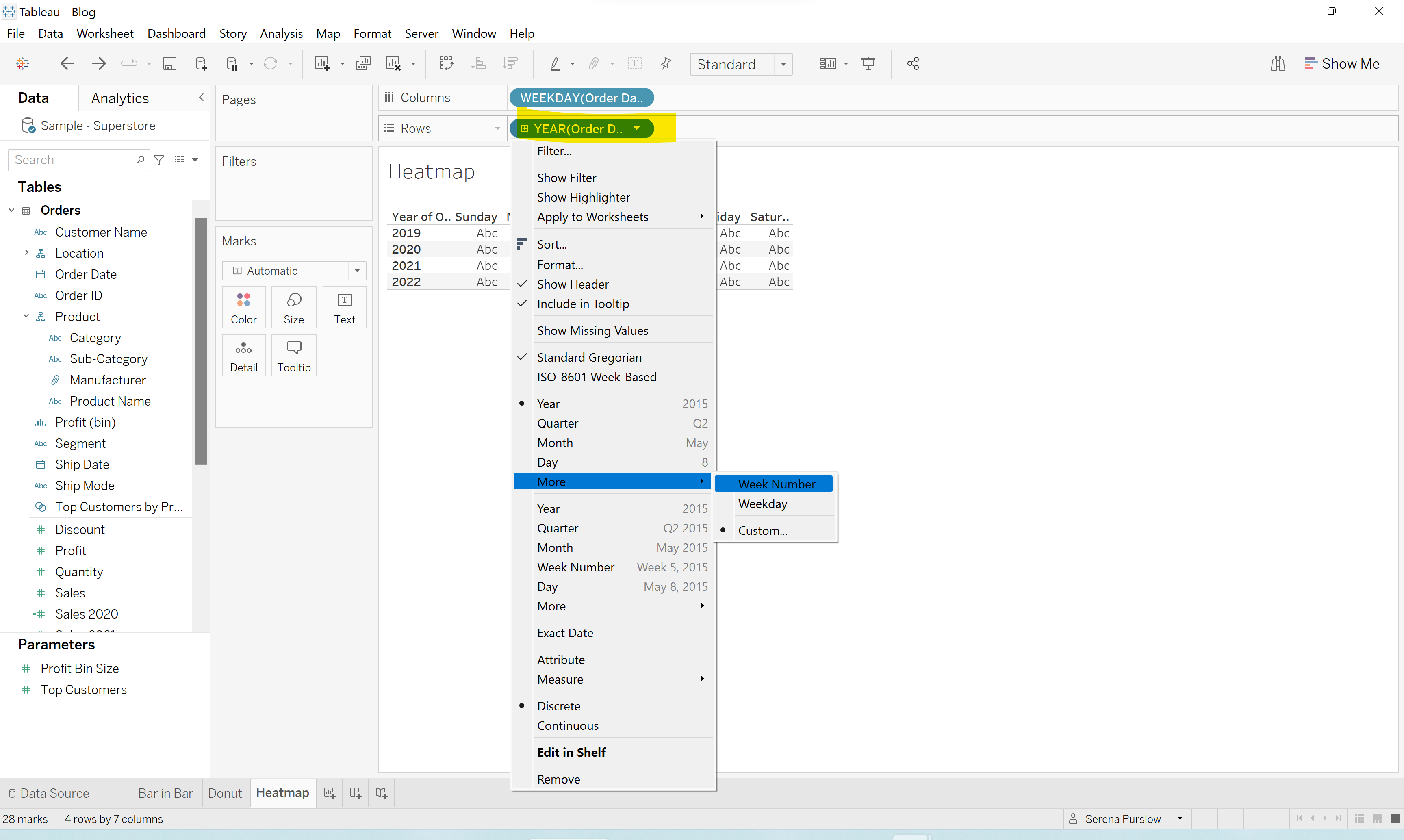
Using the dropdown menu for Order Date in the columns bar, we are going to turn this into a weekday, so we will have our week days running along the top of our chart:
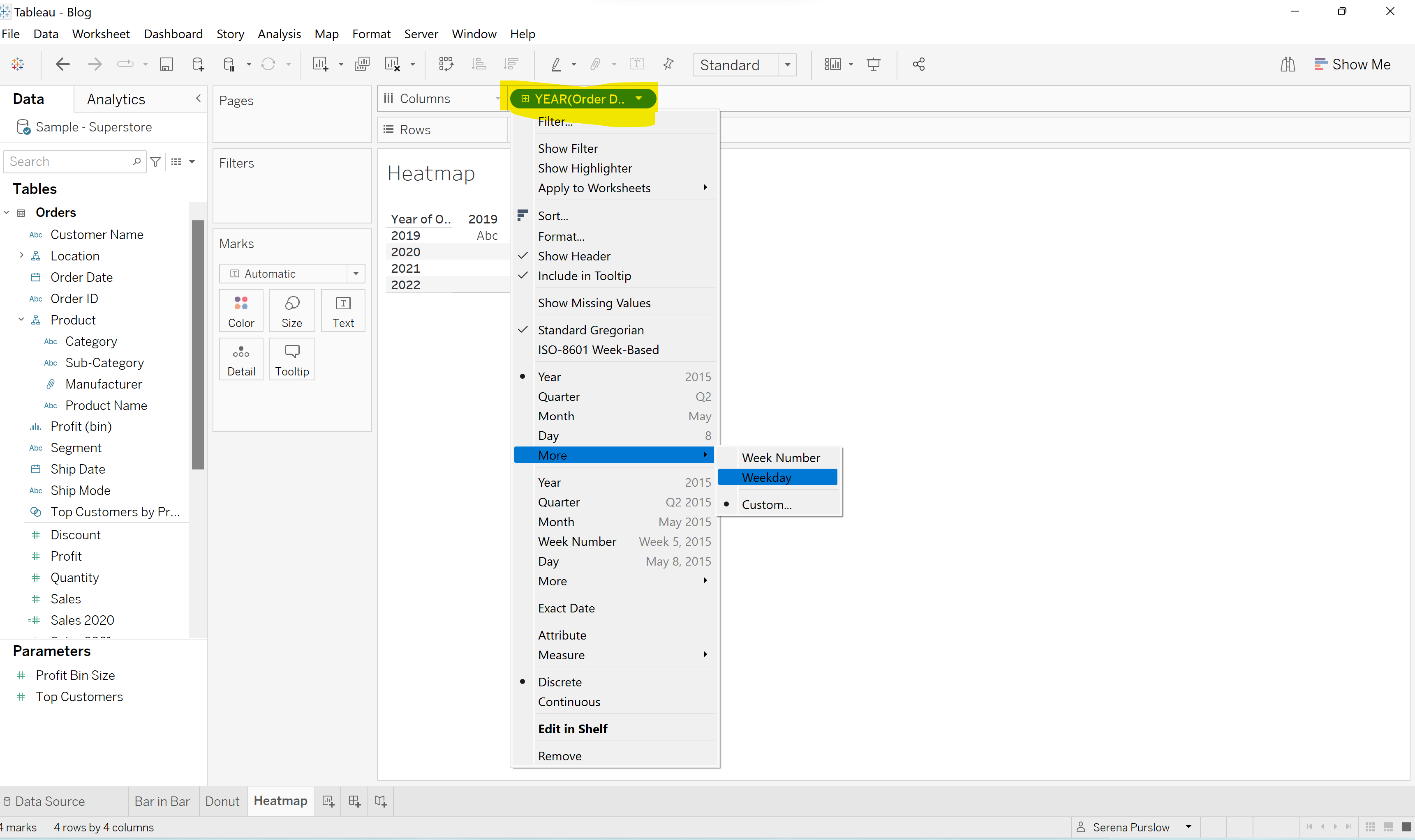
We are going to do something similar for our Order Date in the rows bar, but this time choosing 'Week Number':
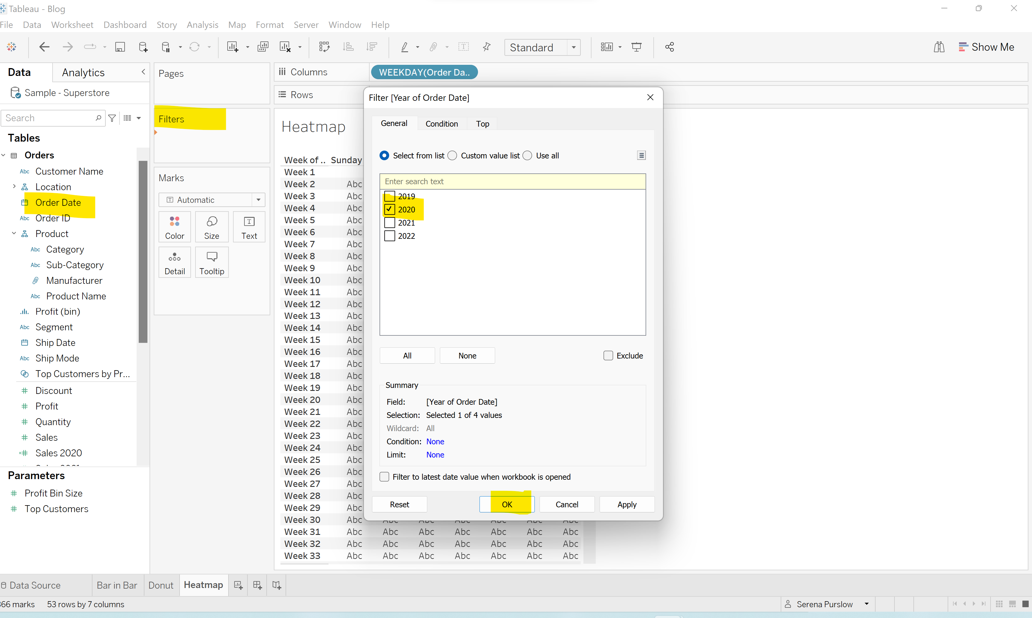
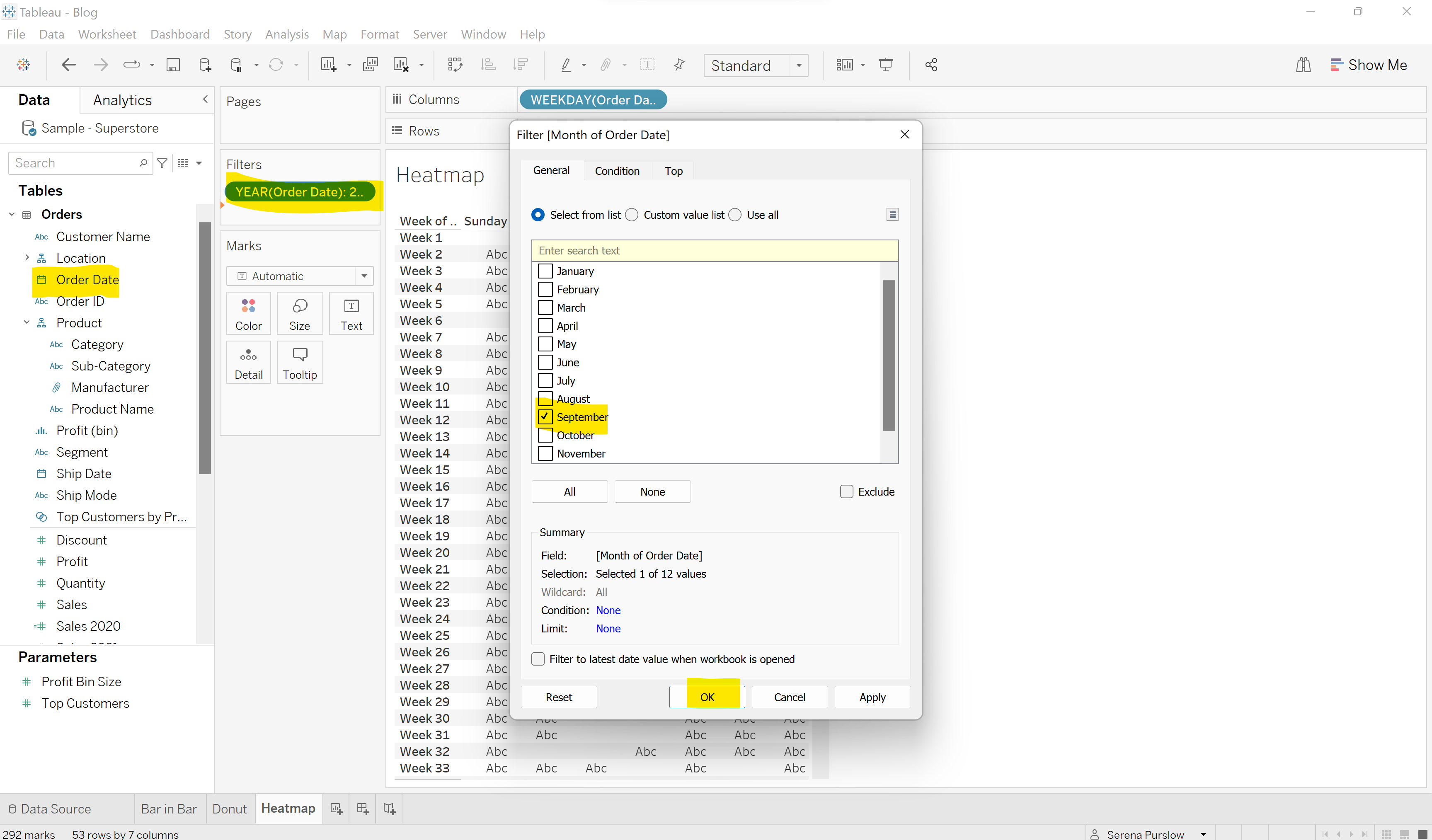
Next, we want to filter for our chosen Year/Month. Drag Order Date into the Filters Box, select 'Year' and then choose your year as below:
Repeat this again, but this time selecting 'Month', and choosing your month:
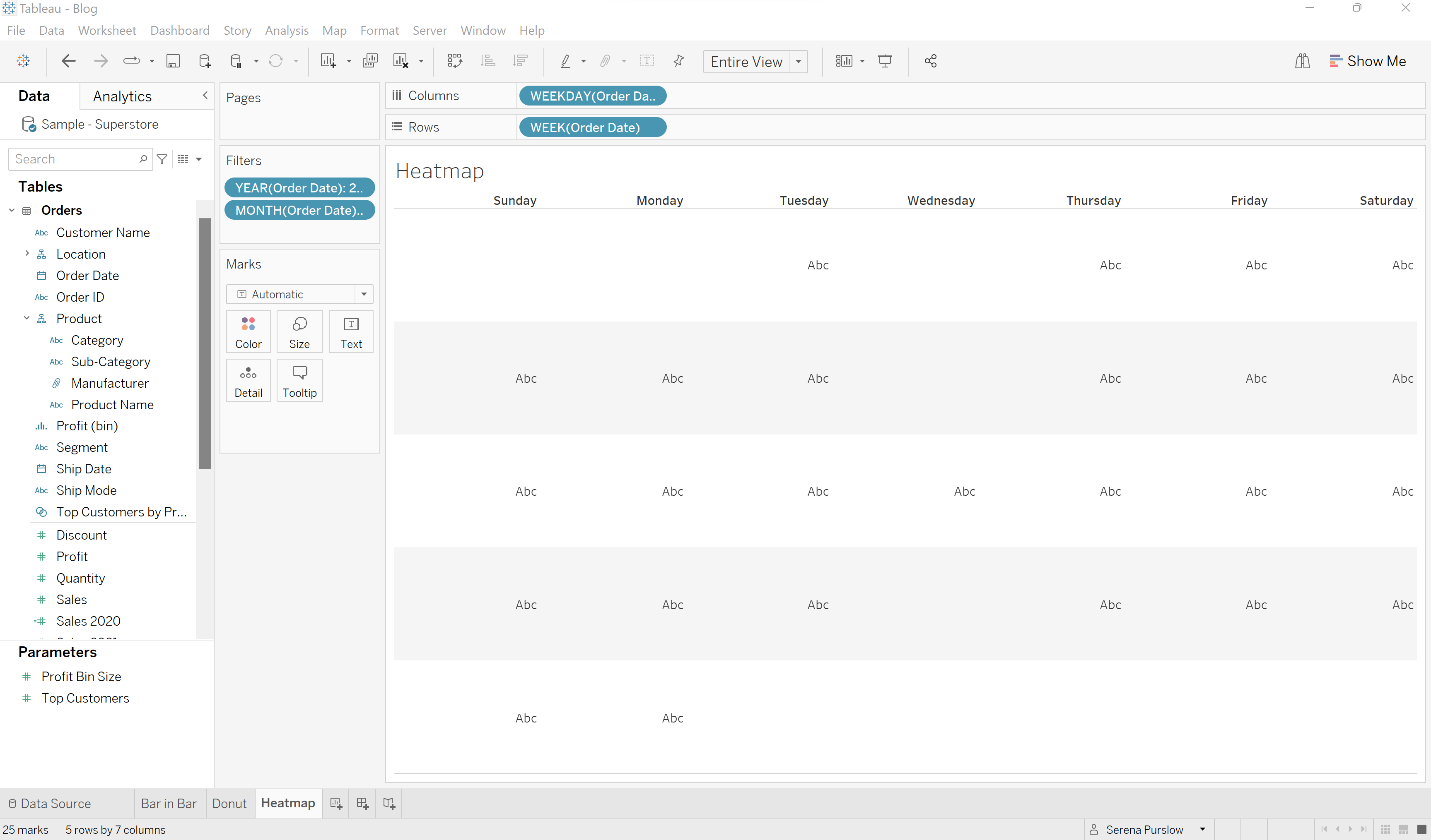
Hide field labels for rows, and remove the axis for 'Week'. Put your chart in 'Entire View' and your worksheet should be looking as follows:
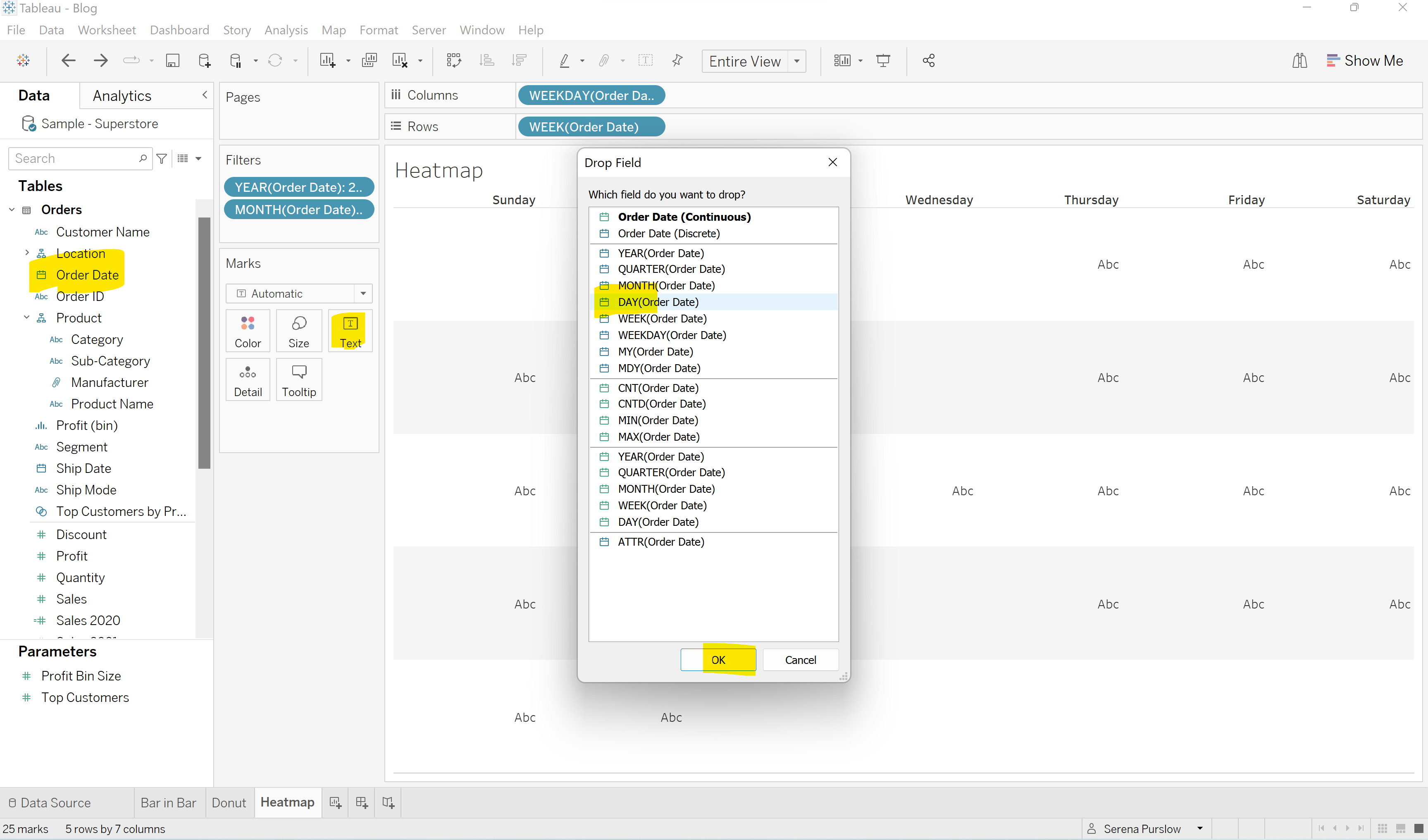
Next we want to start adding in values to our table. Right-drag your Order date field into the 'Text' box in the Marks card, selecting 'Day':
Next we want to drag our Sale field into the 'Color' box, and then change the Marks field from 'Automatic', to 'Square'.
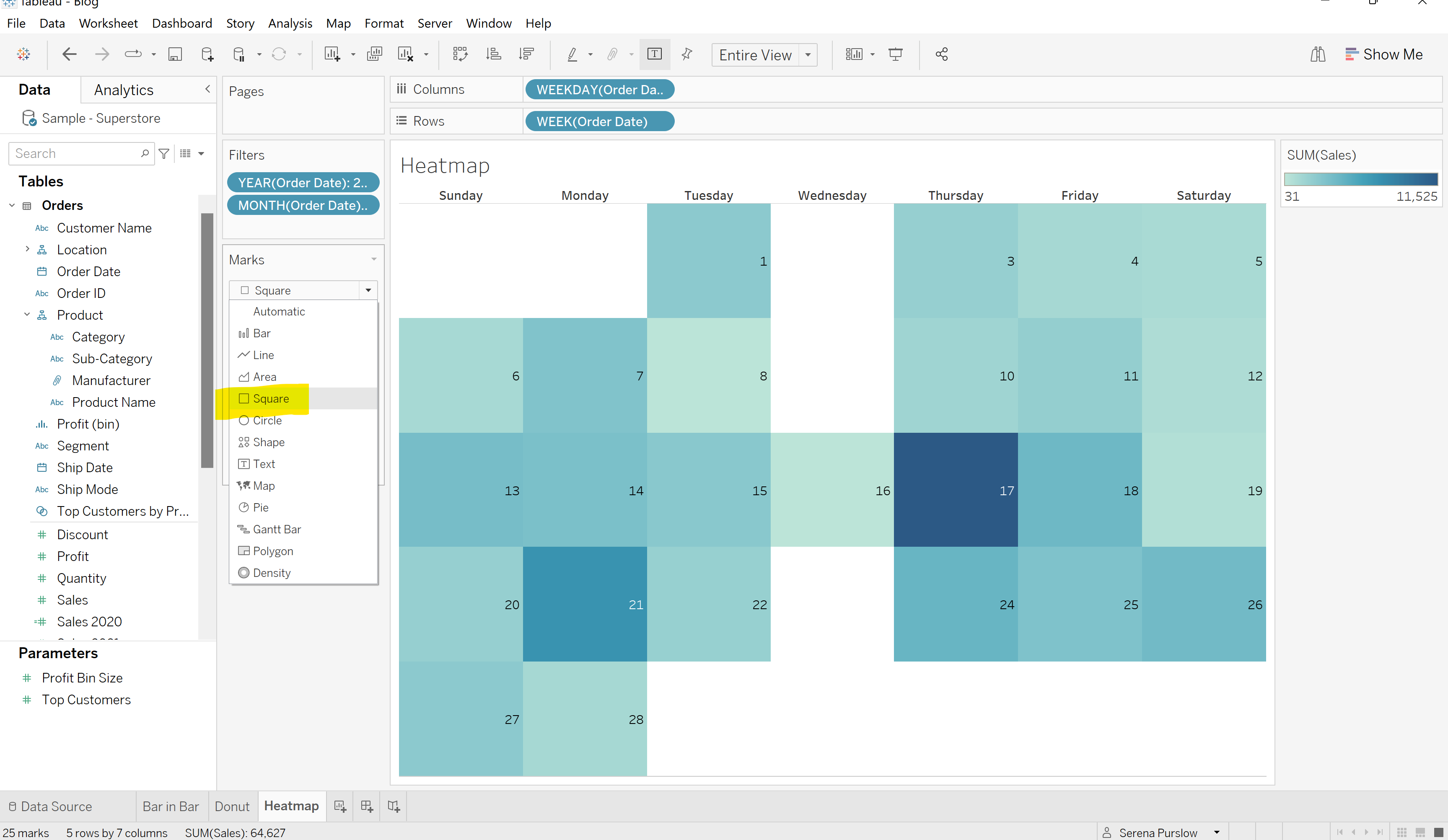
We now have a calendar which is colored by sales, and tells us the day of the month and day of the week. All that's left to do is a little formatting. I changed the size of the days of the weeks text, and of the day of the month. I changed my colors, and added a fitting title.
And... Voila! You have converted a regular table into a beautiful heatmap calendar!
I hope you've enjoyed this blog, found some helpful tips, and hopefully wow people with your interesting and beautiful data visualizations!