


Our presentation challenge this week was to take our new data prep skills and apply them to a bunch of messy data, then use the resulting squeaky clean data to make a Tableau dashboard to present.
Data and Project Planning
Inspired by the ongoing Football World Cup, we were given data on FIFA World Cups between 1930 and 2018. This data was messy, and big. Think random characters, duplicate rows and dates stored as strings (i.e. text).
Researching the topic I found that a team is more likely to win when playing at home than away, so using this information I decided to ask the following questions:
- Which Host country's draw the largest crowds?
- Is there an advantage for the Host country in terms of winning matches?
I also wrote a user story to structure my project with, which was:
As a… Sports Journalist; When… Reporting on FIFA world cups and predicting outcomes; I want … to know whether, historically, home teams win more than away teams, and whether attendance is increasing, meaning home teams have more of their fans supporting them; So I can… predict future match outcomes.
Data Prep
I chose to clean and prepare my data in Tableau Prep this week. After loading it in, I had a look at the data to see what needed changing.
These were the steps I took to make my data usable.
- Had a look through the data, removing columns I thought were unnecessary.
- Changed dates from string to date format.
- Created Host Country variable.
- Created a ‘Win’ variable using a calculated field, so I could see if a country had win or lost their match.
- Unioned the data for different World Cups together, to create one large dataset.
- Double checked any cleaning steps - duplicates, misspellings etc.
- Output my data ready for use in Tableau Dashboard!
Writing my steps like this, you would think I had a very tidy workflow. I will admit that I did not create my workflow as logically as I would now, with the benefit of hindsight. With reflection I should have first unioned my datasets together, and then gone about cleaning the large dataset, rather than cleaning many individual datasets in the same manner before joining them together. However, that's the beauty of trial and error - you learn something every time.
After outputting my clean data, I opened it in Tableau Dashboard to have a look over what I was working with, and start building an idea of what I wanted to do with it. Using Excalidraw I created the following sketch, then got to work building it!
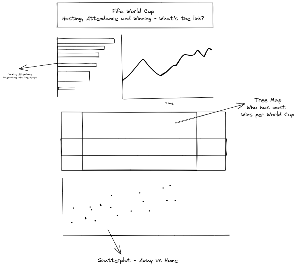
Finished Viz:
Using my clean data, I created the following Viz to take a look at the rates of World Cup attendance over the decades, looking at whether or not the Host country won, and whether Home or Away positions result in more goals. Here is my finished viz:
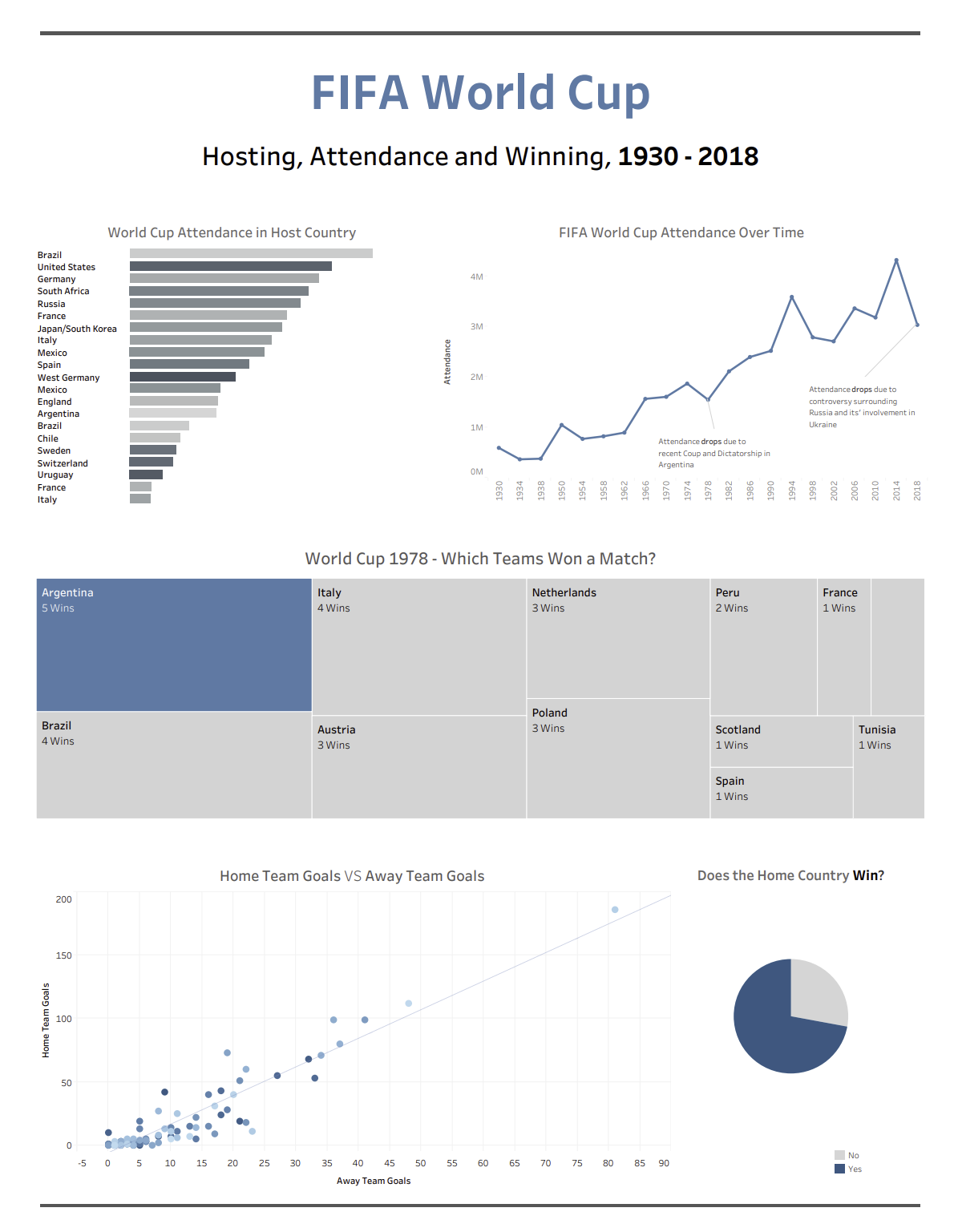
You can check out my Viz on Tableau Public here:
https://public.tableau.com/app/profile/serena.purslow/viz/DSPresentationW3-FIFAWorldcups/Dashboard