The penultimate day of our dashboard week at the DS was focused on using a different software than we are used to - Power BI. Our task was to use some sample data to come up with a KPI business dashboard. Having only had one session trying out Power BI previously, I was a little nervous to get started with this, but as I've done previously, I spent a lot of time planning which definitely helped in the end.
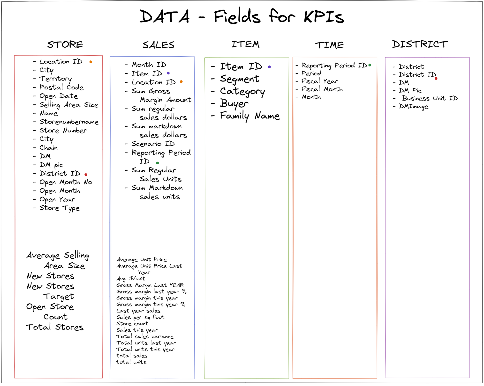
My planning started with getting some inspiration for KPI dashboards on Tableau Public, and getting an idea of what KPIs I would need for my dashboard. The data I chose to use was on retail analysis, so I had a google of important metrics for this. I then went through the data and looked at all the available fields I had, so I could start planning my dashboard.

After looking through the data, I then loaded it up into Power BI, and had another explore of what values pulled through. The data was stored within a power pivot feature within Excel, which I hadn't seen before so when I pulled it into Power BI I actually found that I had more fields than I had initially thought.
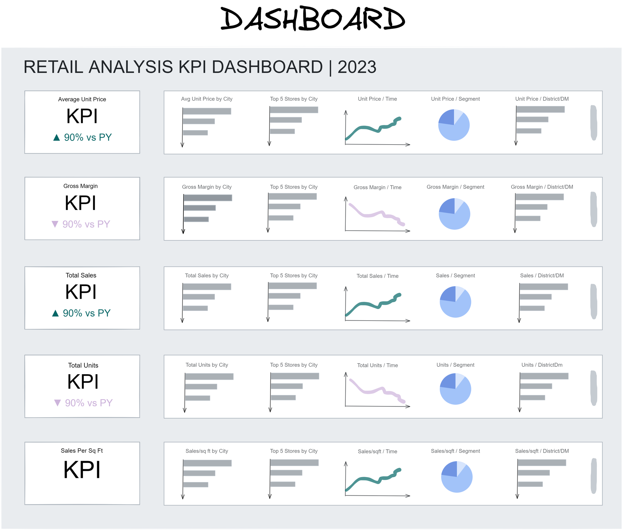
After getting a good idea of the data, I went on to sketch out my dashboard. I took inspiration from one by Priya Padham and another by Edoardo Aversa, and came up with the following sketch:

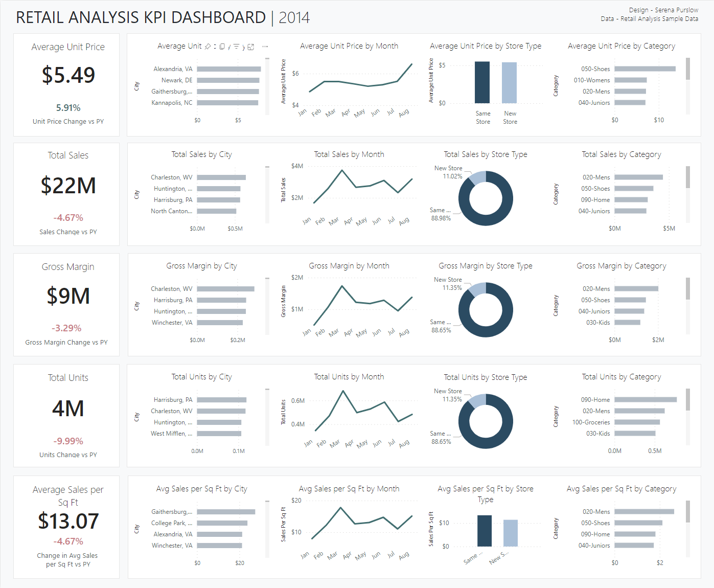
After this I got to building the dashboard in Power BI. It felt pretty weird using Power BI after being so comfortable in Tableau, but it definitely got more intuitive as I got used to the lay out. I had a few struggles creating calculations for percent change, and conditional formatting of colors, which I found less intuitive to do than in Tableau, however I managed to get there in the end.
Whilst I feel like you have more control over the formatting in Tableau, I think it's easier to get a really polished look in Power BI, as it really does quite a lot of the work for you. Additionally, PowerBI has automatic filters - if you click on one field, it will filter the rest of the dashboard, which I really liked. You can of course do this in Tableau, but it was nice not having to write out lots of filter actions! I guess the benefit of doing it in Tableau however is that you can control which charts are included/excluded in the filtering (there's probably a way to do this in Power BI, I just didn't find it!).

I'm pretty pleased with my finished dashboard, and actually had quite a good time using Power BI. You can check out my finished dashboard here on the Power BI website.
The takeaways from today? I'm really learning the value of having a solid plan. I've been getting better at planning every day, and I think this has really shown in my work, although I do think I was under more time pressure in general on Monday and Tuesday. I think in terms of getting a slick dashboard design, finding inspiration first and setting out a clear structure is a massive aid in making something that looks quite polished.
