


Our third day of dashboard week took a step away from horrible data cleansing, towards design. The focus? Creating an infographic using data on Marvel characters.
An infographic is a visual representation of data and information, and an opportunity to really get into design. I was excited to start this challenge as I've really been enjoying getting to grips with design, and I took this as an opportunity to be creative as possible.
I started by planning my dashboard to a T, as I wanted to incorporate Figma in the design of my viz. Figma is a tool which allows you to create backgrounds, text and much more, but to use it with Tableau, you need to have a really firm idea of where you want everything to sit on your dashboard, so you can create a background in Figma that will exactly align with the contexts and size of your dashboard. This allows you to use a custom design as a tiled background image on your dashboard, and then you can float graphs and other things from Tableau, over this background image.
Before I got stuck into Figma, I started looking for inspiration from other infographics on Marvel data, creating a mood board of ideas that I wanted to incorporate. I then had a brief look at the data in Tableau, to get an idea of what sort of story I wanted to tell. I decided to look at the gender split of characters in the Marvel universe, as from a glance I could see that it was heavily male dominated.
I came up with the following user story:
As a… fan of the marvel universe; When… looking at the division of marvel characters by gender; I want to… be able to see the difference in number of appearances, number of avengers, and numbers of deaths/returns between male and female avengers; So I can… decide on whether Marvel is a male dominated fandom.
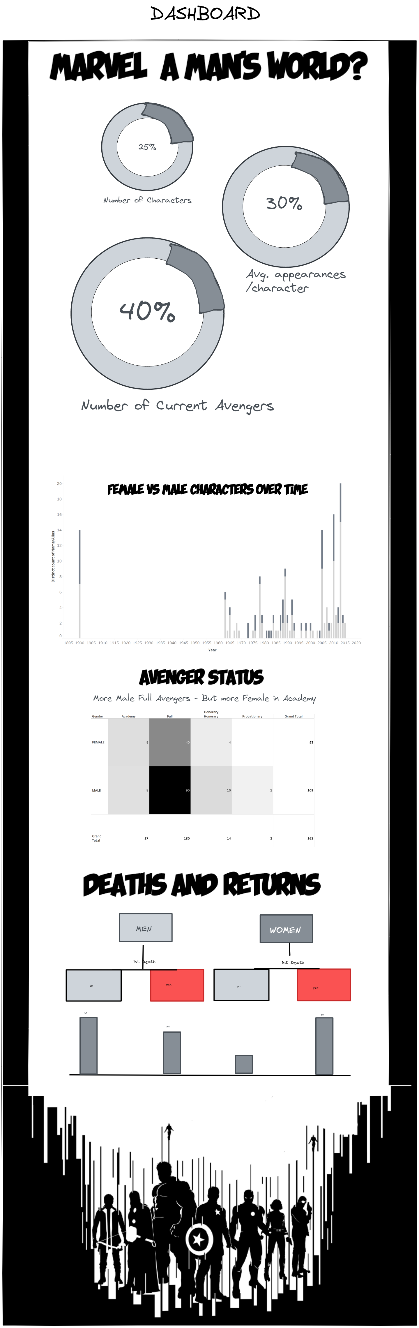
I then came up with a sketch of how I wanted my dashboard to look, and the graphs I wanted to put in it:
With this design in mind, I got to work creating my charts, and then creating my background in Figma. There was a lot of to and fro with this, to make sure elements aligned, such as the titles for my donut chart where the title is actually part of a background image, and the donut chart is layered over in Tableau. I also wanted to create a type of flow chart that would lead into a bar chart, to look at the deaths of male/female Marvel characters. I ended up creating the flow chart part of this idea in Figma, along with the background, and then layering over a bar chart. I had a lot of fun playing with font types, and chart choices to build up the following dashboard:
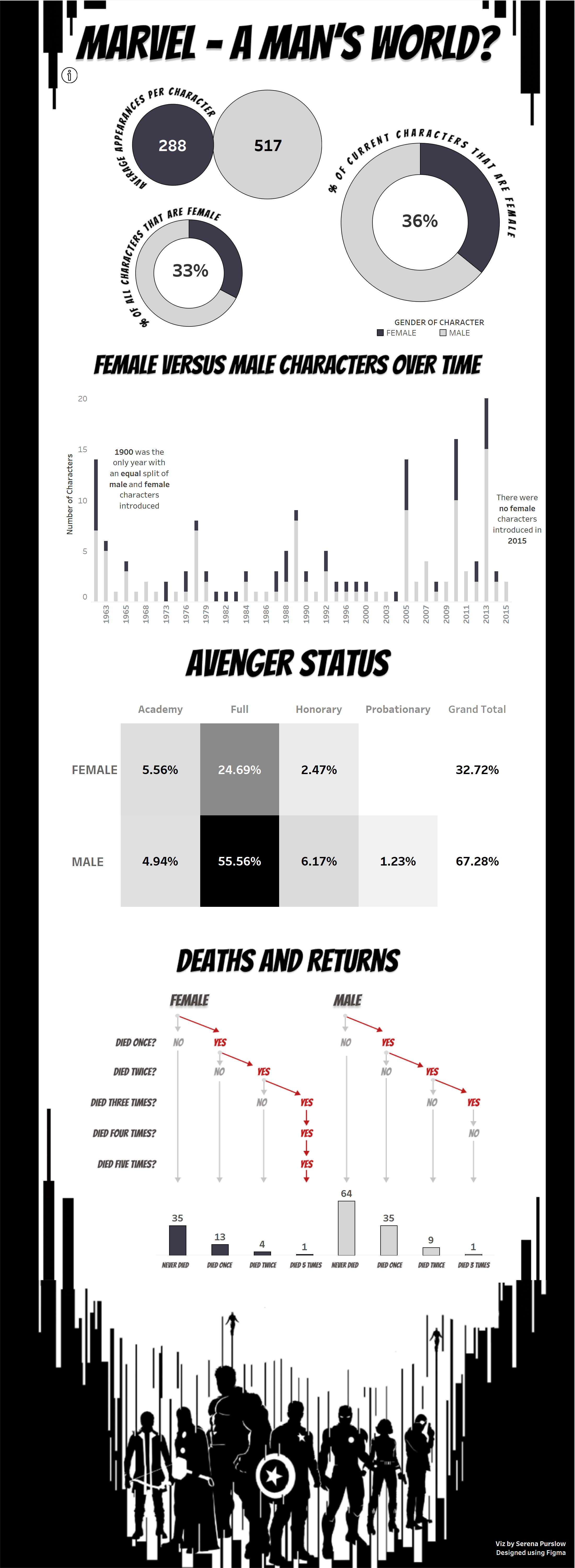
The takeaways from today? I actually managed to create a schedule that I stuck to, which I think was a testament to the lessons I learnt during the first to days of dashboard week, particularly that of setting a scope that is actually achievable in the time given. We've not had our feedback yet, but I'm quite proud of this viz, I have definitely pushed myself in terms of design, and I'm pleased with the final outcome!