


Dashboard week day to and the pressure kept mounting!
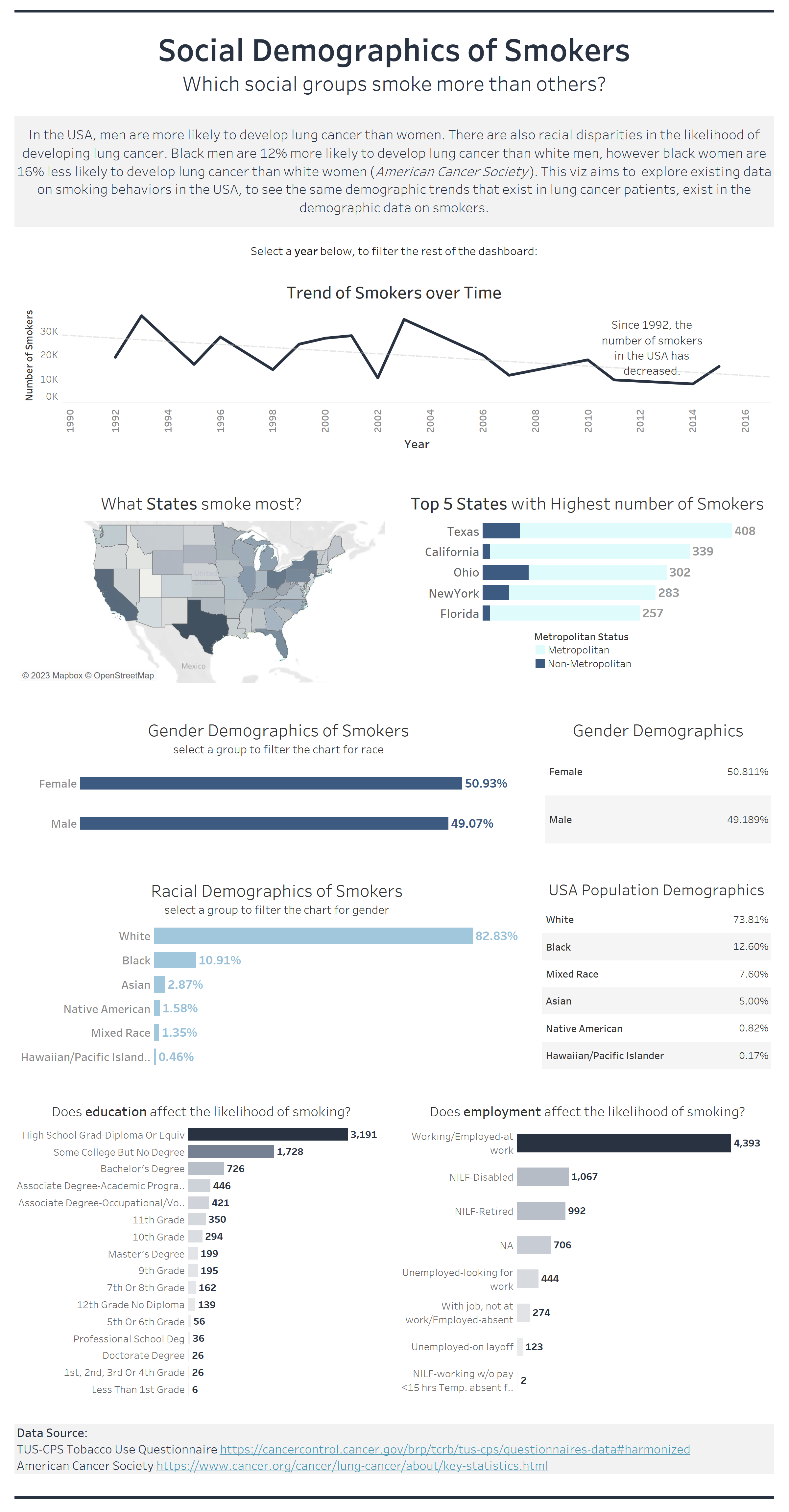
I started the day off with great intentions. We got our brief, I made a plan, did some research and came up with a little sketch. The data was on tobacco use and smoking in the USA, 1992-2019. Looking at papers that had cited the data, I found some interesting research on how the racial population demographics of lung cancer patients are not equally represented by the demographics of smokers, or general population data. With this in mind, I wanted to explore the demographic build up of the smoking data.
I stuck to my plan and was going fairly well until I started trying access the data. Although I'd given myself a good amount of time for data prep and cleansing, this ended taking up most of my day. The data in question could only be downloaded in a DAT file, in which all 288 fields were squished into single cells, and the only way to tell which field started where was by using the data dictionary for the dataset, and looking at the character position. This was tricky enough to extract all the data from, requiring multiple formulas using SUBSTRING, to extract characters at a certain position. However, this was made so much harder by the fact that rows of data for different years had fields that started at different character positions, and this wasn't really mentioned in the data dictionary. I ended up spending hours trying to just get the data in a usable form, made worse by my Alteryx crashing multiple times.
With about an hour to go before the cut-off I got to work building my dashboard. I'd managed to create the template whilst waiting for my data to load through Alteryx, so I didn't have to worry so much about formatting. However, there were several points where I had to go back to the dashboard i.e. Alteryx, to reconfigure some of the fields I had pulled through as they weren't correct. I ended up narrowing the scope of my dashboard, and just trying to create a few charts that would at least tell some of the story I had wanted to tell. In the final half hour I brought in some external demographic data, which ended up not working for most of the years but hey ho, the idea was there. The idea behind this was highlighting the fact that although we may see higher numbers of smokers for certain demographic groups, this may be explained by the fact those groups make up a larger portion of society, so saying they are more likely to smoke would be incorrect.
This was the final dashboard I managed to create in the time frame:
The take-aways for today? Factor in more time for data prep than you need, and don't bite off more than you can chew! I definitely think my plan was way to complex and broad for the scope of today, so moving forward I will try to come up with smaller tasks for myself that I can actually get done in the time I have to do them!