Much of my past week at the Data School has been focused on dashboard design. From parameters to containers, we've been getting into how to make your dashboards most appealing. To get some practice, and build up my skills, I applied some of the key concepts discussed this week to a Makeover Monday challenge, which I'll walk you through now.
Step 1 - Planning
Planning is the key to data success, not just in terms of dashboard design, but in prep and analysis too. Having an idea of what your outcome should look like is extremely useful in helping you actually get there.
The data for this weeks' Makeover Monday was from David Riedman's K-12 School Shooting Database (2022). This data contained information on school shootings in the US from 1970 - 2022.
In planning my dashboard, I went back to my meta plan from earlier this week:
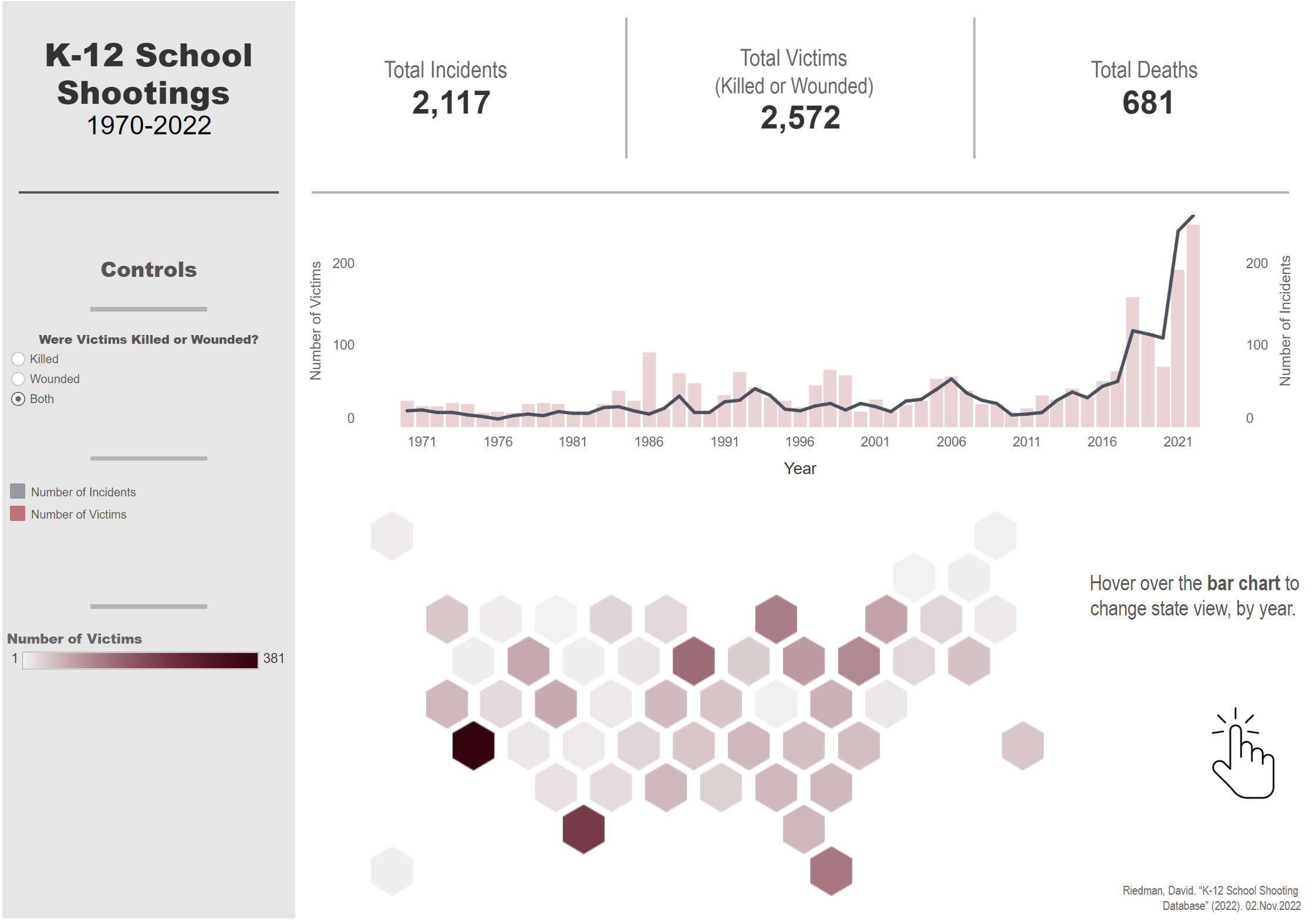
I decided to create an exploratory dashboard, as I wanted my user to be able to explore the increase in shootings in America over time, and the numbers of victims.
I chose my chart choice according to my data: I had some temporal and geographical data that I wanted to display, which influenced my chart choice. I also chose to add some parameter controls, given my data type, so that the user could change the dashboard depending on the type of victims - whether they were wounded, murdered or both.
When thinking about chart choice, it's important we think about how users view data - i.e. our pre-attentive attributes. The type of information we can process quickly depends on position, colour, size and shape (in that order of importance - position being most important). I kept this in mind when choosing my charts.
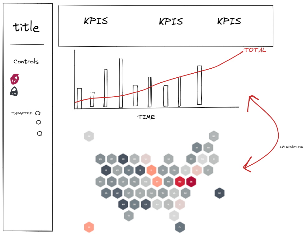
I sketched out an idea of my layout, and had a think about what colours would be appropriate for my design. I wanted to stick with neutral colours, and one colour that would stand out, enabling me to highlight key information.
This was the sketch for my dashboard:

Step 2 - Building
Next step was to build my worksheets for my dashboard using my sketch. To begin with, I explored the data a little, before creating my parameters that would allow the user to change graphs depending on victim type.
I then started by building my bar graph (with my parameters), removing any sheet borders or lines to make the bars stand out, changing my fonts to Arial (which I did throughout my design so it would look uniform), and applying the colours I had chosen. If you're in need of any colour insporation - coolors is a great place to get a range of colour codes and palettes which you can feed directly into Tableau.
Next I went about creating my hex map. I chose a hex map as it gives a more uniform feel to a map, as all states are sized equally, allowing smaller states to be seen. As before, I removed all my borders and lines, as well as the headers. I applied my colour palette of choice, and also added in my parameters.
The next job for me was to create my KPIs, to put at the top of my dashboard. I did this by dragging in a field to the text box in the marks card. I then formatted it as below:

I did this for all of my KPIs and was then ready to build my dashboard, using the sheets I had created.
I began by laying out my containers, depending on where I wanted to put different sheets. Having my sketch was really useful for this, as it gave me an idea of where I should put what container, and whether it should be horizontally or vertically stacked.
After dragging in my graphs and parameters, I added some titles and some dividing lines (which I did by dragging in an empty blank, changing the background colour and outer padding, and then sizing it how I wanted). Last of all, I made sure my colours were all formatted uniformly, and my text was all the same font. And that was it - a much nice dashboard that I could have created 4 weeks ago!

Check out my final dashboard here:
https://public.tableau.com/app/profile/serena.purslow/viz/MakeoverMondayW48/Dashboard1
