Ah, the grand finale of Dashboard Week. A two-day (ish) escapade into the world of IMDB data—TV shows, ratings, genres, awards, the lot. The task? To create a mostly static infographic-style dashboard. After a week of crafting hyper-interactive, all-singing, all-dancing dashboards, this felt almost… peaceful. No frantic parameter tweaking, no action filters—just pure, unfiltered design indulgence. And honestly? A bit of a treat.
Step 1: Data Discovery (or lack thereof…)
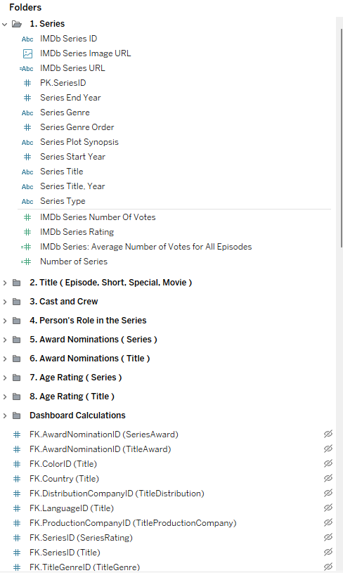
I won’t lie—I didn’t exactly dive into the data. It was more of a polite skim. A brief glance at the fields, a sense of what was there, and a quick decision that I needed to narrow it down. With an overwhelming amount of information at my fingertips, I opted for something close to home—Polish TV. As a proud Polish woman, my household is never without a background symphony of Świat Według Kiepskich or Rodzinka.pl. Nostalgia won. Poland it was.
Step 2: The Plan (and the Pivot)
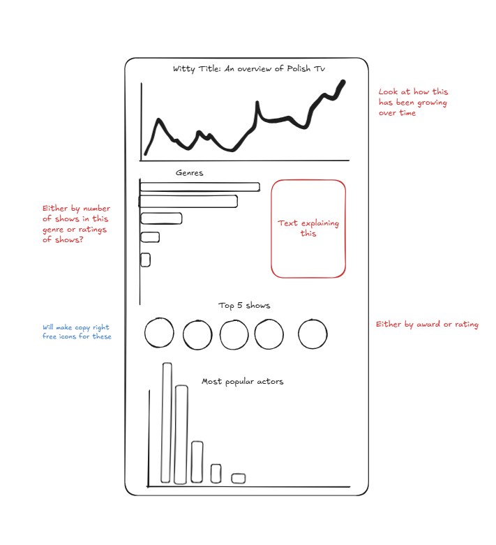
Originally, I envisioned a very proper, very serious data visualization—informative, structured, all about the numbers. But the vibes? Off. So, I switched gears and took a more artistic approach. Enter: Polish folk patterns. If you’re Polish, you know what I mean—those vibrant, intricate floral squares, sometimes with tiny chickens for good measure. A quick Pinterest spiral later, I decided to create a visual grid inspired by these designs, using colour to represent different stats like genre and rating. A Polish folk quilt, but make it data.
Step 3: Data Prep (Or, The Struggle)
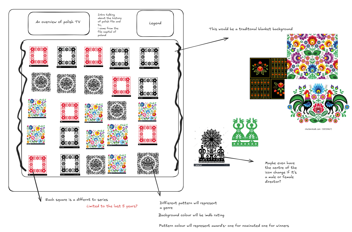
Initially, I hoped to get away with just the raw dataset—no extra fuss. That dream lasted about five minutes. Creating a waffle grid with multiple layers turned out to be trickier than anticipated. Cue a deep dive into the wisdom of Andy Kriebel, a bit of trial and error, and ultimately, the realisation that I needed to extract and join specific tables to make it work in Tableau. This process took… longer than I care to admit.
Step 4: Assets, Assets, Assets
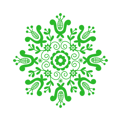
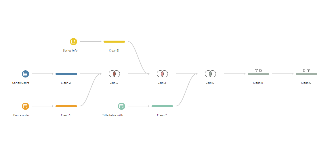
Finding the right visuals became an adventure in itself. I scoured the internet for pre-made assets, but alas, nothing quite fit the vision. So, like any desperate creative, I took matters into my own hands—Canva to the rescue. Ideally, with more time, I’d have drawn even more detailed illustrations, but for now, a slightly cartoonish approach would have to do. Squares, a bed, pillows—the essentials for my folk-art-inspired TV data duvet.
Step 5: The Build (And the Mild Chaos)
At first, I attempted to layer floating elements (please, Tableau gods, forgive me). It was a disaster. I had to pivot, refine my data prep, and make the waffle template work properly. Once that was sorted, the actual build came together relatively smoothly—thanks to trusty map layers. Then came the colours. Polish folk art is bold, but I wanted something vibrant yet not overwhelming. I’m still tweaking, so expect some shifts in the palette.
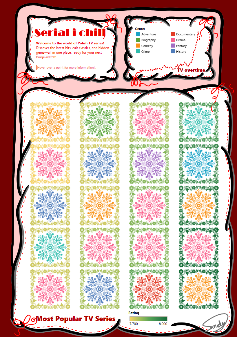
And voilà—the final viz!
Let me know what you think. Next steps? A new background and possibly some size adjustments to fit the legends better. But for now, I’ll bask in the joy of making data look pretty.
~S
xoxo
