


Welcome to my new series, where we dive into the quick, chic tips for data analytics and visualization that can (hopefully) be implemented faster than you can flag down a black cab in Central London. Think of it as the Pret A Manger of analytics advice—bite-sized, satisfying, and guaranteed to make you feel like the Samantha of your office.
Since Cohort 48 has been deep in Power BI week (I see you all at your desks in the City, juggling KPIs and flat whites), let’s kick things off there. Picture this: the whole class groaning when I casually asked Robbin how to make a bar chart change colour based on a slicer selection. Sorry, team! But in my defence, how could I not chase this idea down? And now, like a good mate sharing the latest finds at Liberty London, I’m passing this little hack on to you.
Step 1: Make the Measures
Under the Home tab in Power BI, you’ll find a button called New Measure. It’s the DAX equivalent of jotting down a cheeky column idea on the Overground—it’s where inspiration turns into reality.
Here’s what you do:
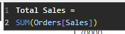
- Create measures for "Total Profit" and "Total Sales."
- Aggregate them using
SUM, because raw data is like Tesco meal deals—not bad, but not dinner-party ready.
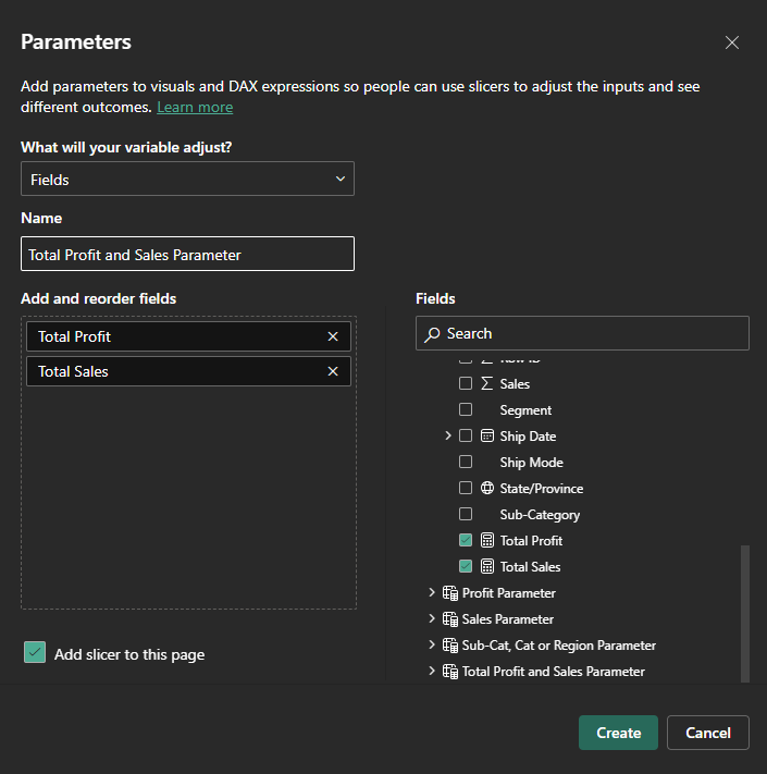
Step 2: Create a Parameter
Next, head to the Modeling tab and click New Parameter. This is where we pull in our measures, give the parameter a name worthy of an afternoon in Mayfair, and click Create. It’s like assembling your Soho House guest list—curated, intentional, and designed for a smashing time.
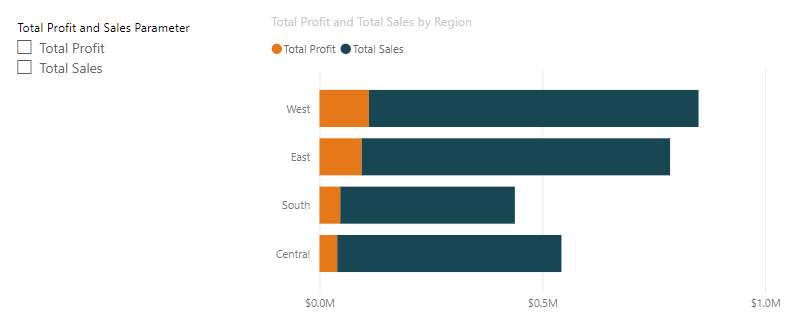
Step 3: Build the Bar Chart
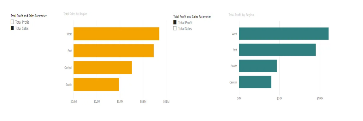
Click on the bar chart visual, drag a categorical column (like Region) to the Y-axis, and the parameter to the X-axis. Voilà! A bar chart that changes based on your slicer selection. But hold on—this chart is analytics’ answer to a roast dinner without Yorkshire puddings.
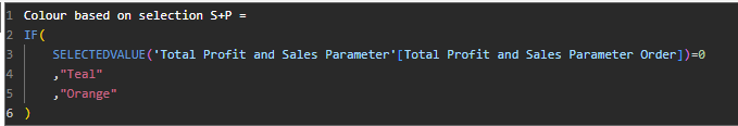
Step 4: Add Colour
Here’s where we make the magic happen. Two options:
- Colour Measure: Write a simple DAX formula that assigns a colour (e.g., teal for profit, orange for sales) based on the parameter value.
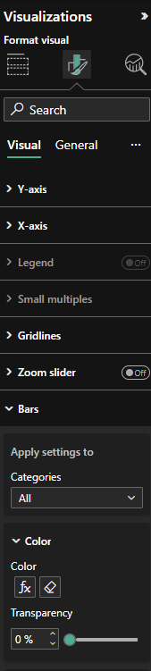
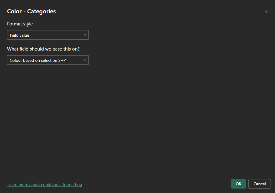
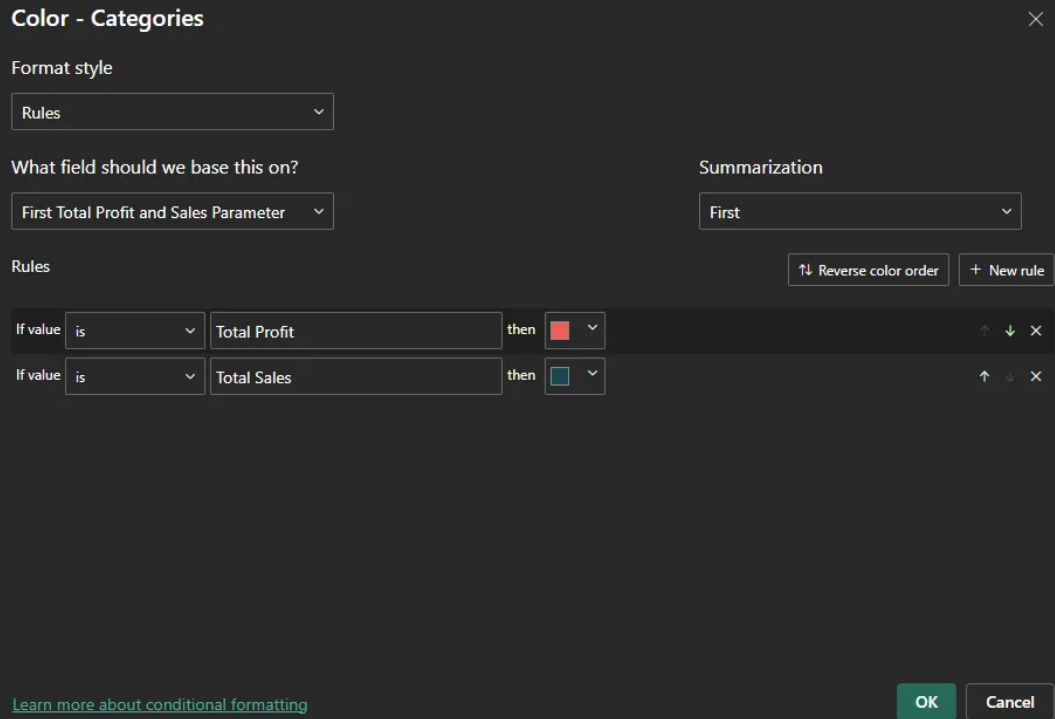
- Rule-Based Colouring: Skip the DAX faff and set rules directly in the Format Visual tab.
Either way, your bar chart will now be giving Harrods-window-display energy and actionable insights.
If you fancy giving this a go, download the Sample-Superstore dataset here. Because in data analytics, as in life, it’s not just about the numbers—it’s about how you present them.
And just like that, your bar chart became the talk of the Tube.
Song of the Day:
~S xoxo