


They say in the world of data, things are never as simple as they seem. And today, as I dove into the world of Power BI, I learned that the road to insightful dashboards is paved with calculations, assumptions, and a lot of trial and error. The task at hand? To create a dashboard for Contoso—a retail giant in the tech world with stores scattered across the globe. Sounds simple enough, right? But as any data enthusiast knows, the devil is in the details.
The brief was clear: pick an analytical route. Performance. Product trends. Or maybe even a dive into the depths of customer demographics. I started with the basics—jotting down business questions that could lead me anywhere from regional analysis to tracking over-time performance. Then, of course, came the data discovery phase, where I uncovered the golden nuggets of fields and their subtle connections. And let’s not forget the most crucial insight—I needed a customer demographic breakdown. Who was buying what, how much, and where were they spending the most?
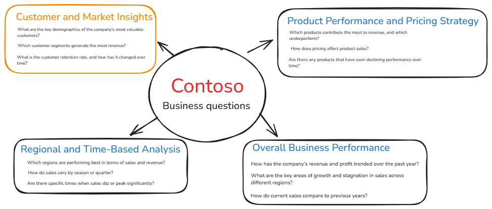
After narrowing the focus to customers in the USA (because, honestly, taking on every country felt like a task for another day), I set my sights on creating a meaningful narrative. What did I want this dashboard to say? Here’s where it got interesting:
- The Overview: Age, gender, and location of buyers.
- Customer Segments: The frequent flyers, the one-time shoppers, and those high-value customers splurging on the priciest gadgets.
- Retention Insights: Who’s returning year after year? How many orders are being placed monthly? And are we actually hitting our retention goals?

Of course, no dashboard is complete without its KPIs:
- Customer Lifetime Value
- Retention Rate
- Average Order Value
- Total Revenue per Customer & Total Profit
And because I love a good tweak, all of these can be broken down by year, and the lifetime value shifts with a parameter, letting you see if holding onto customers longer truly increases their value.
The real magic began once the building started. There were formulas—lots of formulas.
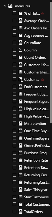
DAX versus Tableau? A whole new kind of brainpower required. But after countless calculations (and a fair few moments of “what did I just do?”), here’s what I came up with:
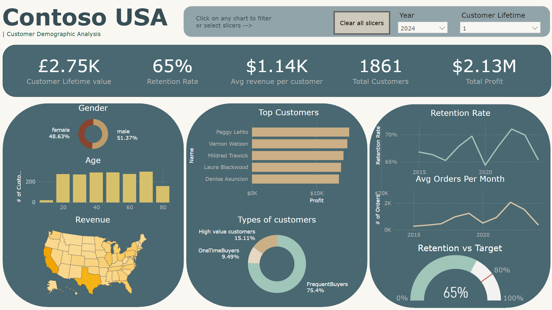
Next Steps?
- Resize those KPIs—give the charts room to breathe.
- Add percentage changes to each KPI. Because who doesn’t love a good visual comparison?
- Add a target line to the retention rate chart and get rid of that pesky gauge chart.
It’s a work in progress, but as always, I’m eager to hear what you think. 😊
~Sandy
xoxo