I couldn’t help but wonder—was my digital CV a reflection of me, or just a polished, pixel-perfect version of who I wanted to be?
Dashboard Week, Day 2. The task? Create a digital CV in Tableau that encapsulates four months of blood, sweat, and dashboards. Simple, right? But like any great makeover montage, it all starts with a little research…
Step 1: Seeking Inspiration
Like any self-respecting data enthusiast, I took to Tableau Public to see what was out there.
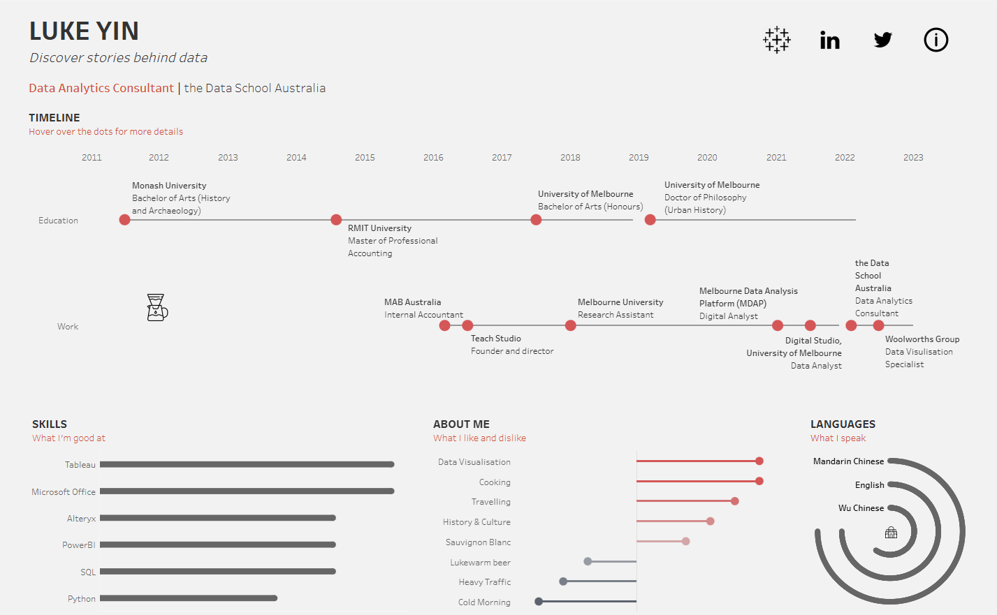
- One design caught my eye with its neat division of education and work experience into two separate Gantt charts. Organised, clear, aesthetically pleasing—everything my sock drawer aspires to be.
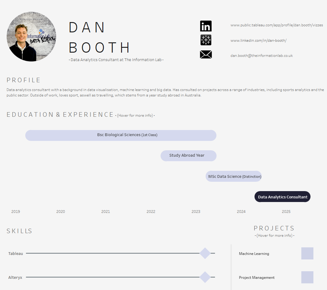
- Another had a clean, minimal style with rounded edges that softened the overall look. Bonus points for the clever career highlights section—snappy, effective, straight to the point.
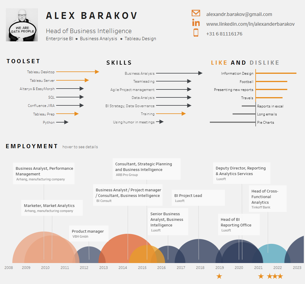
- And then there were the competency bar charts. A slick way to show skills, strengths, and even dislikes at a glance. I was sold.
Step 2: The Grand Plan
Armed with inspiration and an ambitious to-do list, I sketched out my plan (first in my trusty notepad, then in a more aesthetically acceptable format). The vision?
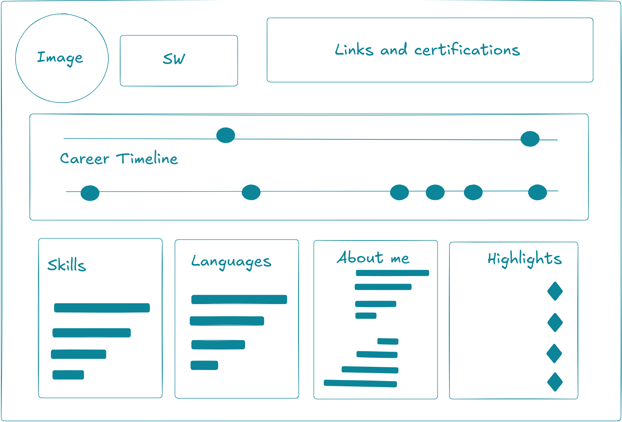
- A chic headshot (because who doesn’t love a well-lit selfie?), my name, and current role.
- Clickable social media links and certification badges—because validation is key.
- A career timeline split into education and work—simple, effective, no clutter.
- Bar charts to showcase skills and interests, plus a highlights section for the mic-drop moments of my career.
- A mobile-friendly version with a vertical career Gantt, because let’s face it, we all live on our phones.
Step 3: Gathering Resources
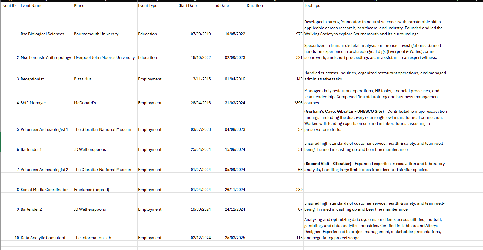
Now, the real work began—building the data. Up until now, we’d been cleaning and transforming data, but creating it from scratch? A whole new ballgame. Trying to recall my job history from a decade ago felt like trying to remember every ex’s birthday—impossibly difficult and slightly traumatic. Note to self: start keeping better records.

Next, colours. I wanted something that screamed ‘me’—so, naturally, I gravitated towards teal and turquoise, my personal beachy zen aesthetic. Mood boards were made, palettes were curated, and before I knew it, I was down a Pinterest rabbit hole.
Lastly, icons and logos. If I was linking to my certifications, I wanted actual certification badges, not just generic icons. It’s the little details that make a dashboard feel polished, after all.
Step 4: The Build
The career Gantt was my first challenge—and oh, what a challenge it was. I initially attempted a waterfall-style chart, but overlapping events made it look more like a crime scene than a career path. After much trial and error, I settled on two simple lines with dots to indicate milestones, neatly colour-coded by work and education.

Next, the bar charts—quick, easy, satisfying. Then the highlights section, followed by the social icons and buttons. With everything placed onto the dashboard, it was time for the finishing touches: aligning elements, tweaking colours, adding subtitles, and formatting tooltips (or deleting them when they got a little too chatty).
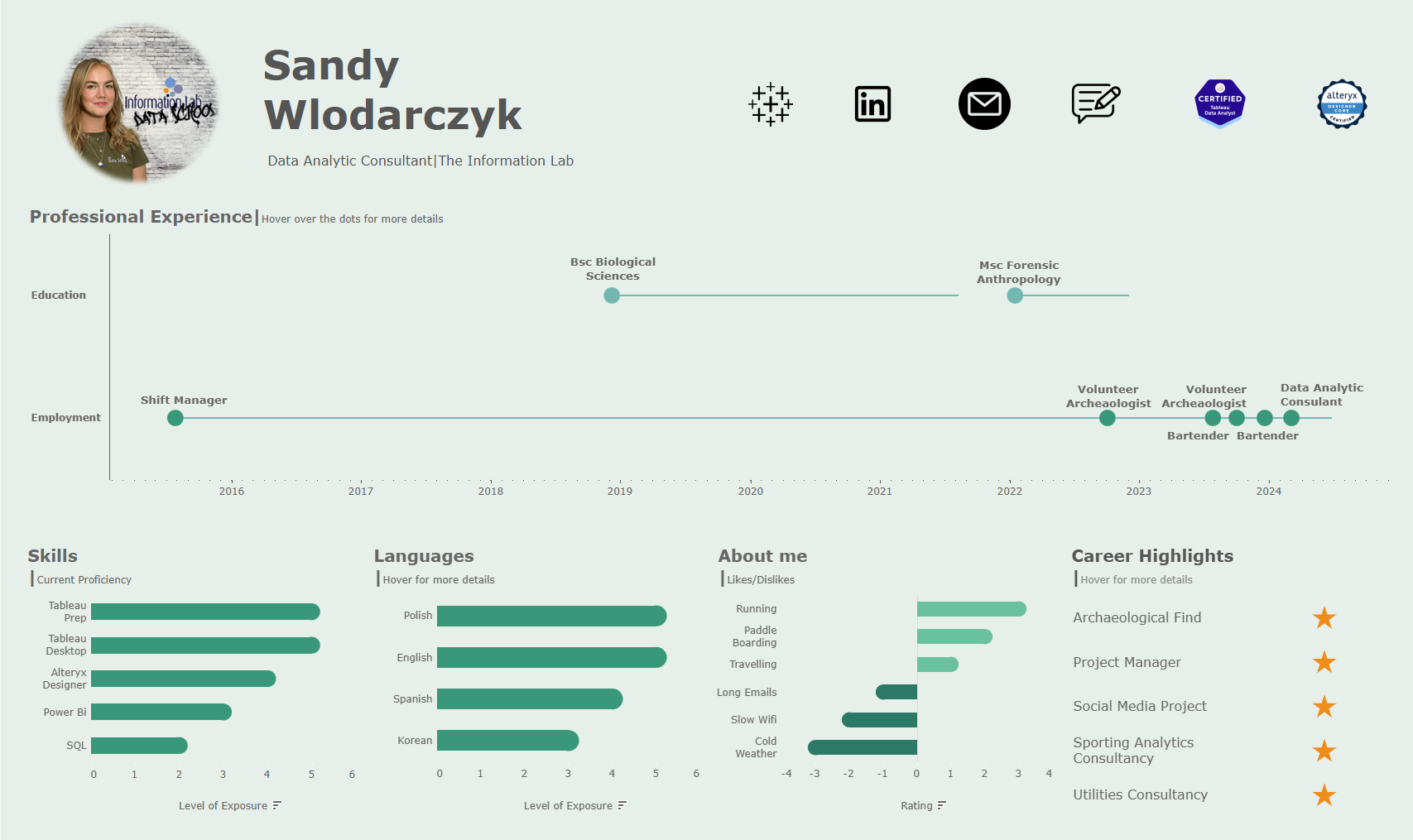
And voilà—the final version. A digital CV that felt me, through and through. A few last-minute tweaks—like swapping out generic icons for real certification badges—added the perfect touch. Fully interactive, fully mobile-optimised, and ready for the world to see.
So, what do you think? Check it out for yourself: Tableau Public Link.
