


Today, I found myself on an unexpected first date with two characters who had been strangers to me until now: Power BI and Power Query. If data had a fashion show, these tools would be walking the runway. For those blissfully unaware, Power BI is Microsoft’s answer to modern business analytics. It connects you to your data, dresses it up in gorgeous visualizations, and suddenly you’re turning numbers into insights that make your manager gasp in delight.
But the unsung hero behind the scenes? Power Query. Think of it as the stylist prepping your data for its close-up: cleaning it, organizing it, and making sure it looks ready for the big event. For my fellow newbies, Power Query feels like Excel’s more refined sibling—designed specifically for prepping data, wrapped in a Microsoft UI that screams, “I’m easy to use, darling”.
Power Query: Cleaning Up My Act
We started with Power Query—the first stop on my data journey. Our mission? To clean and prep the mess. Imagine sorting through your closet Marie Kondo-style, but instead of clothes, you’re dealing with messy columns and misplaced values.
I quickly learned the difference between Power Query and Tableau Prep. Both do the job, but Power Query feels like “Microsoft heavy”: lots of buttons, menus, and hovering tooltips telling you exactly what to do… which, as a former SPSS-suffering student, was a blessing in disguise.
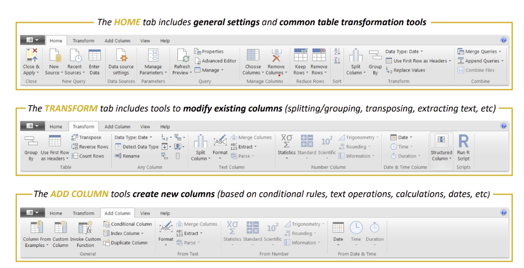
Let’s break it down: the Home, Transform, and Add Column tabs are your power trio:
• Home: Where you remove clutter—columns, rows, change data types—a digital decluttering of your dataset.
• Transform: The makeover station. Here you split, trim, and reshape your data—like telling Power Query to grab just the first half of a messy column.
• Add Column: Same as Transform, but non-destructive—think “duplicate column and experiment” without guilt.
Some of my favourite new tricks? Changing data types, splitting columns like a pro, and extracting tables from websites (seriously, where has this been my whole life?). Picture it: I could’ve saved myself hours on that DS application visualization if only Power Query had walked into my life sooner. Hindsight, as they say, is 20/20.
Power BI: The Real Showstopper
Once our data was clean and polished—Netflix’s Top 100 films based on Rotten Tomatoes scores—it was time for Power BI to shine. If Power Query was the prep team, Power BI is the fashion show: big visuals, bold colours, and all eyes on the data.
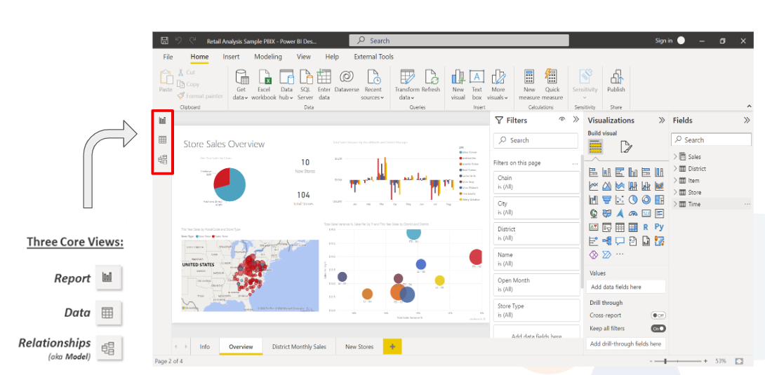
At first glance, the interface feels familiar—like a cousin of Word, Excel, or even Power Query. But the magic happens when you start dragging, dropping, and double-clicking your way to graphs and charts that make you look like a data wizard.
Unlike Tableau, Power BI let me save and reuse custom themes—a small but life-saving detail. There’s something about applying your favourite colour palette across multiple visuals that feels like having your signature red lipstick on standby—consistent, effortless, and uniquely you.
Creating visuals was as easy as picking a mark type, populating axes, and switching things up when inspiration hit. Double-click the bar chart icon and decide you’re more of a scatterplot girl? No problem. Change it with a click, tweak the formatting, and you’re good to go.
We played with mark types like:
• Tables and Matrices (classic and versatile)
• Line Charts and Bar Charts (the wardrobe staples of data viz)
• KPIs and Combo Charts (for when you’re feeling fancy).
The final product?
My very own visualization of Netflix’s Top 50 films. A quick bar chart showed average scores by decade, and a scatterplot revealed something unsurprising—newer films? Not so great. Sorry, Rotten Tomatoes, but the numbers don’t lie… though I did laugh out loud.
Was it perfect? No. Did I have fun? Absolutely. Like any first try, there were bumps, hiccups, and questionable creative decisions. But as I looked at my graphs, I felt proud—and maybe a little like Carrie Bradshaw typing away on her MacBook. Because sometimes, data isn’t just numbers and charts… it’s a story waiting to be told.