For an executive overview dashboard in Tableau with Superstore data, I wanted to build a drilldown bar chart of key metrics by a chosen dimension. After watching Andy Kriebel's video, I built a drilldown bar chart of categories to sub-categories. I recommend watching the video before following the upcoming steps in this blog as I don't include steps to build parameter actions into the drilldown, which are essential for this kind of visualization.
Though Andy's video drills down from category to sub-category to segment, I decided I wanted my bar chart to drill down from category to sub-category. I also wanted to bar chart to have the following functions:
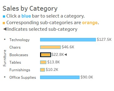
- Once a category is selected, display its corresponding sub-categories in a "highlight" color.
- Allow the user to select one of the individual sub-categories, and display that selection with an indicator.
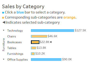
To build a bar chart that functions like the one shown above, you can follow the steps below. Again, please note, steps 1-4 are directly from Andy Kriebel's video which is linked above as well as here.
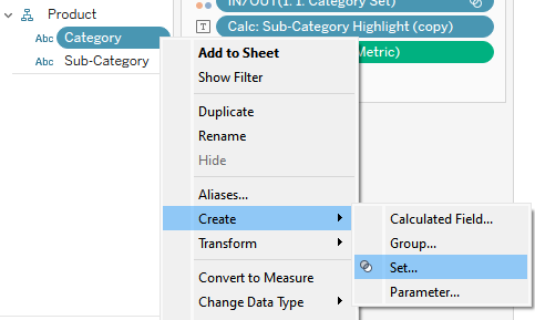
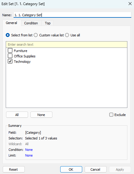
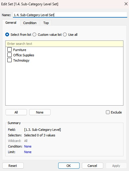
Step 1: Create a Category Set
As stated in Andy's video, the first step of making this drill down bar chart is to create a category set.
Step 2: Create a Category Header. This calculation was also in Andy's video.
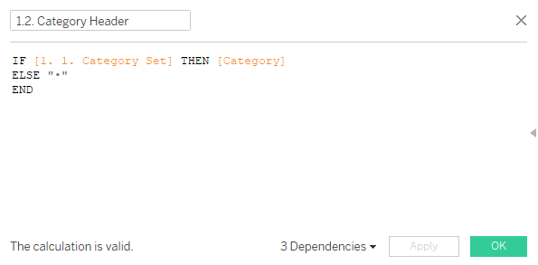
- What it means: If an item in the category set is selected, the category. Otherwise, show "•".
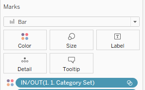
Step 3: Place the Category Set on to Color in the Marks Card. Assign the highlighted color to the "IN" items.
Step 4: Create a Calculated Field for sub-category level. This calculation was also in Andy's video.
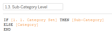
- What it means: If an item in the category set is selected, then show its corresponding sub-categories. Otherwise, show the category.
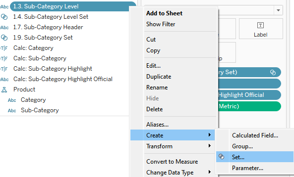
Step 5: Click on the sub-category level calculation (from Step 3), and create a set. This calculation was also in Andy's video.
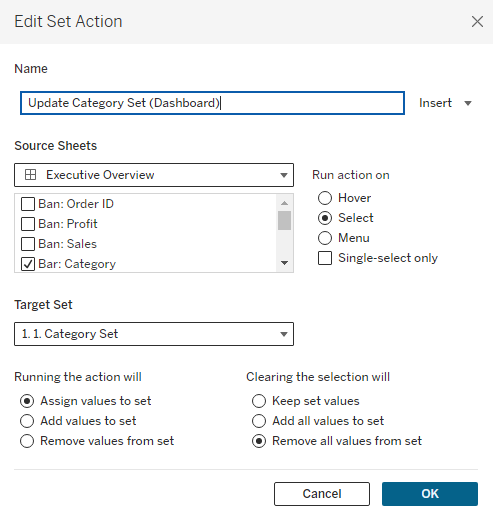
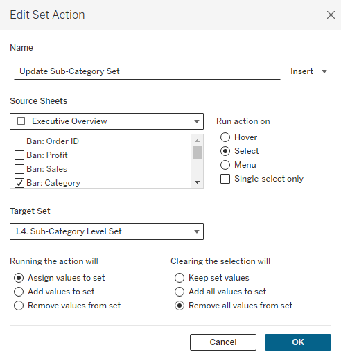
Step 6: Build set actions for the Category Set
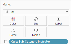
Step 6: Create a Calculated Field for a Sub-Category Indicator
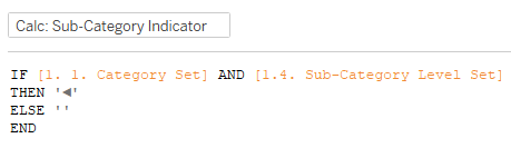
What it Means: If an item is selected in the category set AND if an individual corresponding subcategory is selected, then show the indicator ◄. Otherwise, show nothing.
Step 7: Place the Sub-Category Indicator on Text in the Marks Card
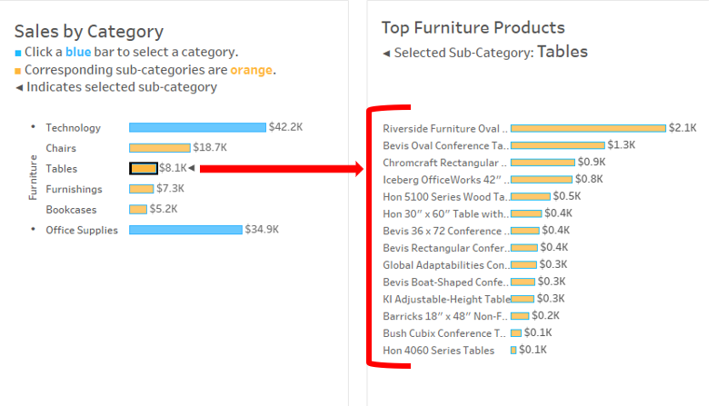
Final Result: As displayed above, the final result should resemble the screenshot below:
Head over to Part II of this blog to see how I used this bar chart to filter to the product level.