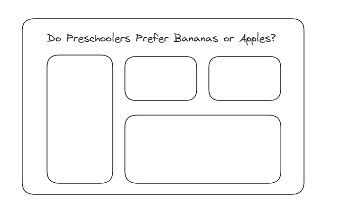
In the realm of data analysis a well-crafted dashboard transforms data into actionable insights. It serves as the map that allows users to navigate seamlessly through mountains of information. The essence of a good dashboard lies in its ability to expedite the journey from raw data to meaningful understanding, sparing users from having to sift through spreadsheets.
In this post I'll discuss strategies that can be used to create dashboards that communicates your data story effectively and reduce the time to insight.
Title
One of the most critical components of a dashboard is its title. The title is the users first point of reference– it establishes context and guidance on the data being presented. If the goal of the dashboard being created is to provide answers to a question consider making the title of your dashboard that question you are asking.
Context
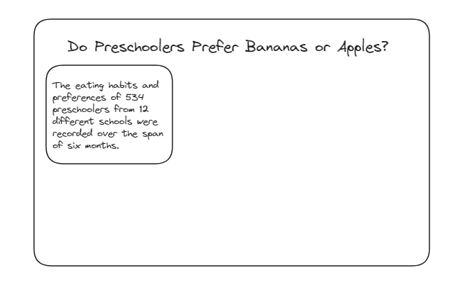
When in the midst of creating a dashboard, it's easy to get so immersed in the data that we might forget not everyone exploring our dashboards possesses the same familiarity with the presented information. As you put the finishing touches on your dashboard, it's valuable to take a moment, step back, and reflect. Ask yourself: What elements might be confusing to others? What seemed complex to me before I became well-acquainted with the data? Addressing these questions and providing context helps ensure your dashboard not only conveys information but does so with clarity and accessibility.
Time & Focus
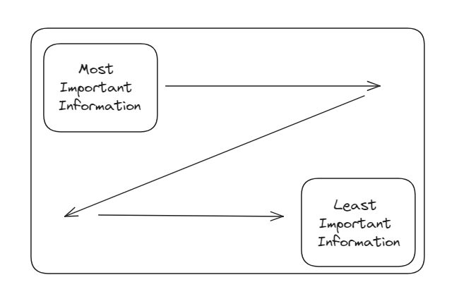
Rarely do we find ourselves creating a dashboard that attempts to unravel every intricacy of a dataset. When embarking on the dashboard creation journey, it's essential to ask: What are the pivotal aspects that demand focus? Particularly when dealing with temporal data, ponder over the crucial periods that merit thorough scrutiny. A helpful principle is to position the most vital information at the top-left corner of your dashboard, allowing the narrative to flow across the screen in alignment with our natural reading patterns. Consequently, reserve the bottom-right corner for the less critical details, forming a deliberate hierarchy of information presentation.
Color
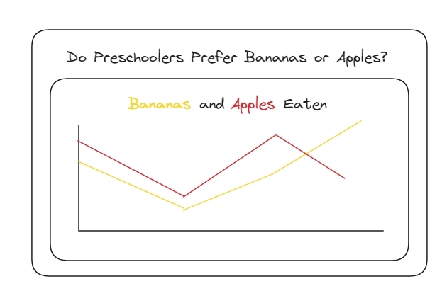
Color plays a pivotal role in shaping any dashboard. It serves as a visual guide, directing attention to critical elements, highlighting positive or negative trends, and spotlighting key information. However, in leveraging color, it's crucial to address accessibility concerns, particularly for individuals with colorblindness. Moreover, the use of color should be judicious, focusing not just on aesthetics but on conveying additional information. Tempting as it may be to add color for visual appeal, it's essential to ensure that each hue contributes meaningfully. Additionally, when employing color, it becomes imperative to provide context. Whether through legends or by strategically coloring keywords in the title, users should clearly understand the significance of each color.
Consistency
Maintaining a consistent visual presentation of your data is key to facilitating swift insights for the user. The goal is to create a seamless experience where users can effortlessly identify patterns and organically follow the narrative of the information you've curated. Achieve this by adhering to uniformity in font selection and size for headings and subheadings, ensuring that alignments are consistent and neat, and preserving uniform spacing throughout the dashboard. This approach significantly alleviates visual clutter, providing users with a smoother and more intuitive navigation experience.
White Space
While the temptation to fill a dashboard with abundant information is understandable, embracing white space contributes to a more effective and professionally polished product. White space offers breathing room for your charts and figures, preventing users from feeling overwhelmed as they digest the presented information. Opting for a clean, uncluttered dashboard with ample padding not only enhances visual appeal but also fosters a more user-friendly experience.
