


A bar chart with Gantt-like lines is a hybrid visualization that combines the elements of a bar chart and a Gantt chart. This chart features:
- Bars: Represent specific metrics or values (e.g., sales, costs, or counts) for different categories or time periods.
- Horizontal Axis (X-axis): Typically displays categories, time periods, or specific tasks.
- Vertical Axis (Y-axis): Displays the values associated with each bar.
For example, imagine you have a bar chart showing sales for different categories of furniture. Above each bar, a Gantt-like line represents the profit for each category. This visualization allows you to see sales and profit simultaneously.
Steps to Create a Bar Chart with Gantt-Like Lines in Power BI
This type of chart is not offered by default in Power BI, but you can create it by modifying the line and clustered column chart. Using data from Superstore, we will create a bar chart with Gantt-like lines.
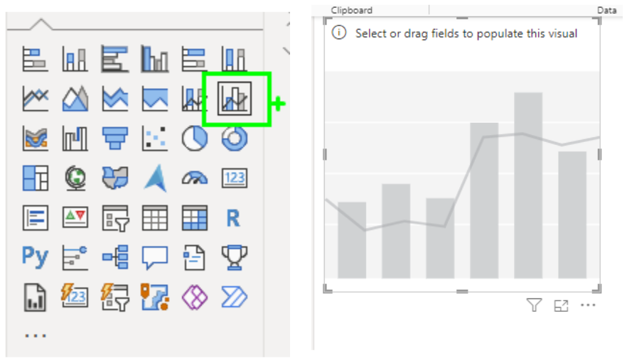
1. Create a Line and Clustered Column Chart
Click on the empty canvas in Power BI and select the Line and Clustered Column Chart. An empty chart will appear on the screen.
2. Drag Values into the Visualization Pane
- Drag Product Category to the X-axis.
- Drag Sum of Sales to the Column Y-axis.
- Drag Sum of Profit to the Line Y-axis.
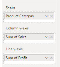
If desired, rename the values by right-clicking and selecting ‘Rename for this visual’.
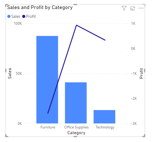
At this point, your visualization will look like this. The line here can be misleading to viewers because it implies that the values are connected in some way and that we are observing some sort of change over time.
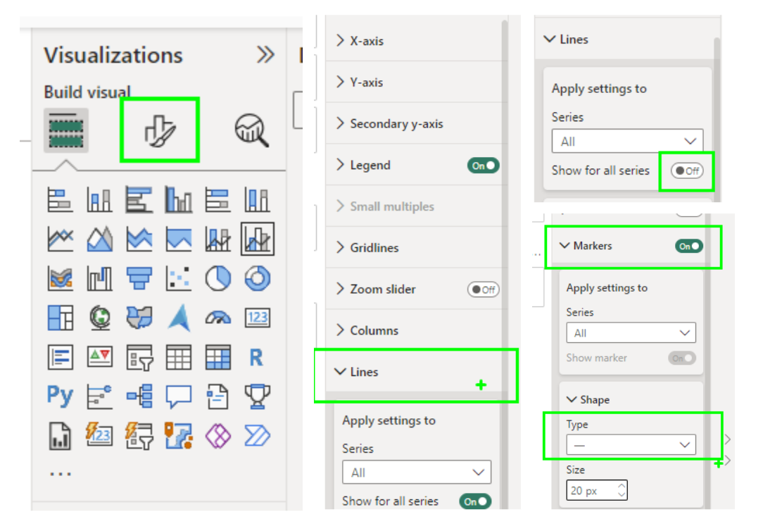
3. Format the Visual
- In the visualization pane, select the format button and open the dropdown menu for lines.
- Turn off the ‘Show for all series’ option.
- Open the Markers menu, turn it on, and change the shape type to a line. Other shape types such as circles or x’s may better suit your visualization needs.
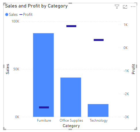
4. Finalize Your Chart
You now have a bar chart with Gantt-like lines! This visualization allows you to compare metrics (like sales and profit) effectively while presenting the data in a visually engaging manner.
Conclusion
Creating a bar chart with Gantt-like lines in Power BI can help you visualize and compare different metrics more effectively. By following the steps outlined above, you can enhance your data presentations and provide more insightful visualizations for your audience.