If you are coming from the world of Python you may be familiar with the concept of a correlation heatmap. These heatmaps allow us to visually interpret how different variables correlate with one another. This tool can show us interesting trend in our data and reveal relationships that can be explored. In Python the use of additional libraries, like seaborn, allow us to easily create correlation heatmaps.
While it is possible to build a correlation heatmap in Tableau there are a few additional steps. We will be using data from the World Indicators dataset provided by Tableau to review how to build a correlation heatmap. We will be seeing how numerical fields from the World Indicator dataset correlate with one another. In order to do this we will need to pivot our data and will be using Tableau prep to do so, but you may use any software of your choice.
- Open Tableau Prep
The first thing we will need to do is pivot the data in the World Indicators dataset. This pivoted data will later be joined with the unpivoted dataset to create our correlation heatmap. Open prep and select the World Indicators Sample Flow.
2. Create a New Clean Step
Forking off from the last clean step on the flow add an additional clean step. In this step
In this clean step make the following changes to the dataset:
3. Create a Pivot Step
Once you have the fields you would like to get correlation for create a pivot step.
Pivot the following values and rename Pivot 1 Names to Var and Pivot 1 Values to Value 1.
4. Export the Dataset
Once you have pivoted the data export it.
5. Open Tableau and Connect the Datasets
In Tableau open the the World Indicators dataset which is built into the program. In addition to this, connect to the pivoted dataset that was just created. Connect the dataset again to itself in the data connection pane.
6. Create a Sheet to Build Correlation Heatmap In
In a new sheet drag the 'Var' field to the columns shelf and 'Var (Corr.csv1)' into the rows shelf.
7. Create a Calculated Field
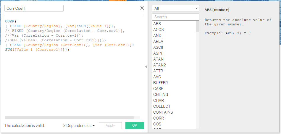
To get the correlation between values we will need to create a calcuated field. Using the CORR function, get the correlation.
CORR(
{ FIXED [Country/Region], [Var]:SUM([Value 1])},
//{FIXED [Country/Region (Correlation - Corr.csv1)],
//[Var (Correlation - Corr.csv1)]:
//SUM([Values1 (Correlation - Corr.csv1)])})
{ FIXED [Country/Region (Corr.csv1)], [Var (Corr.csv1)]:
SUM([Value 1 (Corr.csv1)])})

8. Use the Calculated Field to Color the Correlation Heatmap
Drag the calculated field to color and label on the marks card and change the chart type to square.
This will leave you with a correlation heatmap that looks like this:
