The beauty of data visualization is that you can take a mountain of information and package it into an easily digestible visual. A spreadsheet that was previously a jumble of numbers can transform itself into a beautiful bar chart that clearly demonstrates a previously unknown trend or pattern. When a visualization is well done it looks deceivingly simple, but that simplicity comes from the careful consideration of how information will be laid out and consumed.
Pre-attentive attributes are visual properties that our brains can quickly and effortlessly perceive without conscious effort or focused attention. These attributes include things like color, size, orientation, and motion. They allow for rapid perception, guiding of focus, and enhance pattern recognition. Below we discuss some common pre-attentive attributes that can be used in data visualization to effectively communicate your message.
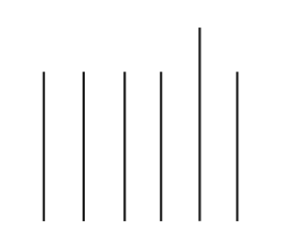
Length:
- Description: The size of a visual element along one dimension.
- Example: Bar charts use the length of bars to represent values.
Width:
- Description: The size of a visual element along the other dimension.
- Example: In a tree diagram, the width of branches might represent different categories.

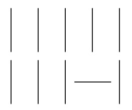
Orientation:
- Description: The slant or angle of a visual element.
- Example: Arrows pointing in different directions can indicate trends or flow.
Size:
- Description: The overall dimensions of a visual element.
- Example: Scatter plots use the size of markers to convey additional information, such as the magnitude of a variable.

Shape:
- Description: The form or outline of a visual element.
- Example: Different shapes in a diagram might represent distinct data categories.

Enclosure:
- Description: Placing visual elements within a boundary.
- Example: Grouping related items within a box to signify a relationship.

Position:
- Description: The location of a visual element in relation to others.
- Example: Scatter plots use the position of points along two axes to represent data points.
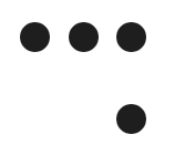
Grouping:
- Description: Combining related visual elements to form a perceptual unit.
- Example: Clustering similar data points together to form a cohesive group.

Color Hue:
- Description: The pure color of a visual element.
- Example: Using different colors for distinct categories in a pie chart.

Color Intensity:
- Description: The brightness or darkness of a color.
- Example: Intensity changes in a heat map to represent variations in data values.