


As a data schooler we are tasked to complete Makeover Monday challenges in one hour. Makeover Monday is a weekly challenge to improve a Tableau dashboard from a given dataset. This week we took a look at the Henley Global Passport Index which ranks every country by how powerful their passport is. A higher ranking country would allow their citizens to visit more places without a visa.
Here is a picture of the original visualization given:
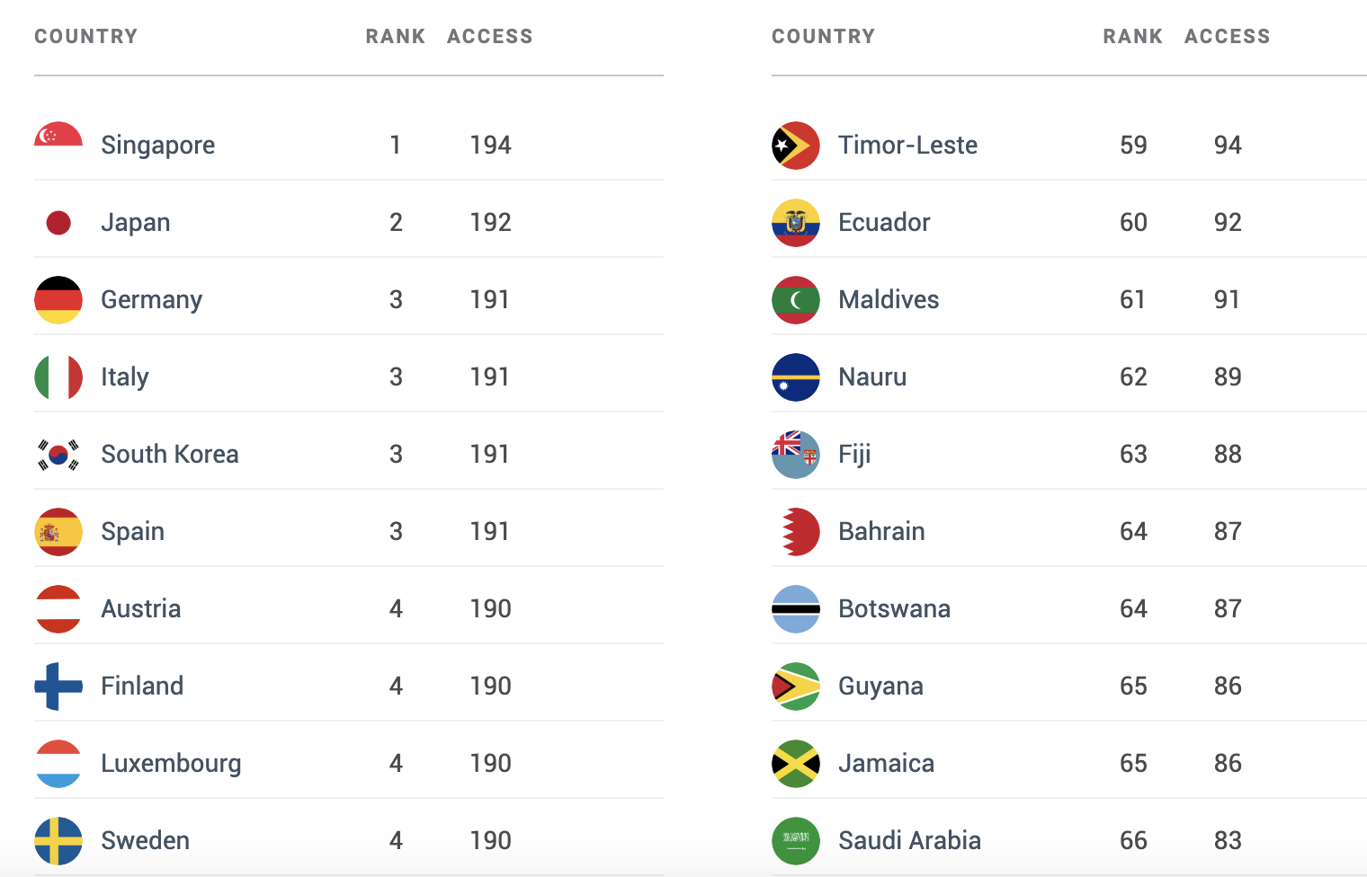
After looking at this I immediately liked how they included pictures of each country's flags. It also shows the top ranked countries quite clearly. However, it only shows a very limited amount of the data. The dataset includes information about 199 countries from both 2022 and 2023. This led me to want to let whoever uses the visualization to see as much information from the dataset as possible. Here is what I was able to create:
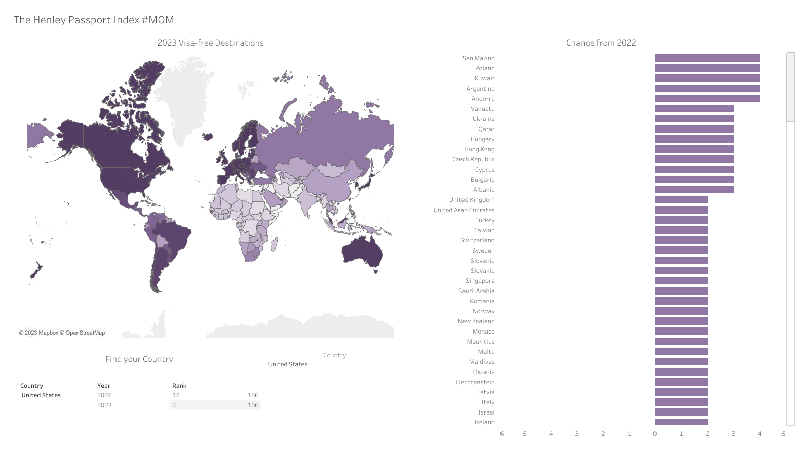
By using a map and a color gradient, we are able to see information about many more countries. In addition, I included a bar graph that shows how each country has changed over the past year and a table where you can search for specific countries to look at their data. This viz can still use some work with formatting since there is a lot of white space but I was successful in showing as much of the data as possible.