


Today we actually received a data set that was clean. It contained information about approximately 20,000 songs, their qualities, the number of views they have, and the artist that created it. From this data, I wanted to create a dashboard that would recommend songs based on the user's preferences. These preferences are the values for certain measures in the data set and they would be compared to each song's measures. That comparison would be used to rank songs based on which ones are most similar to the preference.
The measures used for these calculations were: Acousticness, Danceability, Tempo, Energy, Valence, and the number of streams each song had. These were all normalized so they can be measured in a scale of zero to one. After subtracting the preferences from the values in each song, we can take the average of all of those measures to find a 'distance'. That distance would represent how far from the preferences each song is. Lastly, we can rank each song by how close to zero the distance is.
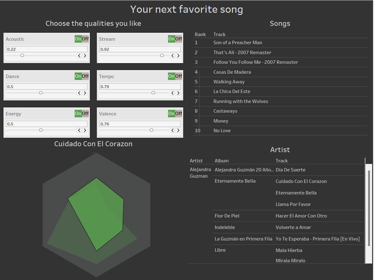
In the dashboard, the cards at the top left are where the user can enter their preferences. This will filter the table of songs on the right. Then they can click on a song to see it's measures on the radar chart. along with which artist created it.