


Today we worked on a dataset about Spotify and YouTube. From Kaggle, the data included the top 10 songs from various artists and information about the song and its YouTube video. Although comparing Spotify popularity to YouTube popularity could have been interesting, I focused on just Spotify Data.
The Ask
Today's project was a fun data set! We had creative liberties as there was minimal data prep needed. After the tough previous day, this was definitely a relief to work with data that was clear and I knew what I wanted to do.
Wireframe
As soon as I saw the different scored measures when it came to song properties, I knew I wanted to do a radar chart. I know... another radar chart during dashboard week.... However, the positive is that I am able to practice the chart type, I was able to scope well because I know what the chart requires, and it simply answers the question I set out: What makes a song popular?
I had different ideas as to what I wanted to include in my dashboard and I have them listed in the first wireframe below.
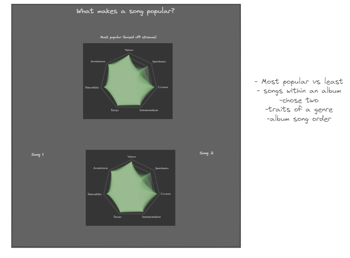
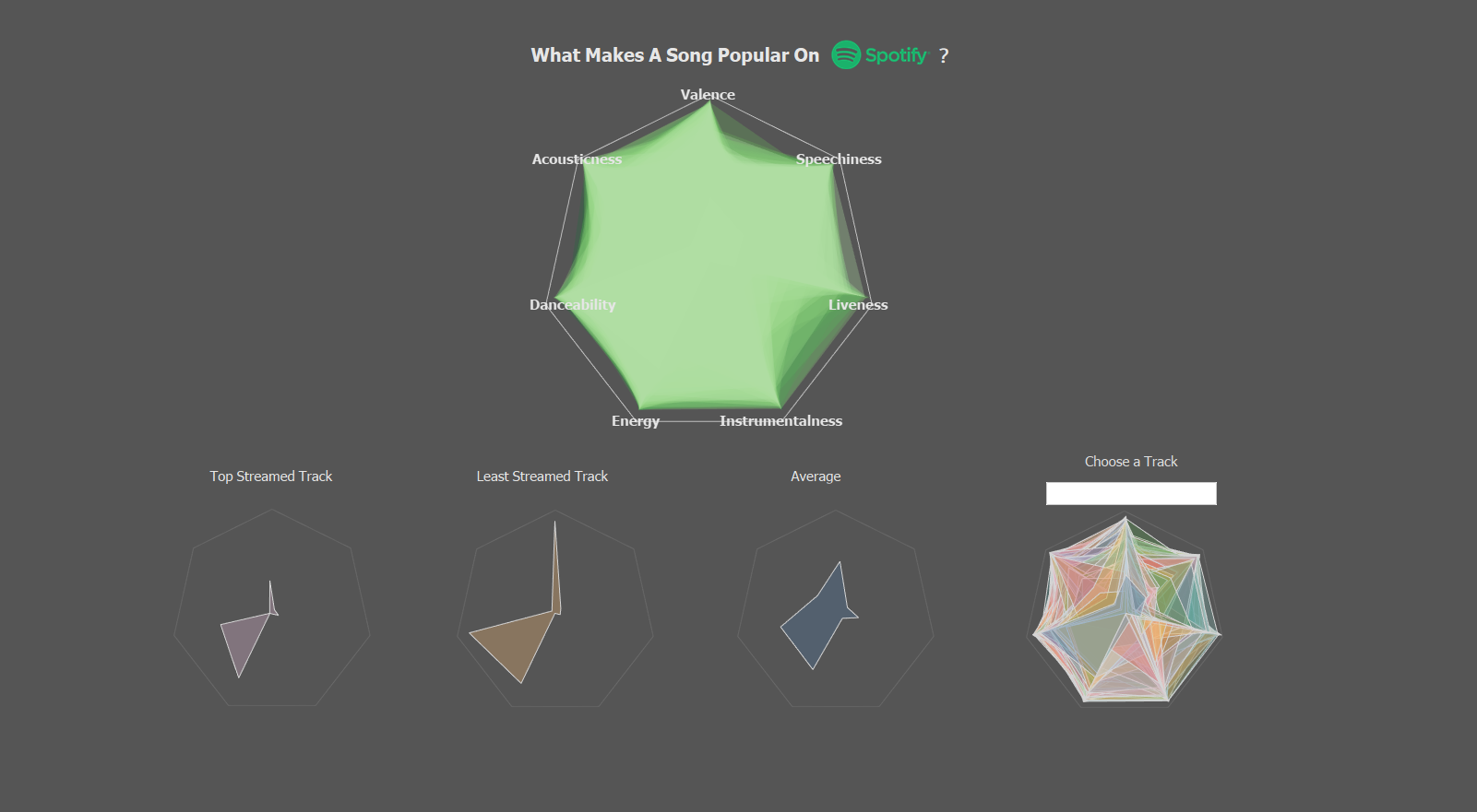
However, in the end I decided to show 4 individual radar charts: The top streamed song, the lowest streamed song, the average, and finally, you choose a song
Data Exploration
Today's data prep was very minimal, in fact, I did not even use the output of my data prep in the end. I used Alteryx mainly just to answer the question I had of if there are specific measures that makes a song more likely to be popular.
In the top section of data prep (in blue) I was pivoting my data so that the measures like "danceability" would be pivoted into Measure Names and Measure Values since I knew that that was how I needed my data to be structured. The reason I sis not use this output was because a lot of the artists and songs titles were messed up because they contained special characters. I learned later that this was because of the code page language, but I had already moved on.
The section below I used to sort by maximum stream (since some songs were duplicated because they had multiple artists). There I was able to identify the song that was most popular by streams and subsequently the least popular. I mainly did this to refer back to make sure my number were correct.
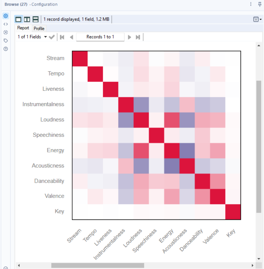
The bottom section was very interesting. Again, in the search for understanding what makes a song popular, I performed an association analysis and you can see my results in the second picture below. There was no significant correlation based on stream, however, it was interesting that Loudness was the highest correlated with streams.
I did not end up using any of this data prep, so this was treated more as data exploration.
Dashboard
I think my dashboard came out great and I am proud of what I was able to achieve in a day. However, there is a minor flaw that affects its useability. The outside is a floating template and Tableau's layout order places floating in front of what is in containers, regardless if you send the floating object backwards. Because of that, the tool tips do not work. A way around this is to float everything and send the template to the back, but I was not able to fix that within the time frame.
There were many bumps in the road with the radar charts that resulted in the final look of the dashboard below. I would have liked to have the four different radars shown on the big one and changed based off what view you wanted while keeping the back showing the rest of the tracks not selected. However, I had trouble doing this. I tried doing the different colors by using filters, parameters, and sets and none worked or caused a different issue... In the end, I just separated the charts and duplicated the Track field so I can have the tracks I wanted in the colors I wanted.
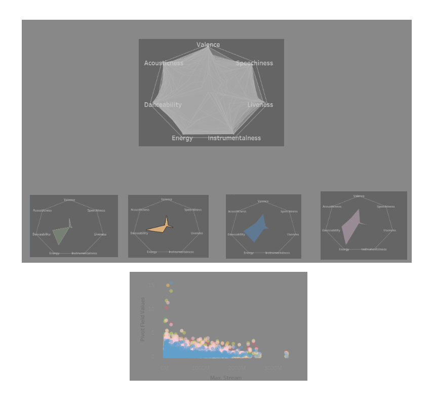
Also, if you see the second wireframe image, I also had a scatterplot showing the correlation between maximum stream and the different measures (shown on color) for each track. Since I was going to add it to the dashboard after I formatted the floating images, I scraped the idea because time was running out. I was not sure how to format it, but it could have been interesting to show as there was not much of a correlation between any (as we can see in the scatter plot and association analysis).
Another interesting observation is that the top streamed and least streamed track are very similarly shaped, so it would debunk the idea of a significant correlation.
See my final dashboard here:
Presentation
Again, the atmosphere was casual, so there was not too much stress for this section. I thankfully was proud of my work, and going last to present definitely built up the excitement.
I made sure to go through each step of my thought process like I have done in this blog and a positive of doing this is the ability to spitball different solutions to ideas that didn't work out and questioning why they did not. (i.e. the floating container and tool tip situation)
Hope you enjoyed reading about my experience and see you tomorrow for my next blog for Dashboard Week Day 5, the final day!