When I first saw that the project today was on survey data I was (scared) because I know that it usually requires a lot of data prep, however, I was pleasantly surprised that the data was quite clean! From Kaggle, the data set was a Young People Survey whose respondents are Slovakians aged from 15 to 30 years.
The Ask
The ask today was not as direct as the day before. However, there is more of a focus on dashboard analysis and design than data prep.
Wireframe
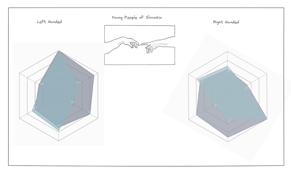
The best way to focus scope is wireframing before starting data prep. This was especially helpful for this project, because if not, I would need to separate multiple categories in data prep. I thought of focusing on comparing left versus right handed responders through different metrics. To achieve showing different answers in one chart I thought of using a radar chart.

Data Prep
The data prep today was not too hard. The Kaggle site consisted of two data sets one with the list of questions and its short form of questions as well as response data. I made sure to get the long form questions so I can have the full questions for my dashboard. After knowing which categories of questions to focus on, I separated them to group them and unioned them back together so I can make my parameter switch for the radar charts.

Dashboard
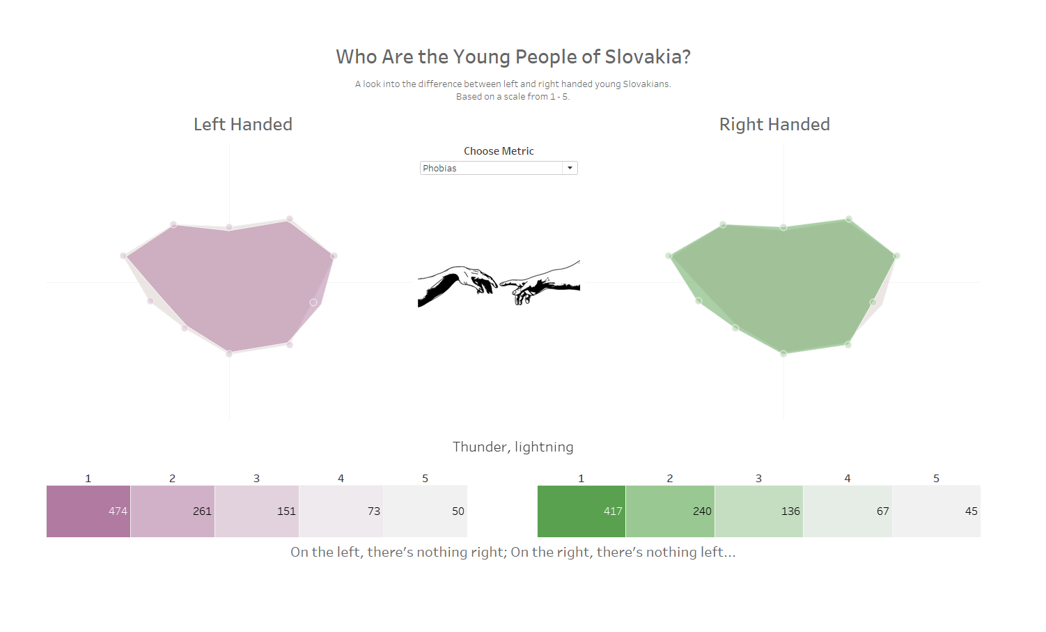
Unfortunately, I was not very proud of my final product, but I went out of my comfort zone to create a radar chart, which I am not very familiar with. Since I did not find any differences I though the dashboard did not show anything, however, I was reminded that no difference is still an insight. In the end, in the categories I analyzed, there were not many differences between left and right handed people. There are other positives of the dashboard; I like that I was able to keep a clean design and kept to the style I have been building.
See my final dashboard here: Young People Survey Data

The Presentation
Presentations today went well. Since there were a lot of angles to go with for this project, it was very interesting to see what everyone did. One that surprised me was Terrence's analysis because he started with an overview and noted some inconsistencies in people's responses and that segwayed into an analysis of the responders who identify as liars.
This was fun but quite challenging project for me because there was so much information available and I did not know where to start.
I hope you enjoyed reading about my experience and see you tomorrow for my next blog for Dashboard Week Day 3.
