The Pareto Principle was developed by an Italian economist which states that 80% of effect comes from 20% of actions. A pareto chart applies this principle by combining bars and line graphs. During this blog I will be using sample superstore, and we will work towards building a pareto chart with the customer number by quantity sold.
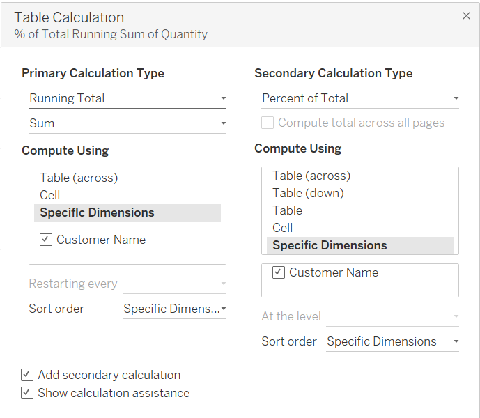
We start of by dragging customer name on to columns and the sum of quantity on to rows. We right click sum(quantity) and a running total calculation. After doing this we need to edit the table calculation and make sure it is computed using a specific dimension and then add secondary calculation. We want to add a percent of totals calculation and once again make sure specific dimensions is selected. Our table calculation pane should look as follows:
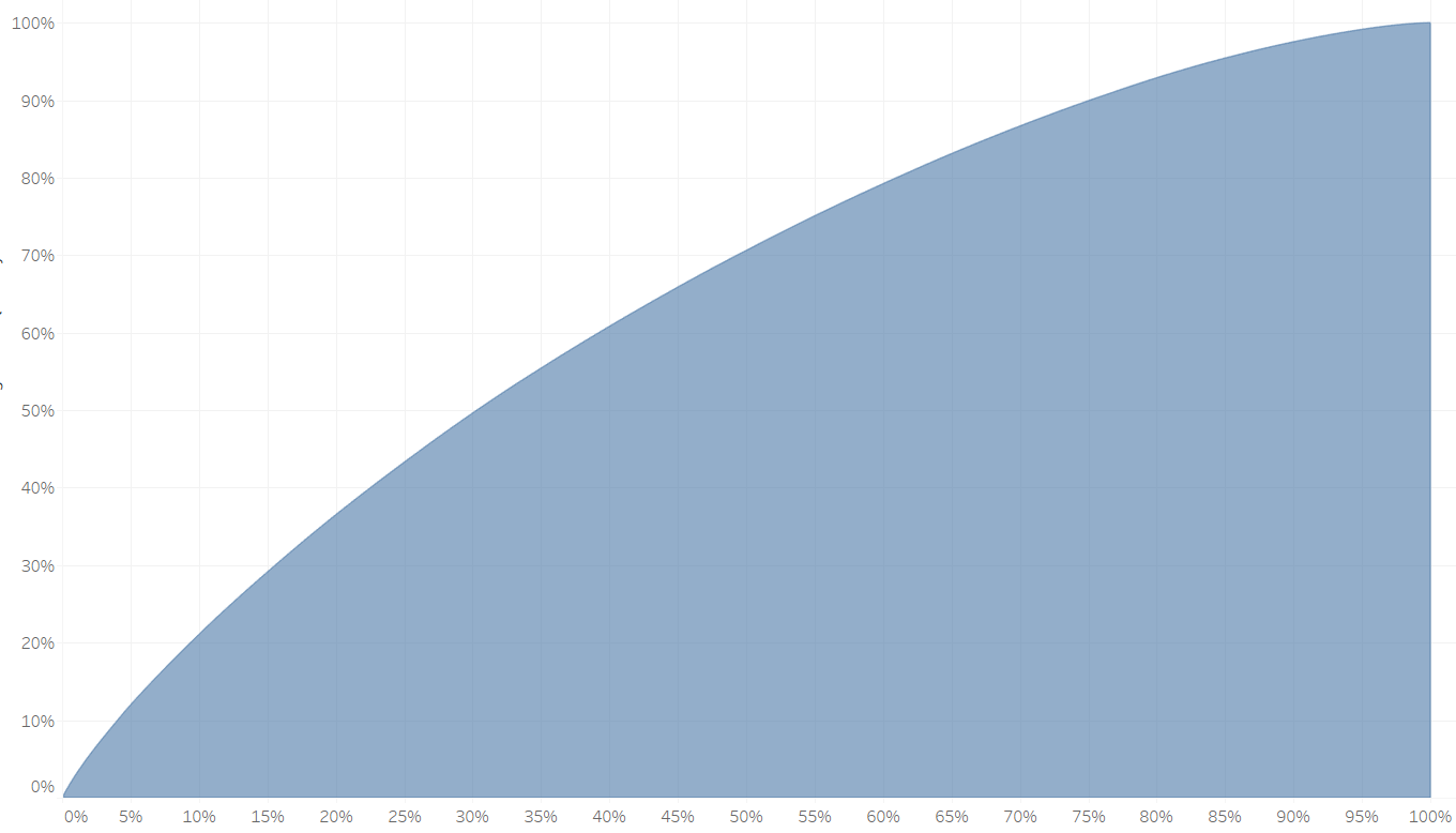
We want to add customer name onto detail and then change our column to count distinct of customer name and sort customer name ascending by sum of quantity. Then we want to repeat the steps of adding the running total calculation and the percent of total calculation onto count distinct of customer name. We then change the chart type to an area chart and we will get the following chart:
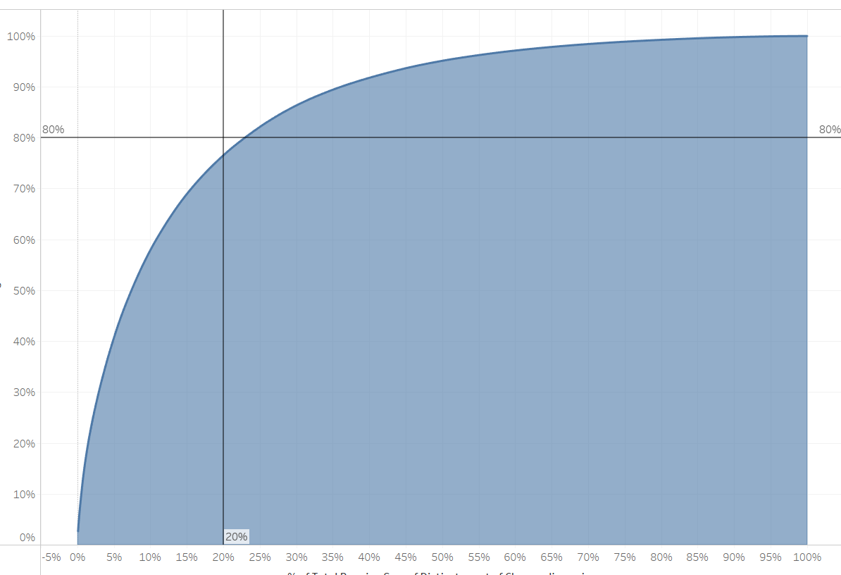
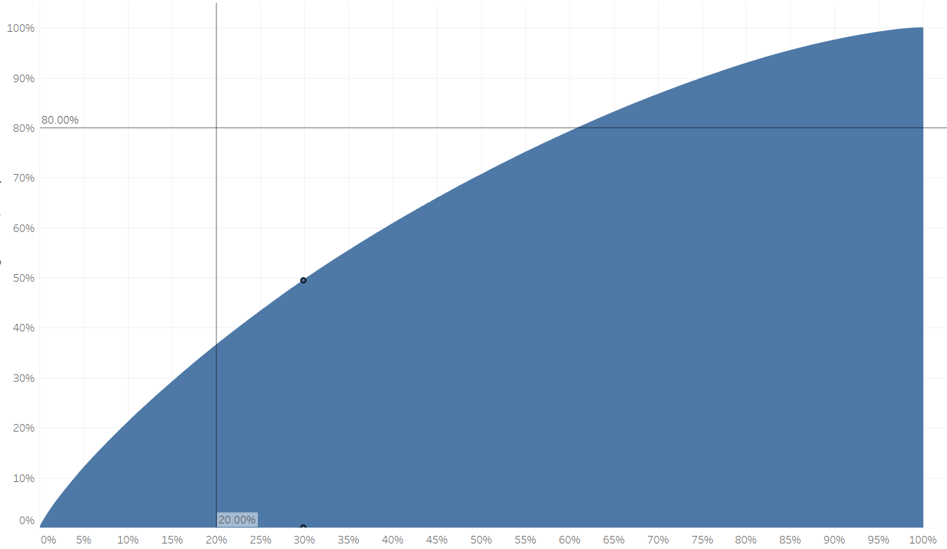
We can finish off by adding drop lines as a reference line that goes across at 80% and up at 20%.
The ideal chart cross or be higher that the intersect of the two reference lines as seen below: