


Interactivity is a handy tool to emphasis trends and changes in our data. We can choose to highlight or filter charts and data by clicking on a a bar or point. When adding interactivity to our report, we can use slicers and drop-down bars to our reports.
When using Power Bi. Unlike on Tableau, interactivity on Power Bi can be set withing a couple of clicks. We start off by clicking on our chart and selecting the edit interactivity icon under the 'format' tab.

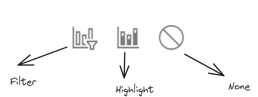
When we select the chart that we select a chart we will get two to three options by the chart. We will get the option to filter, highlight or none. This will allow us to choose how we would like our selected chart to interact with the chart of our choosing.
A way to add filters to the entire report is using the slicer option. When choosing chart type, select the slicer option and drag in the field we would like to filter.

We can then change the general setting to view the slicer as a tile, dropdown, or vertical list. Interactivity is a useful tool which helps us highlight trends and dive deeper into our data.