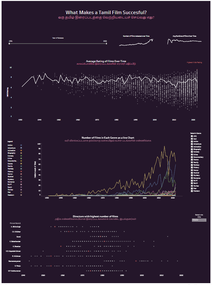
For day three of dashboard week, we continued on from yesterday:
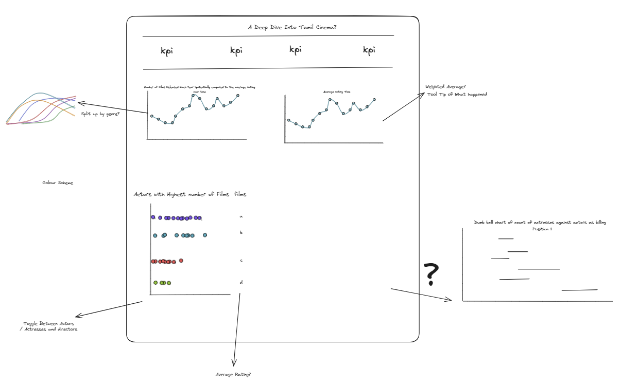
After retouching my plan I spent the first hour retouching graphs and making any charts that were missing from the previous day. Then I started building my visualisation. I tried to think of the story I was trying to tell when I organised my charts. The hardest part for me was the design element. As someone who is more technical than creative the design element took me a long time. I had spent the previous day looking for inspiration and decided on a dark background with light writing which is different to my usual style of dashboards.
I decided to use dynamic zone visibility for my visualisation which took me longer than I anticipated. However after watching this video by Tableau Tim, I was able to complete the task:
https://www.youtube.com/watch?v=ehnBM0ym6yI
I added some more charts as KPIs which I had not planned for in my plan. I also had not anticipated the change in formatting when I uploaded my visualisation onto tableau public. In future I will make sure I do this in advance so that I have time to make the corrections required.
Despite having two days, I did find myself pressed for time and did not manage to practice my presentation as much as I would have wanted to. I thoroughly enjoyed this task and look forward to building on it further next week.#