


Today I was tasked with going back to the viz that I made for my interview/presentation to try to find ways to improve it using knowledge I've gained during my first couple of weeks at the Data School.
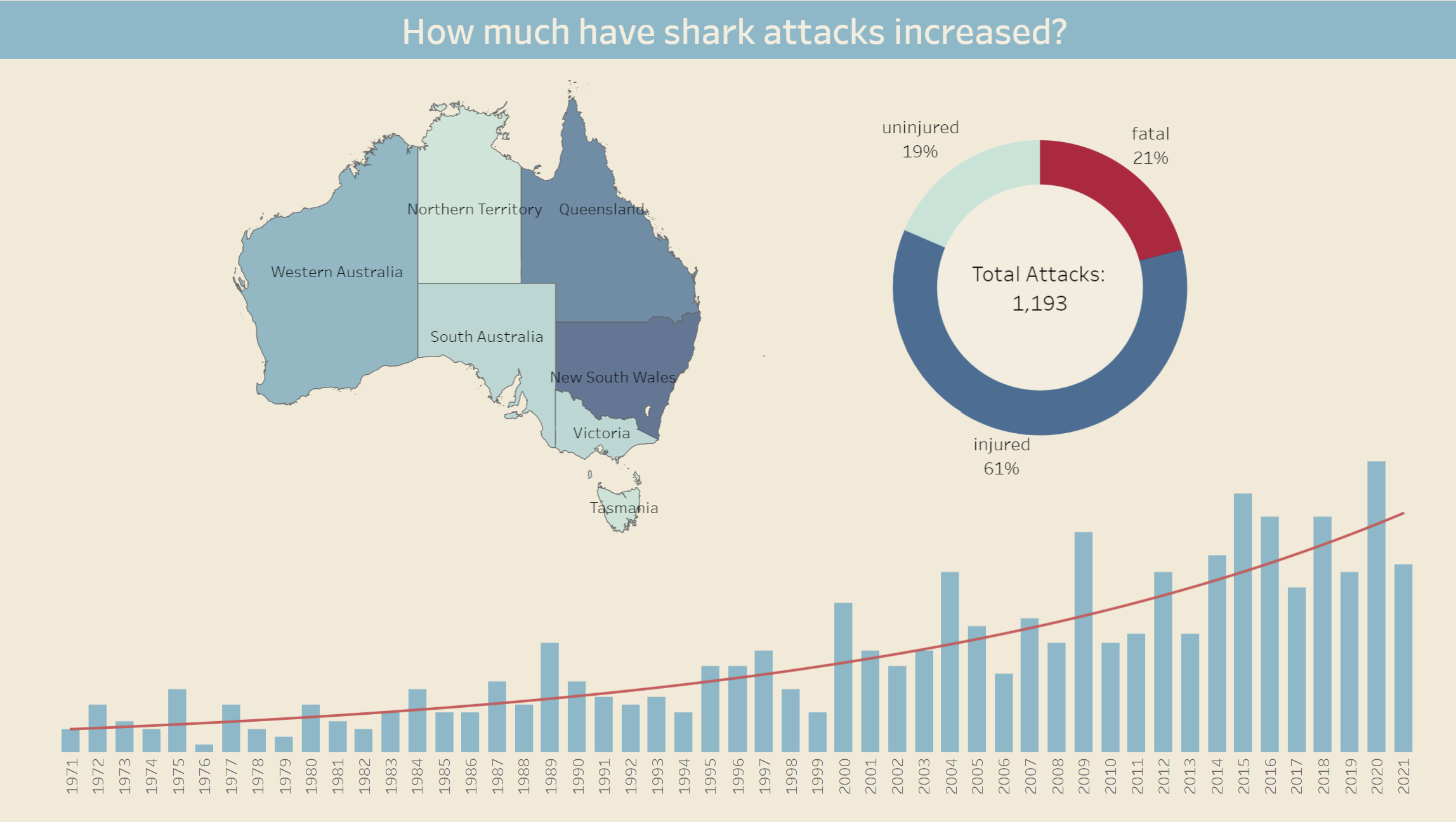
The first and most obvious issue was the title of the original viz: "An overview of shark attacks in Australia". This is a little bland, doesn't give any sense of storytelling and if it was a newspaper headline it wouldn't draw in any readers.
For the new version I have chosen "Is it still safe to swim in the waters around Australia?" which is much more enticing and really sets me up to tell a story.
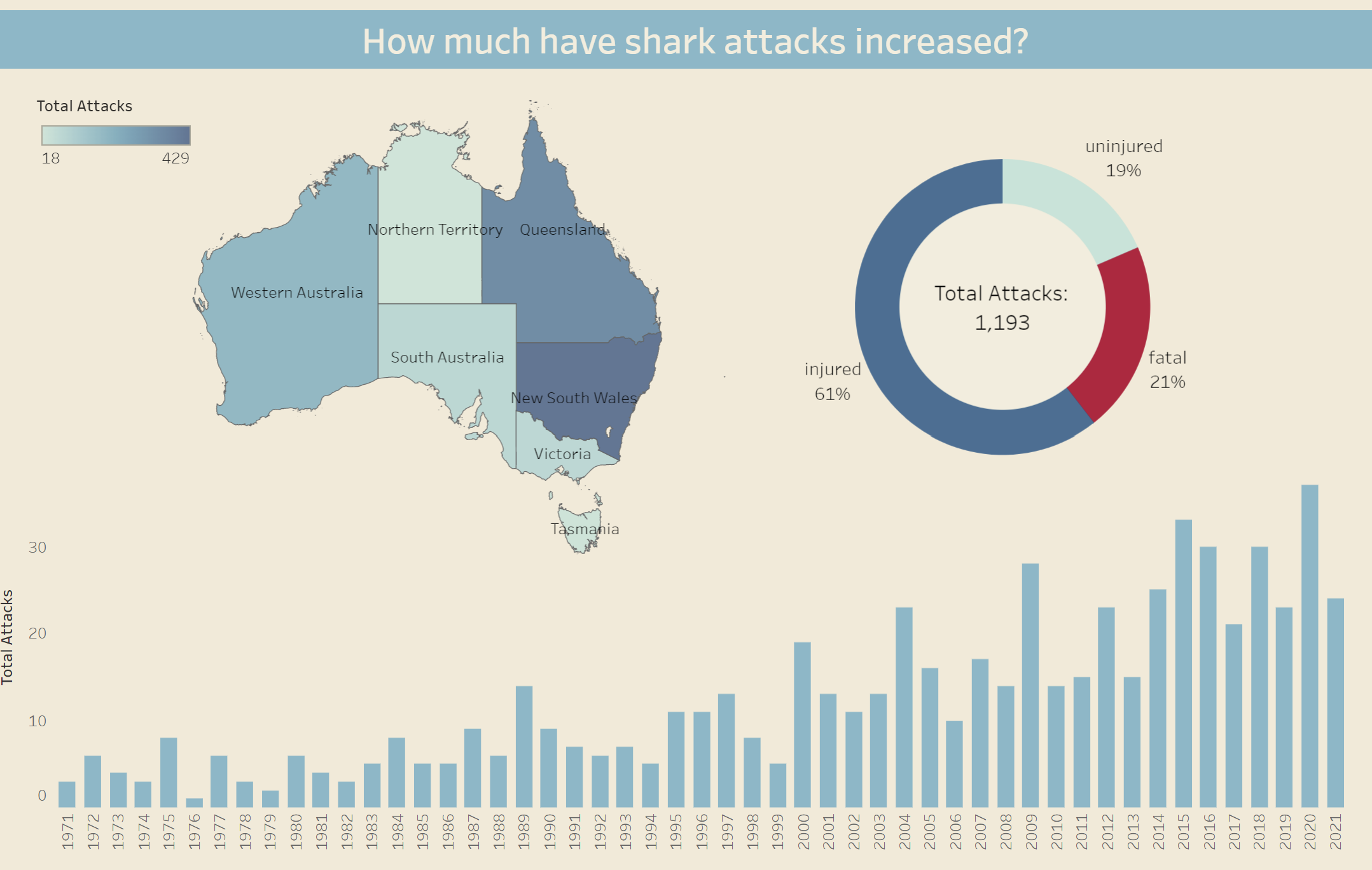
Section 1 of my Viz only needed some minor changes: adding a legend to a heat map, rotating a donut chart, removing a pointless trend line & adding an axis to the bar chart.
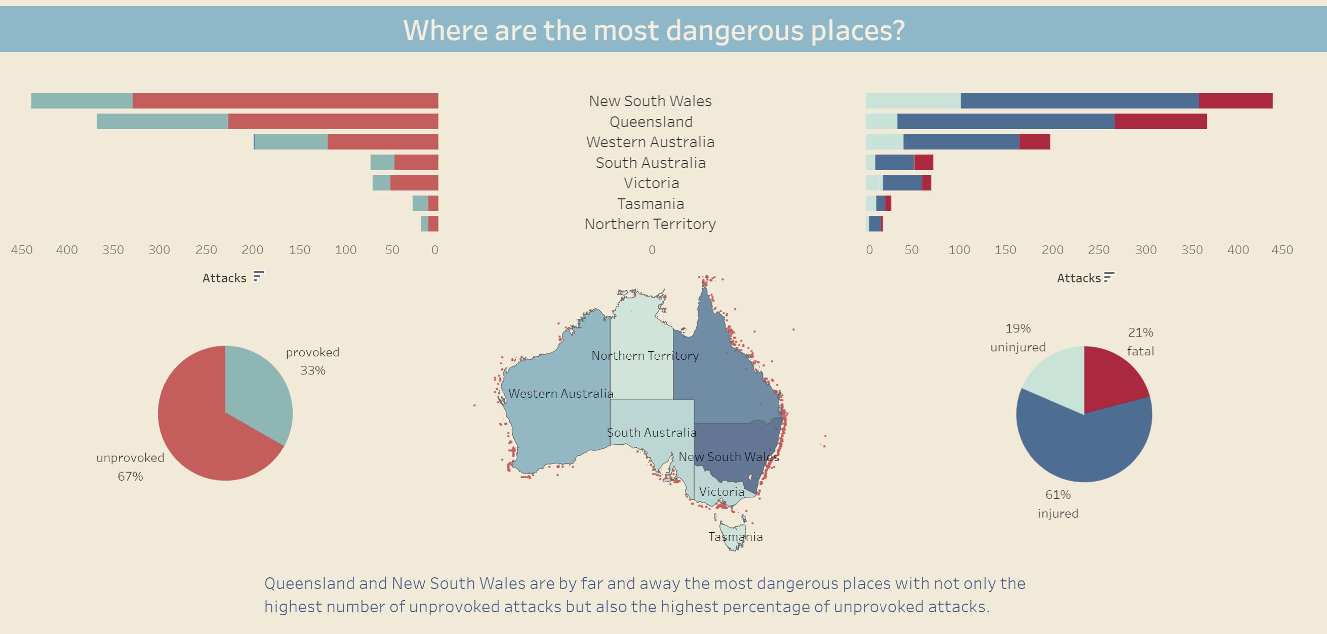
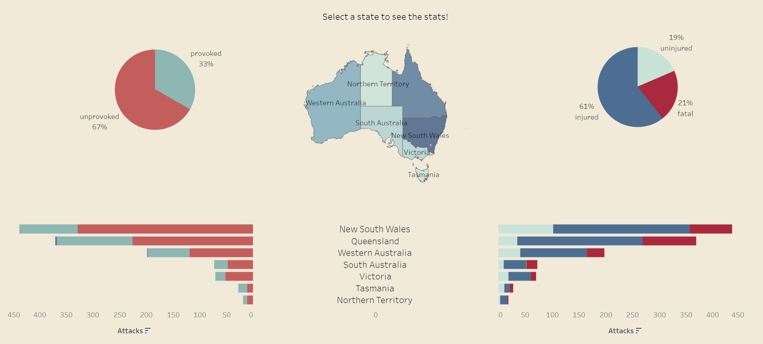
Section 2 was a modular data analysis pane that didn't quite make sense and required more drastic measures, . The map which is used to control the data view really made more sense at the top of the view so I flipped the entire view. A bonus unplanned side effect of this was that putting the pie charts above the butterfly bar chart seemed to make the data just a bit easier to read. I also removed the scatter overlay on the map as it really wasn't adding anything useful to the viz.
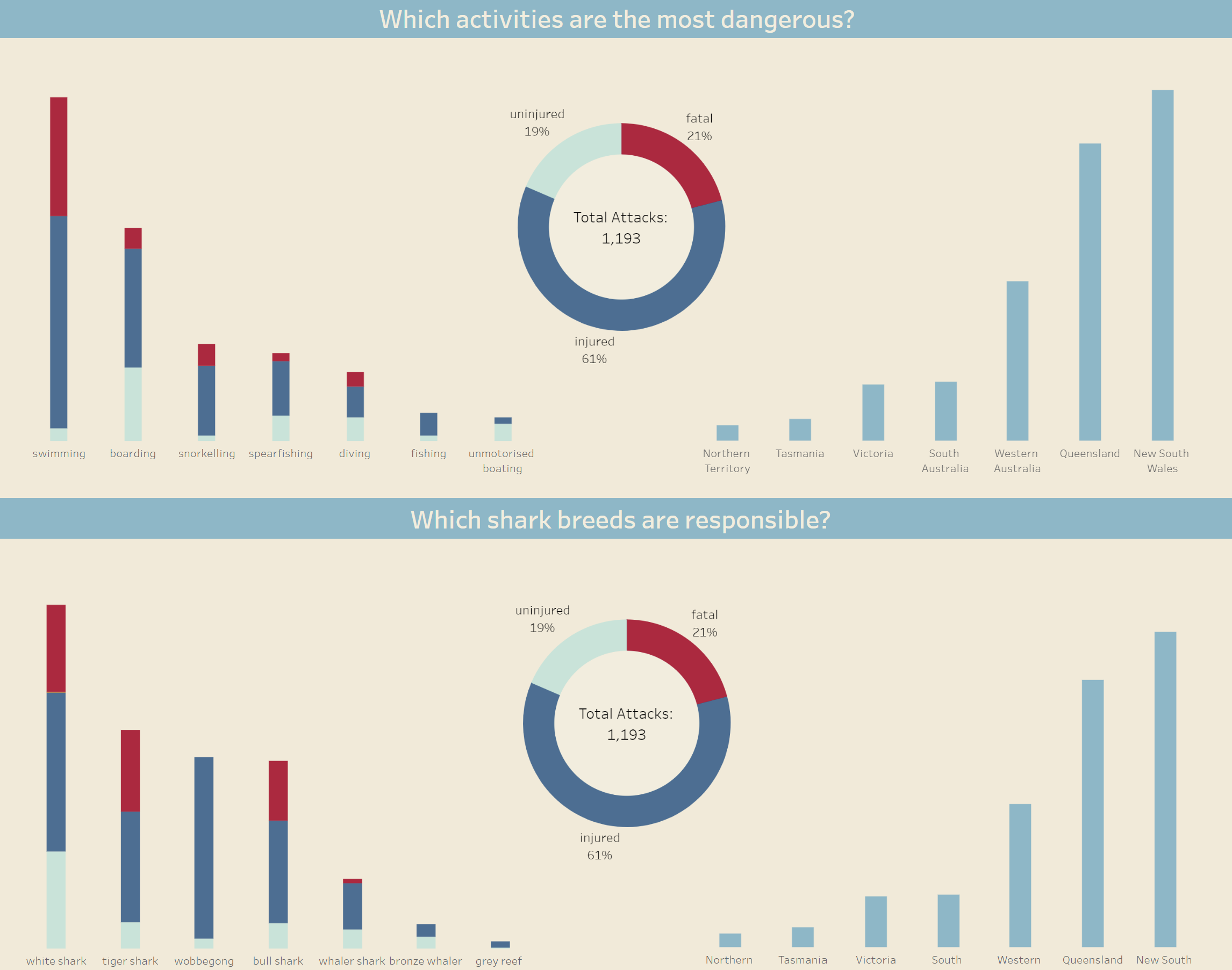
Section 3 of my original viz contained a breakdown of various statistics relating to shark attacks such as relationships between the danger associated with certain activities and shark breeds. Given my new story based headline, I felt that these statistics didn't lend anything to the new narrative of my viz, as a result I deleted this section in it's entirety with a plan to replace it.
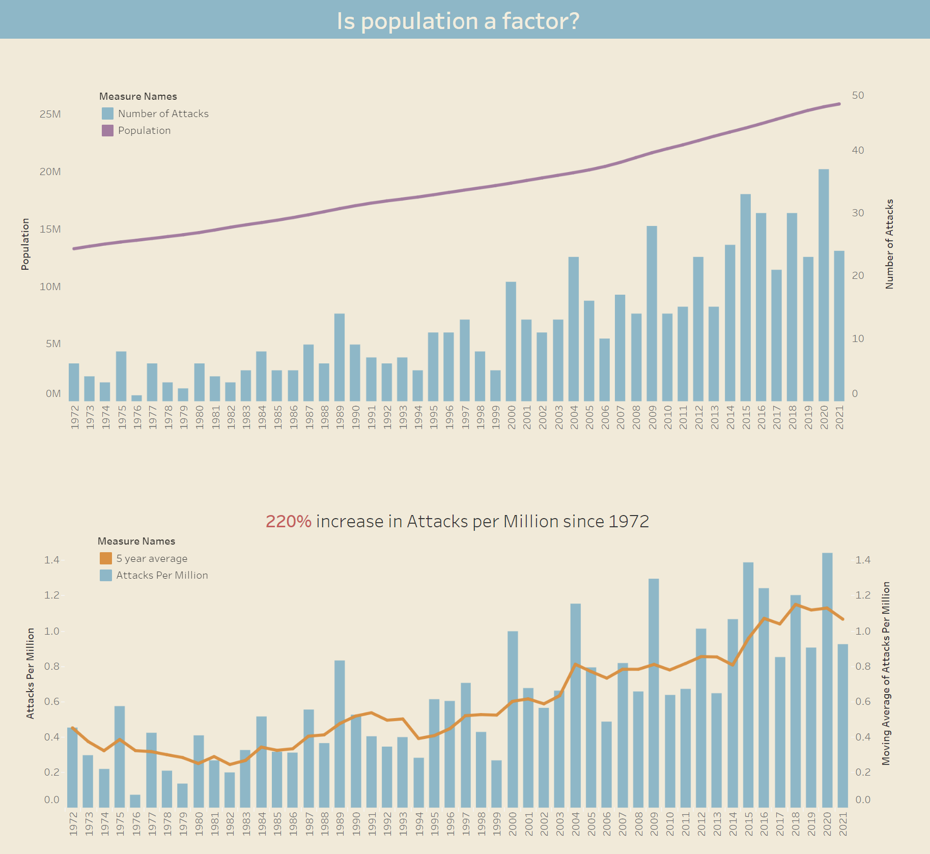
For my new 3rd section I used data that I found on the growth of the Australian population over time to look at the effects of population on shark attack numbers to see whether or not it was just a case of more people = more attacks.
The first chart I created which just plotted the relationship between population increase and shark attack numbers did appear to show a trend indicating that the rise in shark attacks could be due to the population increase however, when I then plotted a second chart showing the number of shark attacks per million of the population it showed that that number is also increasing. There is clearly more to this trend than meets the eye and would likely require even more data to really figure out the real reason for the increase.
Finally I removed a multi-paragraph conclusion at the end of my viz as it seemed bulky and unnecessary.
You can see my original viz here and my new version here.
I hope this helps any new hires when updating their vizzes!