


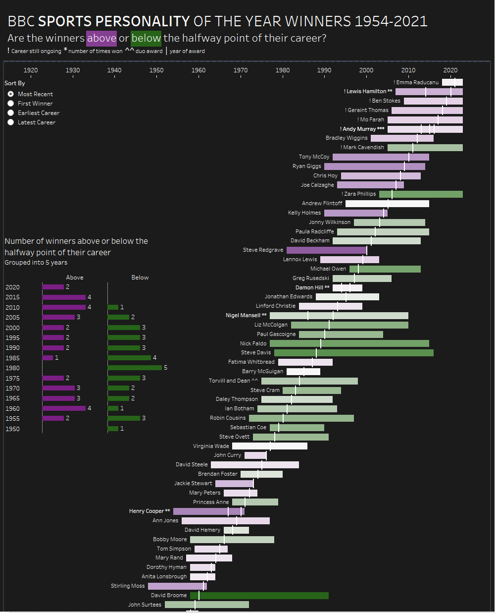
Welcome back to my series of dashboard week blogs. Today we were tasked with choosing from a selection of Tableau dashboards with the goal of recreating them in Power BI. I chose a gantt representation of BBC sports personality of the year winners and their respective career lengths by Lorna Brown.
The first port of call was to try to get the gantt looking similar but this turned out to be quite a challenge. Firstly Power BI doesn't come with a native Gantt visualisation option so I needed to find one on the extensions marketplace to enable to make my gantt.
First off I tried the Microsoft Gantt tool but this proved to have 2 main limitations:
- I couldn't add an overlay mark for the year of award
- The Gantt doesn't fit to the size of the visualisation box, it extends off the side and doesn't have an option to fit to the view.
The second Gantt I tried, known as Gantt 2.2.3 would not recognise my date fields despite every other visualisation tool recognising them perfectly.
My third option was Acterys Gantt which came through with what I needed. It gave me the ability to scale correctly to the viz and overlay the year of win above the Gantt bar, resulting in the following viz:
One of the coolest features of Lorna's viz was the ability to change the sort order with a parameter. Try as I might I couldn't figure out how to do this in Power BI in the time given so I found a roundabout way of doing it by creating 4 different sheets each with the 4 different sort orders and adding a page navigation bar at the top of the viz.