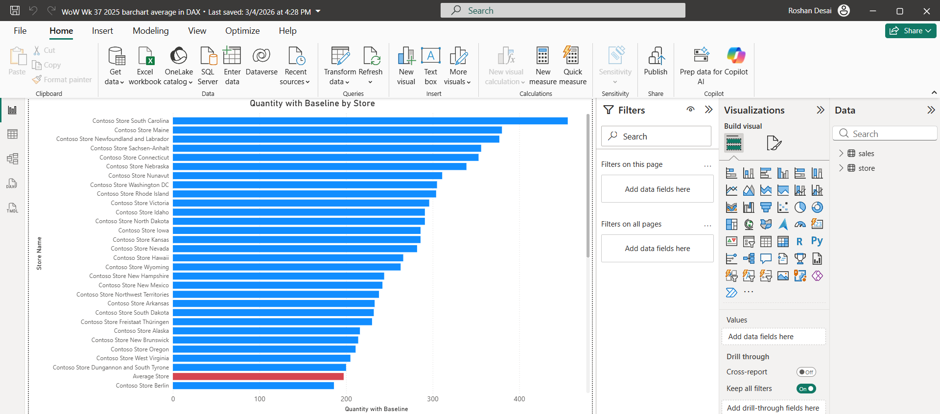
This week’s Workout Wednesday challenge focuses on a really practical reporting problem: how to show a baseline inside a bar chart as if it were just another category, rather than using a standard reference line. The challenge asks us to build a clustered bar chart where every store is shown alongside a custom “Average Store” bar, created through a dummy row and a DAX measure with conditional logic. It is a simple-looking output, but the method behind it is what makes it interesting.
To complete the challenge, the first step is to add a dummy row to the Store data with the description “Average Store.” After that, the online sales row with storekey = 999999 needs to be filtered out in Power Query so the outlier does not distort the baseline. The core of the solution is then a DAX measure called Quantity with Baseline, where IF and SELECTEDVALUE(store[Description]) are used to check whether the current row is a real store or the dummy baseline row.
For normal stores, the measure returns SUM(sales[Quantity]); for the dummy row, it returns an average across stores using AVERAGEX, with CALCULATE(SUM(sales[Quantity])) inside to force the correct context transition. Once that is done, the final step is to place the measure in a clustered bar chart and format the “Average Store” bar in a contrasting colour so it stands out clearly.
Three parts of this challenge were especially tough. The first is understanding why a dummy row is needed at all. A reference line would be easier, but the whole point here is to make the baseline behave like a category in the visual. The second is the context transition inside AVERAGEX. Without CALCULATE, the average will not evaluate correctly per store, so this is one of those small DAX details that makes a big difference. The third is that the challenge tests whether you can separate visual design from data logic. The chart itself looks straightforward, but the real work sits in the model, the query step, and the conditional measure.
A strong use case for this approach is stakeholder reporting where a business wants to compare each location, team, or product against an internal benchmark directly inside the chart. Instead of showing a floating average line, you can show the benchmark as its own bar, which often makes the comparison more intuitive for non-technical users. That is particularly useful when the baseline needs to feel like part of the categorical story rather than an annotation. This is also consistent with the challenge author’s framing, which highlights customer scenarios where a baseline, total, or reference point needs to appear inside the row or column of the visual itself.
Workout Wednesdays are useful because they push you beyond clicking through standard chart builds and force you to think properly about logic, calculations, and alternative design patterns. They are a way to expose yourself to different styles of visualisation and to techniques you may not have tried otherwise. For complex challenges, I really enjoy planning my work, writing out the logic breaks complex calculations into smaller parts, but make sure step away and have a break when you get stuck.
Challenges like this are valuable, as they allow you to build the problem-solving approach you need in real project work.