Creating a Gauge KPI in Tableau can be a great way to visualize performance metrics like profit margins or sales goals in a way that's easy to digest at a glance. It isn’t as straightforward in Tableau as it is in Power BI, where you can easily add one with just a few clicks. In Tableau, it takes a bit more effort, but the result is definitely worth it.
In this blog post, I’ll guide you through the steps to create a Gauge KPI, from setting up the necessary calculations to fine-tuning the visual to make it your own. I’ve included a link to my Tableau Workbook at the bottom for anyone to download and reference throughout the process.
Step 1: Get Your Metrics Together
I will be using Superstore's Profit, Sales, and Category fields to calculate the Profit Margin of each Category using this calculated field:
- Profit Margin = SUM({INCLUDE [Category] : SUM([Profit])}) / SUM({(SUM([Profit]))})
Step 2: Create Calculated Fields
Here are all the calculations you will need:
- Calc 1 = MIN(1)
- Calc 2 = IF [Profit Margin] <0.5 THEN [Profit Margin] ELSE 0.5 END
- Calc 3 = IF [Profit Margin] <0.5 THEN 0.5 - [Profit Margin] END
- Calc 4 = IF [Profit Margin] >0.5 THEN [Profit Margin] - 0.5 END
- Calc 5 = IF [Profit Margin] >0.5 THEN 1 - [Profit Margin] ELSE 0.5 END
- Calc 6 = IF [Profit Margin] <=0.5 THEN 0.005 END
- Calc 7 = IF [Profit Margin] >0.5 THEN 0.005 END
Step 3: Build A Donut Chart
- Type 0 in the Rows shelf and press enter to create a dummy field. Repeat this again.
- Change Marks type to Pie on the All marks section.
- Right click any of the two pills and select Dual Axis.
- Remove Measure Names from the All marks section.
- Change the color of the second pie in the second marks section and reduce it's size.
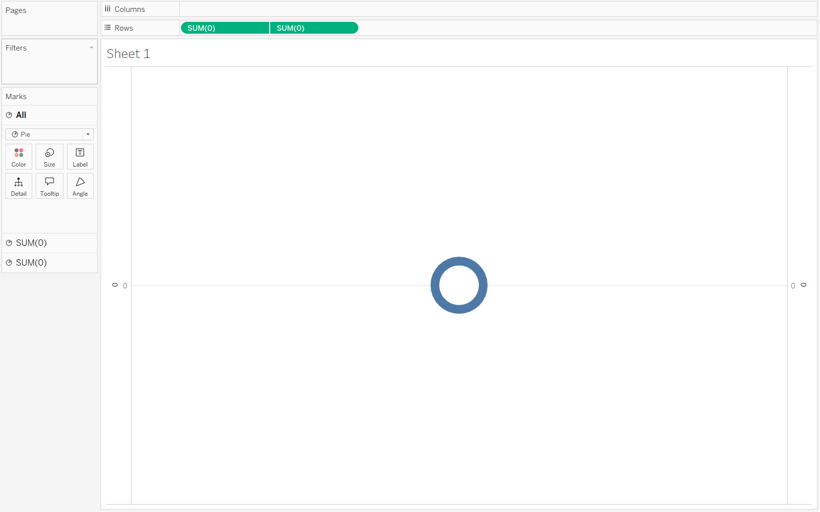
Your worksheet should look like this:
Step 4: Build Your Gauge KPI
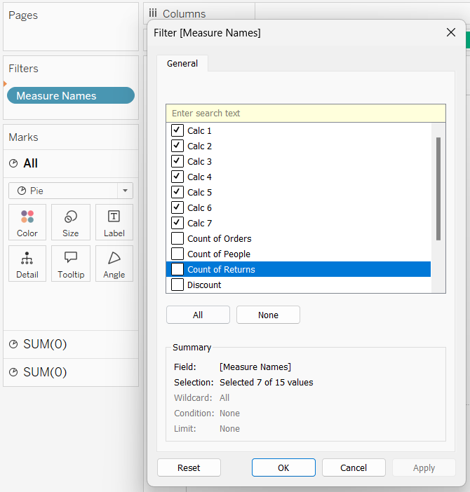
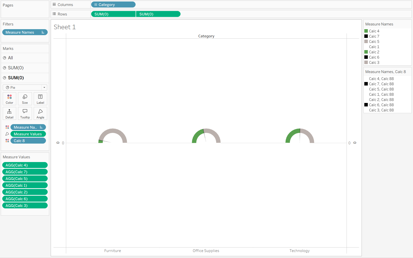
- Drag Measure Name to the Filters shelf and select the calculations made in Step 2.
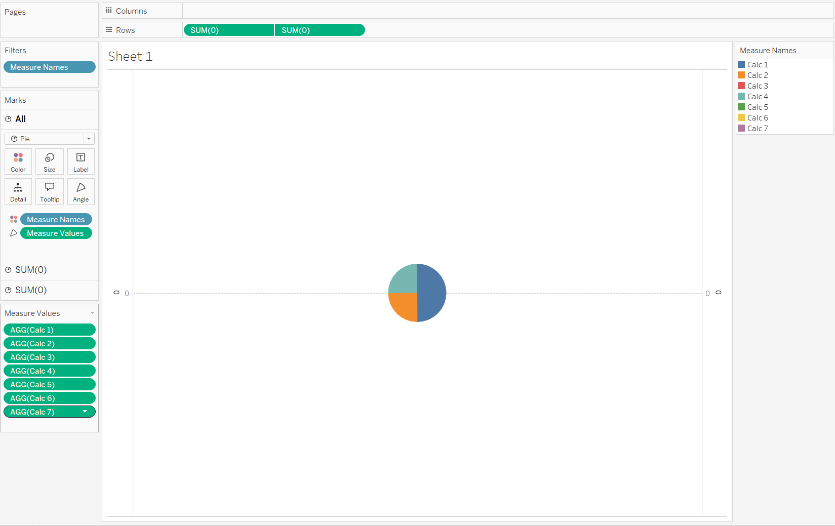
- Drag Measure Name to Color and Measure Values to Angle in the All marks section.
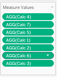
- Rearrange the Measure Values under the Measure Values shelf in this order:
- Change the color of Measure Names as such:
- Calc 7 and Calc 6 = Black
- Calc 2 and Calc 4 = Green
- Calc 3 and Calc 5 = Grey
- Calc 1 = White
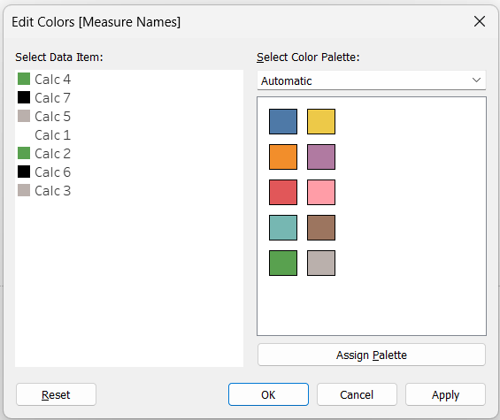
- Create a final calculation called Calc 8 = "Calc 88". Make sure this is in quotation marks to be a discrete field.
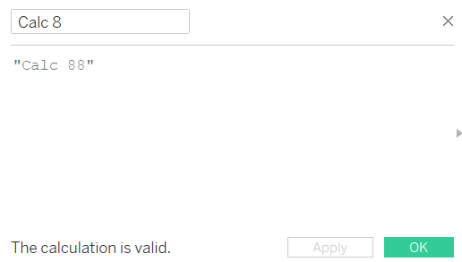
- Drag Calc 8 to Detail of the second marks section and change the mark type to Color.
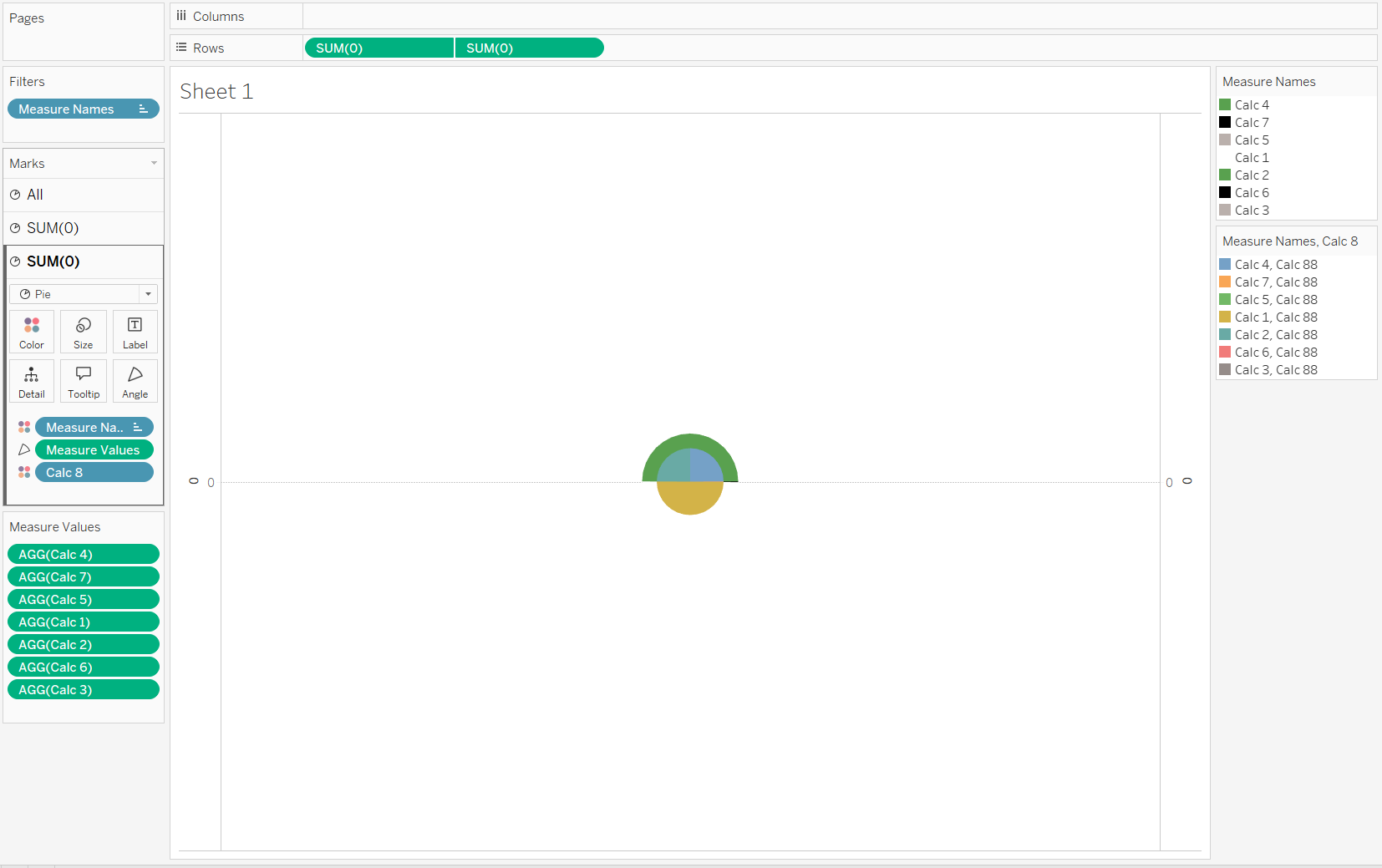
- Change the color of these Measure Names: Calc 6 and Calc 7 as Black and the rest as White.
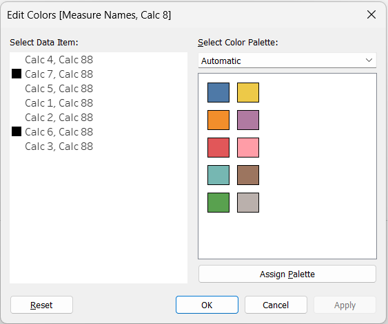
- Add Category to Columns.
Customize your KPI
Drag Profit Margin and Category to Label , align Label to be in the middle, change colors as needed, remove Border and Lines, change Tool Tip, etc.
And that’s it! You now have a Gauge KPI in Tableau that effectively shows your metrics in a clear and visually engaging way. With a little customization, you can tweak the design to fit your needs and present data in an impactful manner. Happy charting!

Tableau Workbook: https://public.tableau.com/app/profile/roshaan.khan/viz/GaugeKPI_17353197587880/Dashboard?publish=yes
