Week 2 at The Data School is all related to the visual elements of dashboard design. This included nailing down what charts work best in different situations, as well as some visual best practice.
We pulled together what we learnt at the end of the day with a mock ' Makeover Monday' session, in which we had to use Excalidraw to plan out how we would present a viz - without access to the data or Tableau. The topic we were looking at was from Forbes' 'World Highest Paid Athletes' 2024 list - which can be seen here https://www.forbes.com/lists/athletes/.
Here you realise that the task is actually much tougher without being able to experiment in Tableau. It forces you to come up with a question or area from the article to focus on, creating a more cohesive dashboard.
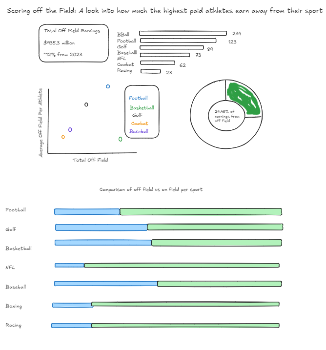
I wanted to focus on the money made by athletes away from the field. Sponsorship and merchandise is a huge part of modern sport, and I wanted to see if there were any differences between sports.

Here is my creation above. I wanted to included a KPI box that would compare the year previous, and a breakdown of the total money made off the field by sport just to set the scene.
Then there is some slightly deeper analysis looking at the percentage of total earnings made off the field in a donut chart and total money made by athletes per sport against the average per athlete in a scatter plot. The scatterplot in an attempt to normalise against athletes that feature multiple times from the same sport, some basic manual calculations found that despite basketball having the highest total, the total per athlete was lower than other sports.
Finally the stacked bar chart is useful in seeing which sports have their stars benefit the most from sponsorship in comparison to team wages, and with only two potential options for each bar I think it would give a super clean overall view.
So now just the simple task of applying what we've learnt within Tableau for real!
