The final day of dashboard week for us involved creating an infographic around a dataset looking at every boy band to chart in the Billboard Top 100 since 1980. Infographics combine data with visual storytelling, making them engaging and informative.
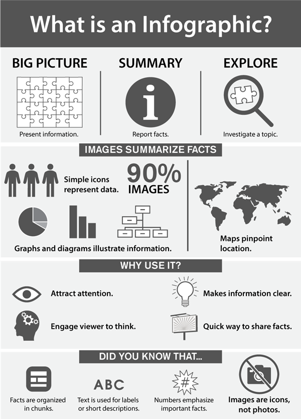
An example of an infographic:

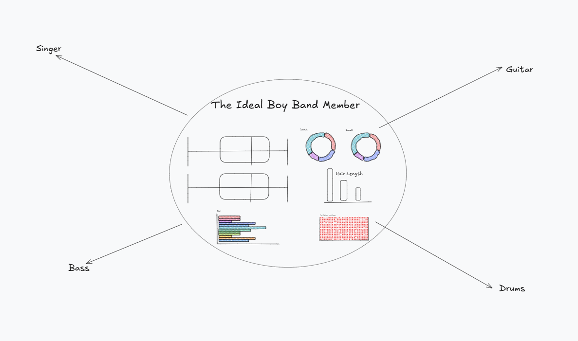
I had a plan at the start of the day, however as I began to execute it I found there were some flaws with the data that would make it more difficult. I wanted to compare the differences in band members by instrument - however with there only being 6 drummers and 16 guitar players out of the 250 odd people in the dataset and everyone else being a singer this didn't seem wise.
My initial plan, which would have branched off to different stand out Stats, can be seen below.

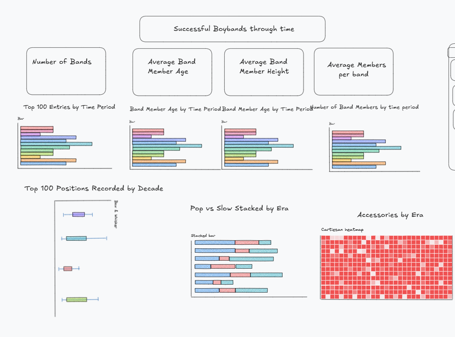
As the day went on I then changed my plan to see how boy bands differed over the different decades - which led me to a new plan.

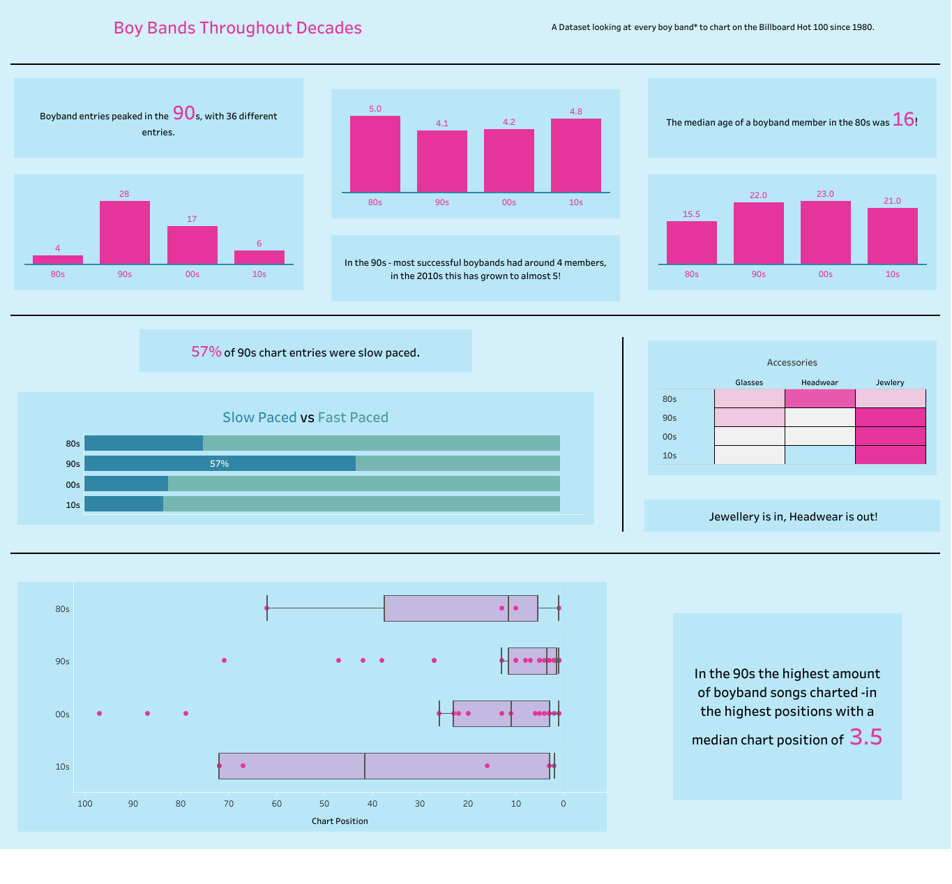
While I preferred this direction I had to make sure that the final dashboard was still ticking the box of being an infographic. To do this I removed some of the charts and added in those highlight stats as text to try and make the key numbers pop out to the reader.
Here is the final dashboard:

