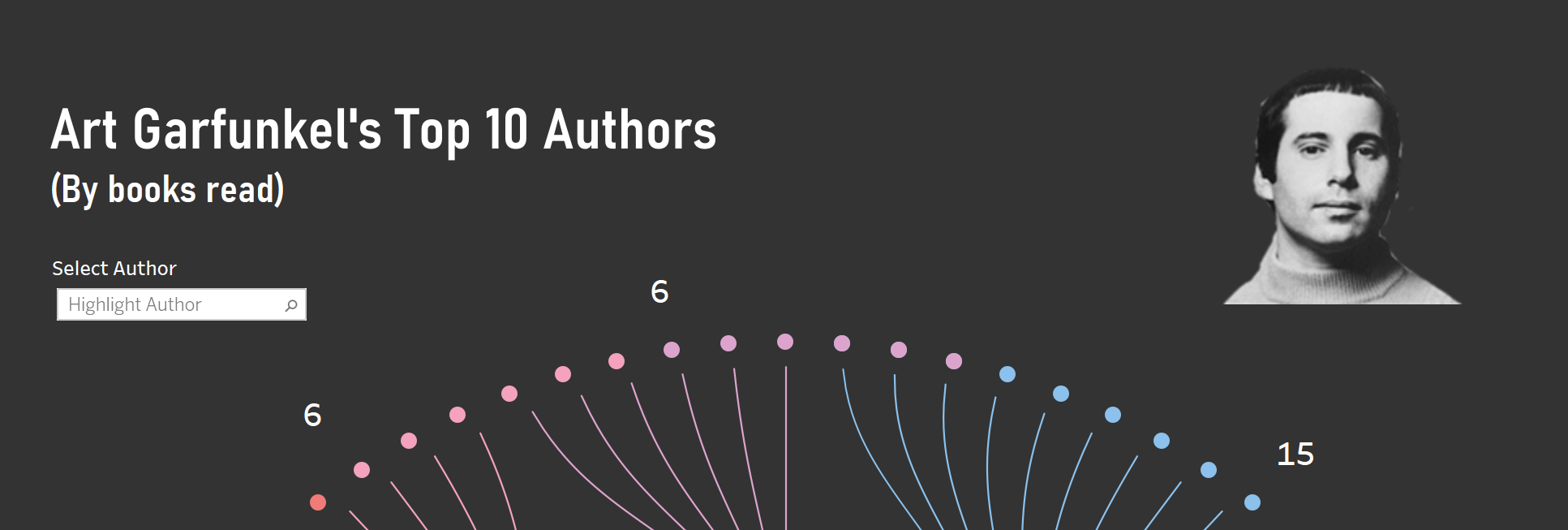
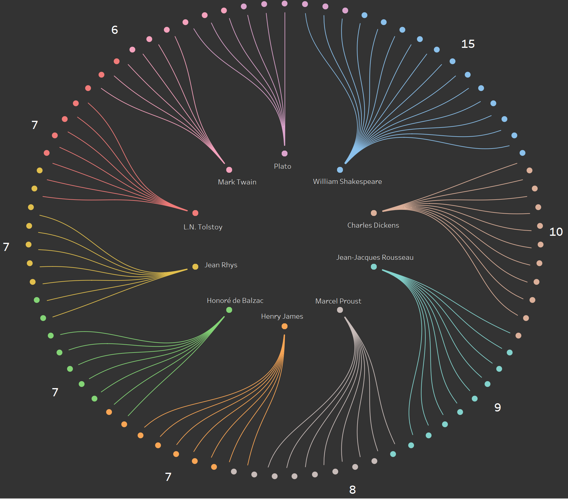
Today's challenge was to investigate Art Garfunkel's library, or more specifically a data set containing a record of all the books he has read and when, year they were published and whether they made it into Garfunkel's favourite books list. Andy added the extra challenge of including something 'fancy' and we had to think out of the box, this left my reliable bar and line charts off the table.
I immediately had an idea of what I wanted to create, a chart which has been pushed to the back of my mind due to all the client projects we have completed recently. This chart would not have been best-practise in any of those scenarios. In fact I'm unsure if it would ever be considered best practise but it does look nice and hopefully fancy enough for Andy.
I then proceeded to draw this awful sketch, one Garfunkel would be truly disappointed by:
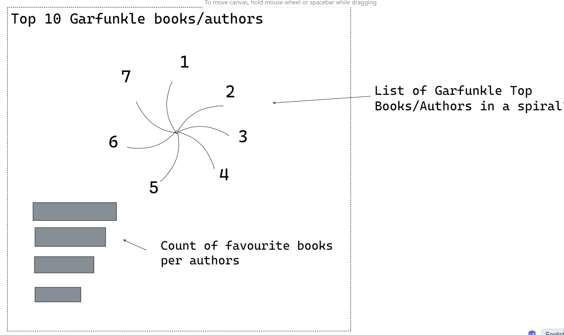
The spiral in this middle is the chart I wanted to create, the sketch doesn't do it justice. I decided to add the bar chart at the bottom to give some sort of insight. I used this blog to guide me when I jumped into Tableau.
The end product is somewhat similar to my sketch however the 'spiral' is slightly different as I opted for a circular sankey approach, which in my opinion was an improvement.
My final dashboard can be found on my tableau public here. I have attached screenshots below.