I'm writing this blog to show some appreciation to Excalidraw. This tool/website has helped myself and DS29 a lot over these last few weeks. It allows users to quickly make dashboard sketches, which can clearly convey the dashboard design and charts used within it. The best part is... It's free!
We have been using this tool within our client projects to show our clients the direction we're taking our dashboards early on in the process for quick feedback. By doing so we can correct early mistakes and forge a path to the desired dashboard that answers the clients questions. It also creates a plan to refer back to when creating your dashboards, a good plan is a essential!
Once you open Excalidraw you're presented with a blank page. The bar at the top contains a selection of shapes, arrows and lines to create your dashboard:

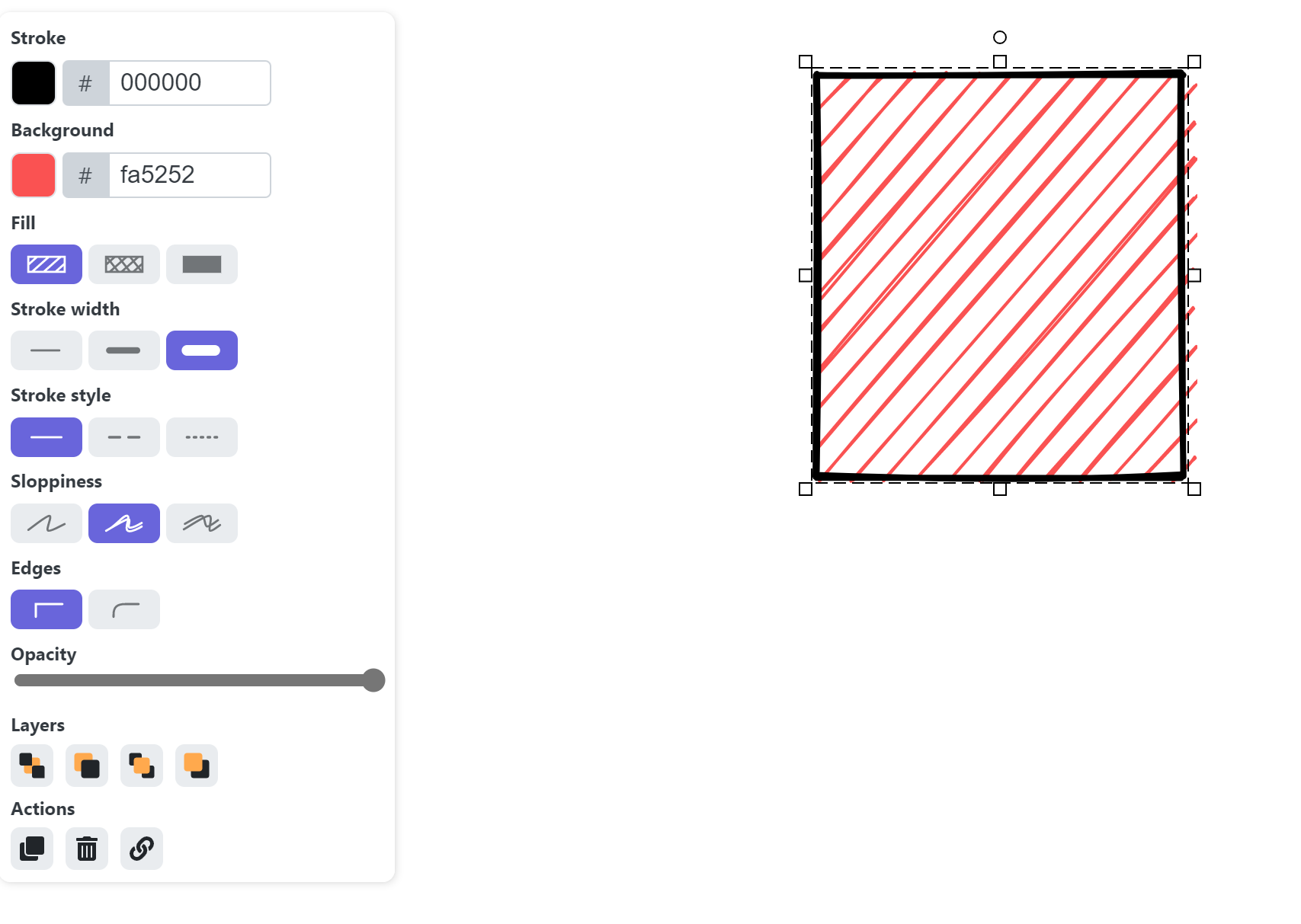
These tools can help efficiently create the basis for your dashboard, the line width, style and colour can be changed via the panel on the left:
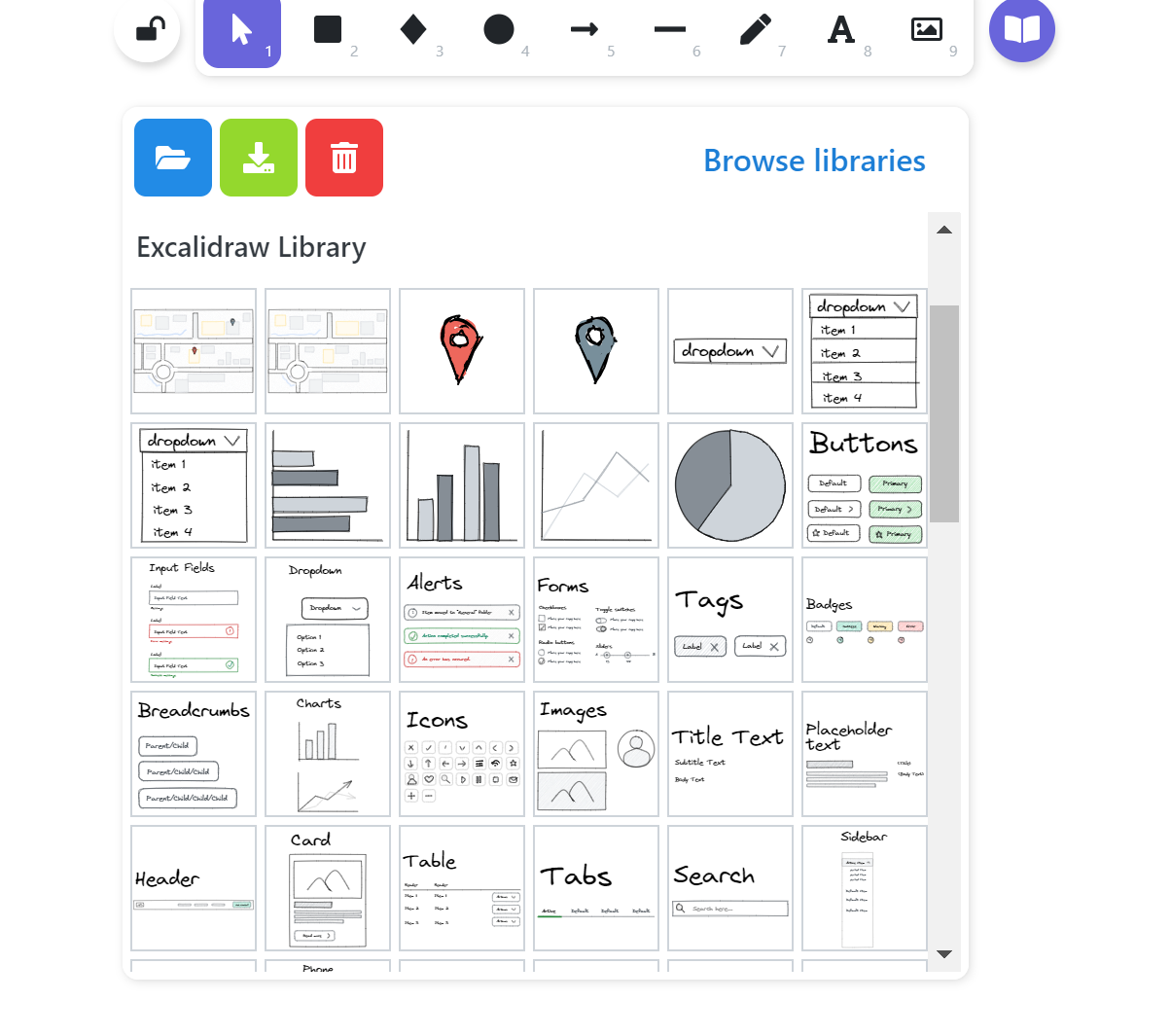
However, the tool which has helped the most to quickly drum up dashboards is the library tool in the top right.

This tool allows you to access premade designs, specifically charts which can be input into your Excalidraw view.
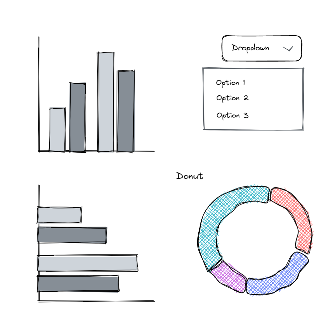
You can search through Excalidraw's extensive library for a variety of options/charts to throw into your dashboard designs.
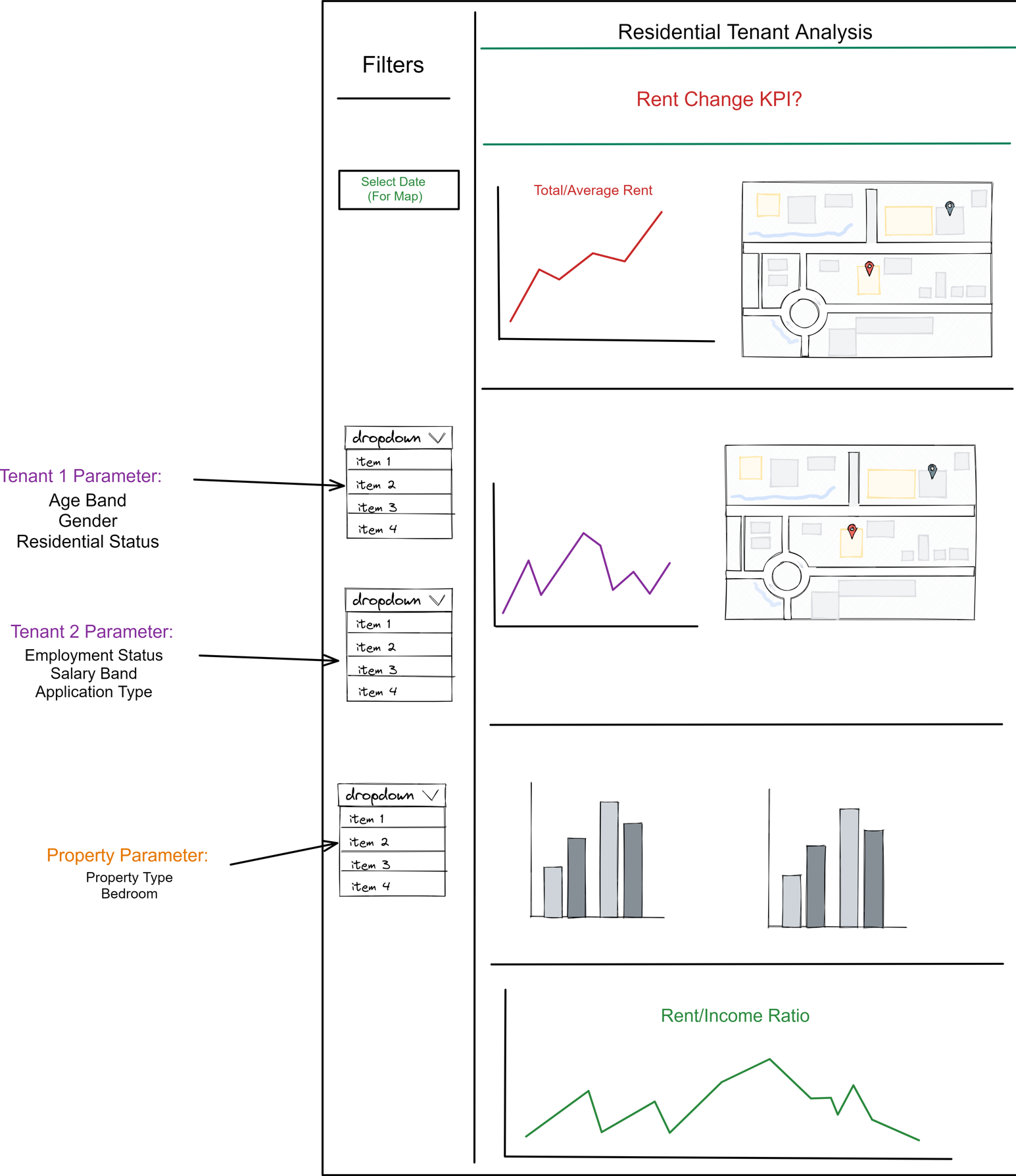
Here's a quick sketch I made in 10 minutes for a previous client project to show what the final dashboard will include:
