For most visualisations that I have created, if I have wanted to add in other measures into the view, I have generally used a dual axis to do this. However, there are reasons why you should use a combined/shared axis in some cases.
What is a dual axis?
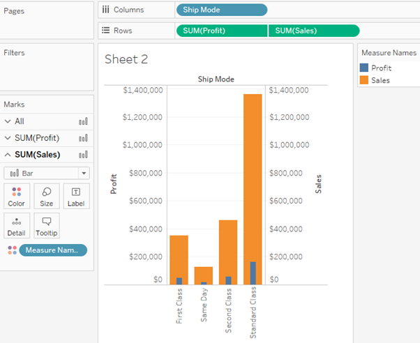
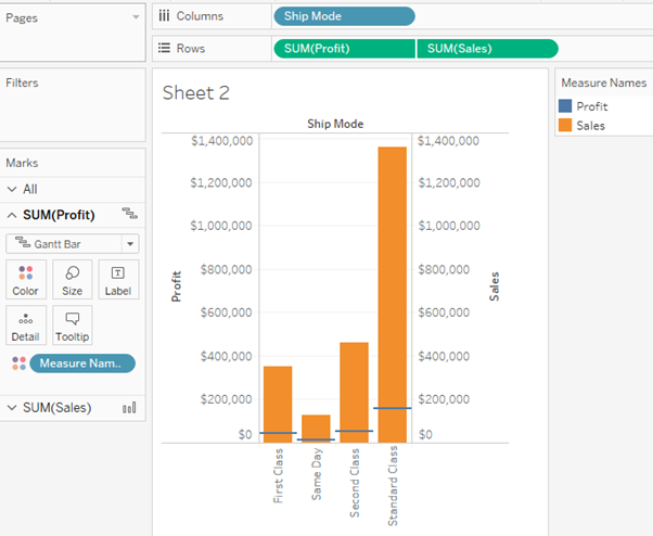
A dual axis chart creates two independent axes (which you can synchronise) that you can plot two separate measures on in the same chart.

This has one big positive that it creates two separate mark cards for each of the measures. This enables you to choose a different mark for each of the measures, letting you create different charts.

However, the negatives are that you can’t dual axis more than once, meaning that you can’t dual axis three measures together. It can also take a few more steps to get what you want, reflexing the fact that you have more freedom with the axis’.
What is a combined axis?
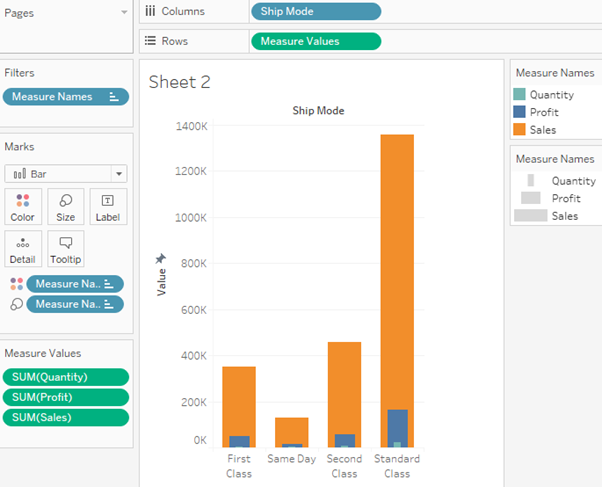
A combined axis merges two or more measures into a single axis so you can plot as many measures as you like in the same chart.

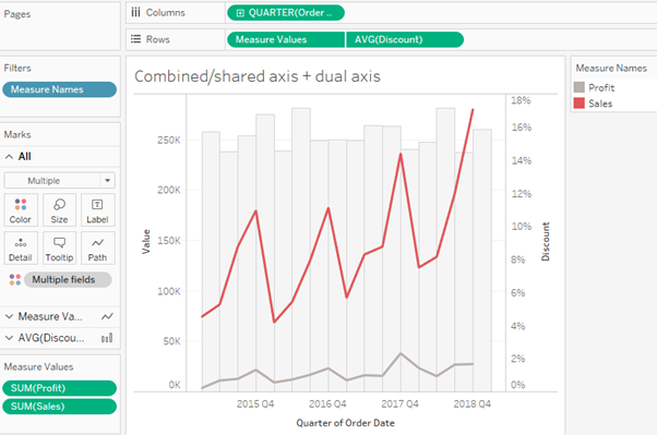
The biggest advantage of this is that you have the option of adding an additional dual axis to this chart later if you need another mark type to reflect another measure.

Other advantages include being able to include all the measures that you wish and that the formatting often takes fewer steps to get what you want. The only real disadvantage is that you have less freedom with the formatting and can only have a single mark type.
[/et_pb_text][/et_pb_column] [/et_pb_row] [/et_pb_section]